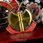
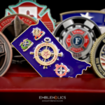
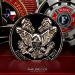
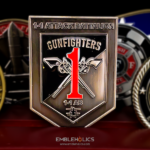
The coin is round, but the middle is hollowed out, which brings the logo, the flags and the text on both faces forward rather than leaving them to compete with a central device. The edge carries an embossed pattern and painted lettering, which gives the piece a strong circular form. It was ordered by RSM.
Removing the Center
Taking the middle out of a coin is the most consequential thing you can do to one, and the effect is the opposite of what people expect.
It does not reduce the design, it concentrates it. On a normal coin the center is where the eye lands, so everything else is subordinate. Remove it and there is no focal point competing with the band, which means logos, flags and text placed around the ring all read at equal strength. That is why the page describes the layout as bringing out more of the details.
The band becomes the whole design. So everything has to arrange around the circumference. That rules out a single large insignia, and it suits a coin carrying several elements of similar importance, which is exactly what a multinational mission coin needs.
The remaining ring has to stay rigid. The center is where a coin is strongest, so the band’s width is a structural constraint as well as a design one. Widen the opening and the ring flexes.
And the opening is now visible content. What you see through it is the background, a table, a hand, a sleeve. That is a real part of how the piece reads, and it is why the shape of the opening deserves as much thought as the band around it.
See whether cutouts make a coin weaker and custom shaped coin vs cutout coin.
Small Text in a Narrow Band
The page is direct about the consequence: with the center removed, the small text has to be clear and readable, so the layout has to be precise. That is the hard part of a ring design.
Four things keep it under control.
One ring of text, not two. Concentric rings of small curved type at this scale are very difficult, because each ring has a different radius and the letter distortion differs between them.
Short inscriptions only. Text following a curve distorts as it travels, and the tighter the radius the worse it gets. A band has a tighter radius than a full coin face, so the word count has to come down rather than the letter size.
More stroke weight than you would use on a flat face. Striking softens every edge slightly, and small curved type on a narrow band has no surrounding space to compensate.
And a quiet zone around the text. Whatever pattern or detail sits in the band, the area immediately around the lettering should be plainer, or the text competes with it.
Pattern and Lettering on the Edge
The edge of this coin is doing real work rather than being left plain, which is unusual and effective.
An embossed edge pattern defines the outline. On a coin whose center is open, the rim is what holds the circular form together visually. A patterned edge strengthens that, which is what the page means when it says the edge gives the coin a strong circle form.
Painted lettering on the edge is a third surface with content. Most coins treat the edge as a finish. Putting text there frees the faces, and on a ring design where the band is already crowded, that is a genuine gain rather than a flourish.
Two constraints. Edge text has to be short, because the edge is a narrow strip and letter height is tightly limited. And it is cut into the thinnest part of the coin, so depth is restricted, which means a painted fill helps considerably over bare engraving.
See a coin with machined edge inscriptions and finish options.
Coins for a Coalition Mission
A NATO-led mission coin has to work for personnel from many nations at once, and that shapes several decisions.
Flags do the explaining. A list of contributing nations requires reading and only works in one language. A set of flags is understood at a glance by everyone who was there.
Which drives the color count. Each flag adds distinct enamel fills, because national reds, blues and greens differ between countries and cannot be shared. That is usually the main cost driver on a coalition coin.
The group is temporary. A mission exists for a period and then concludes, leaving no standing organization to carry the memory. That is exactly the gap a coin fills, and it is why these coins matter disproportionately to the people who hold them.
And the language question has to be decided. A coin handed to personnel from several nations can carry one language or two, and it is worth deciding deliberately rather than defaulting.
See also a multinational challenge coin and an Operation Freedom’s Sentinel coin.
A Color Scheme Matched to the Metal
The page notes that the color scheme had to suit the base material, and that is a point worth making generally.
Enamel does not sit in isolation. A color surrounded by brass reads warmer than the same color surrounded by nickel, because the metal around and beneath it affects how the eye reads the hue. On a coin with a lot of bare metal visible, as a ring design necessarily has, that interaction is unavoidable.
The practical consequence is to choose the base metal and the palette together rather than in sequence. A palette approved against a white screen can look different against the plating it will actually sit on.
Order a Ring or Cutout Coin
Professional artwork is free with unlimited revisions, and nothing goes into production until you approve a digital proof. The challenge coin minimum is 50 pieces, standard production runs about 45 to 50 days after final artwork approval, rush production is available on many projects, and shipping within the continental United States is included. Embleholics is veteran-owned, SDVOSB and registered in SAM.gov.
Two things to plan for. A ring layout rules out a central device, so the design has to be conceived as a band from the first sketch rather than adapted from a conventional layout. And if the coin carries text in the band or on the edge, keep it short and judge the proof at actual size, because small curved type is exactly where a ring design succeeds or fails. Request a free quote to begin.
Frequently Asked Questions
What is a ring shaped challenge coin?
It is a round coin with the center removed, so the design occupies the band between the opening and the rim. Without a central focal point, elements placed around the ring all read at equal strength.
Does removing the center weaken a coin?
It can. The center is where a coin is strongest, so the remaining band has to be wide enough to stay rigid. Widening the opening narrows the band, which is a structural limit as well as a design one.
What kind of design suits a ring layout?
One carrying several elements of similar importance, such as multiple logos or flags. A ring rules out a single large insignia, so it suits a coalition or multi-organization coin better than a single-unit one.
How much text fits in the band?
Less than on a full face. Text following a curve distorts as it travels and a band has a tighter radius than a coin face, so the word count has to come down rather than the letter size. Use one ring of text, not two.
Why not use two rings of text?
Because each ring has a different radius, so the letter distortion differs between them, and small curved type at two different scales on one face is very difficult to keep readable.
Can lettering go on the edge of a coin?
Yes, and on a ring design it is a genuine gain, since it frees the already-crowded band. The constraints are that edge text must be short and that the edge is the thinnest part of the coin, so a painted fill helps over bare engraving.
Why do flags drive the cost on a coalition coin?
Because each distinct color is a separate enamel fill and flags rarely share shades, since national reds, blues and greens differ between countries. The color count is usually the main cost driver on these designs.
Should the palette be chosen before the base metal?
They should be chosen together. A color surrounded by brass reads warmer than the same color surrounded by nickel, so a palette approved against a white screen can look different against the plating it will sit on.
More Army Projects