Plenty of fire departments are also the emergency management organization for their area, or work directly alongside one. That puts two sets of insignia on one coin, and the only real question is which of them gets the front.
Two Organizations, One Coin
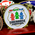
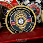
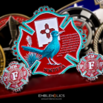
This coin carries the fire department emblem on the front and the emergency management division logos on the back. It is a common situation and almost nobody writes about how to handle it.
The rule is simple: the organization the recipient belongs to goes on the front. The partner, the parent body or the wider agency goes on the reverse. A coin is given to a person, and the face they see first should be the one they would name if asked who they serve with.
Getting it backwards produces a coin that feels like it was made for the organization chart rather than for the people in it. If the recipients are firefighters, the fire department leads. If the coin is going to the emergency management staff, it is the other way round, and that may well mean two coins rather than one.
For the broader category, see fire department challenge coins, and for a department that covers fire and EMS together, see this fire and EMS coin.
When the Two Emblems Do Not Match in Style
Here is the part that catches people out. A fire department emblem is usually traditional: a shield or a cross, heavy outlines, a design that has barely changed in decades. An emergency management logo is usually modern: flat shapes, a contemporary typeface, something drawn in the last few years.
Put them side by side on one face and the clash is obvious. The instinct is to redraw one of them so they match. That is the wrong move, and it is worse than the clash. An official emblem is reproduced, not restyled, and a department that sees its badge redrawn to suit a logo will notice immediately.
What works instead:
Separate them by face. One per side, which is what this coin does. Neither has to accommodate the other, and each gets a full face to be read on.
Let the rim be the only thing they share. A single consistent edge treatment across both faces is enough to make two very different designs read as one object. On this coin it is a plain bold margin with no etching or patterns, which is doing more work than it looks like it is.
Match the weight, not the style. A dense traditional emblem on one side and a sparse modern logo on the other reads as a finished face and an empty one. If the second face is lighter, give it lettering or a date rather than stretching the logo to fill the space.
Several Logos on One Face
The reverse here carries division logos rather than a single mark, which brings its own constraint. A row or cluster of logos is not one design element, it is several, and they have to be set rather than arranged.
Size them to the same optical weight, not the same dimensions. A tall logo and a wide logo at the same height do not look the same size. Set them so they read as equals, which usually means measuring by area rather than by height.
There is a hard limit. Below a certain size a logo stops being a logo and becomes a smudge, especially one with lettering inside it. Three or four work on a coin face. Seven do not, and the fix is fewer logos or a larger diameter, never smaller artwork.
Leave even space between them. Uneven gaps on a round face are the thing people notice without being able to say why.
A Plain Edge Is a Decision
The edge on this coin is a bold plain margin with no pattern cut into it, and that suits what is going on inside it. Two different design languages on the two faces already give the eye plenty to do. An etched or patterned rim would be a third thing competing for attention.
The general rule holds across most coins: one textured element per face. If the field or the artwork is busy, the rim stays plain. If the rim is doing the decorative work, the field stays quiet. Both at once is how a coin ends up looking crowded at arm’s length even when every individual element is well drawn.
See plating options for how the base metal changes the way a plain rim reads.
Volunteer Departments Pay for Their Own Coins
The Locust Community Volunteer Fire Department is a volunteer, nonprofit department, established in 1971. That matters for the coin, because a volunteer department does not have a budget line for one. The money comes from fundraising, from an auxiliary, from members’ own pockets, or from all three.
Two practical consequences. The cost per coin genuinely matters here in a way it does not on a promotion or award piece, and the decisions that most improve a coin, getting the weight right and choosing one good finish, cost very little. And a volunteer department’s coin is often sold as well as given, which means it has to make sense to somebody outside the department: the department named in full, the community identified, and no internal references that need explaining.
For more on that, see volunteer fire department coins, and for another department’s divisional piece, see this training division coin.
Order a Coin for Your Department
Free professional artwork, unlimited revisions and a digital proof before anything is produced. Free shipping within the continental US, a 50-coin minimum, and most orders complete 45 to 50 days after artwork approval, with rush production available. Embleholics is veteran-owned, an SDVOSB, and registered in SAM.gov.
Two things worth sending with a quote request. Your emblem as source artwork rather than a photograph of a patch, and a note on who the coin is actually going to, because that is what decides which emblem leads.
See more firefighter challenge coins.
Frequently Asked Questions
What is an emergency management challenge coin?
An emergency management challenge coin is made for the office, division or department responsible for emergency management in an area, and it often shares a coin with the fire department it sits alongside. In practice that means one coin carrying two sets of insignia, one on each face.
Which emblem should go on the front of a coin?
The emblem of the organization the recipient belongs to goes on the front. The partner body, parent agency or division set goes on the reverse, because a coin is given to a person and the first face they see should be the one they would name as their own.
Can two different emblems go on the same challenge coin?
Yes, and the usual answer is one per face rather than both on one side. Separating them means neither has to be restyled to suit the other, which matters because an official emblem should be reproduced exactly rather than redrawn to match something else.
What if the two emblems are in completely different styles?
Leave both as they are and let the coin’s rim and finish do the work of tying them together. Redrawing a traditional emblem to match a modern logo is the one thing not to do, because a department will recognize its own badge being altered.
How many logos fit on one side of a coin?
Three or four logos can be set on a coin face and still be read, depending on how much lettering each one contains. Past that they stop being legible, and the fix is to use fewer or to increase the diameter rather than to shrink the artwork.
Should a challenge coin have a patterned edge?
Only if the faces are quiet enough to carry it. A good working rule is one textured element per face: if the artwork or the field is busy, keep the rim plain, which is what this coin does with a bold unetched margin.
How do volunteer fire departments pay for challenge coins?
Volunteer departments usually fund coins through fundraising, an auxiliary, a members’ fund, or a combination, rather than from a department budget. That makes cost per coin a real consideration, and it is also why many volunteer departments sell coins as well as presenting them.
What is the minimum order for a fire department coin?
The minimum is 50 coins, which suits a single station, a division or a volunteer department. Larger departments ordering for everyone pay less per coin, but the difference is smaller than most people expect, and the decisions that most affect how the finished coin looks do not depend on quantity at all.
More Firefighters Projects