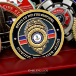
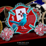
There is no custom shape on this coin, no novelty feature and no elaborate artwork. It is plain and vintage in style, crafted precisely and finished smoothly, and the result is a handsome object rather than a plain one. It was made for Spring Hill’s Fire Department in Tennessee.
What Makes a Vintage Style Work
A vintage register is the most requested look in the fire service and the one most often misunderstood. It is not the absence of design decisions; it is a specific set of them.
A warm metal rather than a bright one. Brass, bronze or antique copper. A cool silver or chrome reads as contemporary however the rest is handled, and nothing else will pull the piece back.
An antiqued finish rather than a polish. Antiquing darkens the recesses while leaving the raised surfaces lighter, so relief reads as depth without paint. It is also what makes a newly struck coin look like it has been somewhere.
Line work rather than sculpture. Older coins were engraved, so etched detail reads as period where heavy relief reads as modern manufacturing.
Restrained or no color. Bright enamel is unmistakably current. A vintage piece either goes without paint or uses one or two muted fills.
And serif lettering with generous spacing. Type is the element that dates a design fastest. A classical serif set with room around it is period; a tightly spaced modern sans serif is not.
Get those five right and the coin reads as traditional with no ornamental content at all. Get the metal or the lettering wrong and no amount of scrollwork will rescue it. See antique vs polished finishes and finish options.
Why a Plain Coin Is the Harder Brief
The page describes this coin as somewhat unsophisticated and yet handsome and elegant, which is exactly the result a restrained brief is aiming at and the hardest one to hit.
A coin with a custom shape, a bold palette or a sculpted centerpiece has something to carry it. Strip those away and the whole result depends on things nobody notices when they are right and everybody notices when they are wrong.
Spacing. With one device and some lettering, the relationship between them is the design. A device slightly too high, or text slightly too close to the rim, is immediately visible because there is nothing else to look at.
Centering. A circle is unforgiving. Any element even marginally off center on a plain round face looks like an error rather than a choice.
Lettering weight. Type that is correct on screen frequently reads too light once struck, because the metal softens every edge slightly. A plain coin has nowhere to hide thin lettering.
And the finish itself. On a coin with no color and no relief to distract, the surface quality is the product. A smooth, even finish is what the page is describing when it says the piece was finished smoothly, and it is the whole difference between plain and cheap.
None of that is difficult, and all of it has to be right, which is the honest reason a simple coin takes as much attention at the artwork stage as an elaborate one. More in Minimalist Challenge Coin Design for SpaceX March Madness.
Coins for a Growing Department
Spring Hill is a city in Maury and Williamson counties in Tennessee, south of Nashville, known for livestock breeding, agriculture and education. The Census Bureau has ranked it the fourth fastest-growing city in the state.
It was home to a Saturn production plant from 1990 to 2007, later renamed Spring Hill Manufacturing by General Motors, and recent growth has brought GM back to local hiring with a thousand new jobs, alongside new Ryder and Goodwill facilities.
That growth is relevant to a coin order in a way worth naming. A department adding staff year over year has a recurring need rather than a one-off purchase, and two things follow from it.
Order above your current roster. New hires arriving continuously means a coin runs out faster than a static department’s would, and reordering means another production cycle.
And keep the design undated. A coin issued to new firefighters over several years cannot carry a year or a staffing figure. An undated classic design can be reordered from the same die indefinitely, which is another argument for the restrained approach.
See more firefighter challenge coins and an engraved text challenge coin for a Tennessee department nearby.
Order a Classic Coin
Professional artwork is free with unlimited revisions, and nothing goes into production until you approve a digital proof. The challenge coin minimum is 50 pieces, standard production runs about 45 to 50 days after final artwork approval, rush production is available on many projects, and shipping within the continental United States is included. Embleholics is veteran-owned, SDVOSB and registered in SAM.gov.
Two suggestions. If you want a vintage look, say so at the start rather than describing individual features, because it settles the metal, the finish, the lettering and the color approach together and those decisions have to agree with each other. And order above your current headcount if your department is hiring, since an undated classic design can be reordered from the same die but each reorder is another lead time. Request a free quote to begin.
Coin Front

Coin Back

Frequently Asked Questions
What is a vintage challenge coin?
It is a coin designed to read as traditional rather than contemporary. It is defined by a specific combination of choices: a warm metal, an antiqued finish, etched line work, restrained color and serif lettering with generous spacing.
How do you make a coin look vintage?
Choose a warm metal such as brass or bronze, specify an antiqued rather than polished finish, use etched line work instead of heavy relief, keep color minimal or absent, and set serif lettering with room around it.
Which element matters most?
The metal and the lettering. A cool silver or chrome base reads as contemporary however the rest is handled, and tightly spaced modern type dates a design faster than anything else. Get those wrong and no ornamentation will rescue it.
Is a plain coin cheaper to produce?
Somewhat, since there is less enamel and no custom die for a shape. But it is not easier to get right, because the result depends entirely on spacing, centering, lettering weight and finish quality, all of which are invisible when correct and obvious when not.
Why does a plain coin look cheap sometimes?
Almost always the finish. With no color or relief to distract, the surface quality is the product, so an uneven or poorly finished face has nothing covering for it. A smooth, even finish is the whole difference between plain and cheap.
Why does lettering read thinner than expected?
Because striking softens every edge slightly, so type that looked correct on screen can read light in metal. The weight is normally increased during the artwork stage, and on a plain coin there is nowhere to hide a thin face.
Should a department coin carry a date?
No, if it will be issued to new hires over several years. An undated design can be reordered from the same die indefinitely, where a dated one is committed to one year and forces a new die.
How many should a growing department order?
Above your current roster. A department adding staff continuously runs through coins faster than a static one, and each reorder means another production lead time of about 45 to 50 days after artwork approval.
More Firefighters Projects