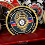
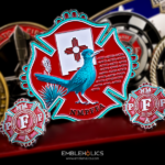
Most coins carry a few words. This one carries a whole prayer, and that changes the design problem completely. The question stops being what the coin looks like and becomes whether the smallest letter on it can still be read.
How Much Text Fits on a Coin
More than people expect, and the limit is not the space. It is the smallest letter height that survives the strike.
Metal has a minimum stroke width. Below a certain size, the raised or recessed line that forms a letter is too fine for the die to hold and too fine for the metal to fill cleanly. The letter does not disappear; it goes soft, and soft letters at small size become unreadable as a group even when each one is technically present.
What actually determines whether a long passage works:
Letter height, not word count. A hundred words at a workable height will read. Forty words crammed smaller will not. The honest way to plan a text coin is to fix the minimum letter height first and then see how many words fit, rather than the reverse.
Line spacing does more than you think. On paper, tight leading looks refined. In metal, adjacent lines of small type start to visually merge, because the relief casts shadow in both directions. Opening the line spacing is usually the single most effective fix when a text block is not reading.
Typeface weight. A light or finely serifed face loses its thin strokes first. A medium weight sans serif, or a serif with even stroke thickness, holds far better at small sizes. This is the one place where the font chosen on screen genuinely has to change for metal.
Engraved beats embossed for dense text. Recessed lettering sits in a protected channel and keeps its edges, while raised lettering at the same size wears at the high points and rubs against pockets and other coins. For a long passage people will actually read, engraving is the more reliable choice.
And paint fill decides the contrast. Engraved text in bare metal relies on shadow to read, which works but is subtle. Filling the recesses with a dark paint makes small type dramatically clearer, and it is worth doing on any coin whose text is the point.
See engraving and finish options for the processes.
Dividing the Faces
This coin puts the text on one side and the department’s insignia on the other, etched into the metal, and that division is the right call for any text heavy design.
The reason is that text and a graphic device compete for the same attention. Put a block of small type next to an insignia and the eye goes to the insignia every time, which means the text is there without being read. Giving the passage its own face means it is the only thing on that face, and the reader’s eye has nowhere else to go.
It also makes the coin work the way this kind of piece is meant to. The insignia side identifies the department; the text side is what somebody turns over and actually reads. Two functions, two faces, neither compromised. For the same principle applied with artwork rather than text, see a firefighter memorial challenge coin.
Using a Prayer, Poem or Creed
Firefighters, police, EMS and military units all have passages like this, and they are among the most common requests we see.
Two practical points before you order.
Settle the exact wording first. Versions of well known passages vary, sometimes by a word or two, sometimes more. A department usually has the version displayed in its own station, and that is the one its people will expect. Checking it against what is on the wall before artwork begins saves a proof round.
Check the authorship. Some of these passages are old and in the public domain. Others have a known author and are still protected, and the Fireman’s Prayer is one with an identified author. For anything written in the last century, confirm your right to reproduce it before ordering. We produce from the text a customer supplies and do not verify permissions on a customer’s behalf.
If the passage is too long to be readable at a workable letter height, the usual solutions are to use the opening lines rather than the whole thing, or to put the text on a larger piece. See more firefighter challenge coins.
About the Prayer and the Department
The Fireman’s Prayer, also known as the Firefighter’s Prayer, hangs in fire stations across the country. It was written by Alvin William “Smokey” Linn, who joined the Wichita, Kansas fire department in 1947 after serving in the Second World War and retired in 1975. He wrote it after a fire in which children were trapped in an apartment building behind window bars the owner had installed, where crews could see them but could not reach them.
This coin was ordered by the Fire and Rescue team of Maury County, Tennessee.
Order a Text Based Coin
Send us the exact wording you want, along with your insignia artwork. Professional artwork is free with unlimited revisions, and nothing goes into production until you approve a digital proof. The challenge coin minimum is 50 pieces, standard production runs about 45 to 50 days after final artwork approval, rush production is available on many projects, and shipping within the continental United States is included. Embleholics is veteran-owned, SDVOSB and registered in SAM.gov.
One thing to expect. On a text heavy coin, the proof stage matters more than usual, because small type is where the difference between a design that works and one that does not actually shows up. Look at the proof at the size the coin will be rather than enlarged on a screen. Request a free quote to begin.
Frequently Asked Questions
What is an engraved text challenge coin?
It is a coin whose main element is a passage of text recessed into the metal rather than a graphic device. Departments use the format for prayers, creeds and mottos, usually with the text on one face and the organization’s insignia on the other.
How much text can fit on a challenge coin?
A full prayer or creed will fit, but the limit is letter height rather than word count. Fix the smallest workable letter height first and then see how many words fit, because text set below that height goes soft under the strike and becomes unreadable as a block.
Why does small text go blurry on a coin?
Because metal has a minimum stroke width. Below it, the line forming each letter is too fine for the die to hold and for the metal to fill cleanly. The letters do not vanish, they soften, and softened small type reads as a smudge.
Should coin text be engraved or raised?
Engraved, for anything dense. Recessed lettering sits in a protected channel and keeps its edges, while raised lettering at the same size wears at the high points from pocket carry and contact with other coins.
What font works best for small text on a coin?
A medium weight sans serif, or a serif with even stroke thickness. Light faces and finely serifed ones lose their thin strokes first. This is the one element where the typeface chosen on screen usually has to change for metal.
How do you make engraved text easier to read?
Fill the recesses with dark paint and open up the line spacing. Bare engraved text relies on shadow alone, which is subtle, and tightly spaced lines visually merge because the relief casts shadow in both directions.
Should the text go on its own side of the coin?
Yes, for any substantial passage. Text and a graphic device compete for attention, and the eye goes to the device every time. Giving the passage its own face means it is the only thing there and will actually be read.
Can we put a well known prayer or creed on our coin?
Usually, but confirm two things first. Check the exact wording against the version displayed in your own station, since versions vary. And check the authorship, because some passages are in the public domain while others, including the Fireman’s Prayer, have an identified author and may still be protected.
More Firefighters Projects