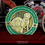
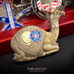
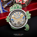
This coin was made by a media outlet rather than by a police department, which puts it in an awkward and interesting position. Its audience is law enforcement. Its identity is a brand. It has a logo and no badge, and the design has to speak to officers without pretending to be one of them.
Speaking to Police Without Claiming to Be Police
Any organization that serves law enforcement without being part of it faces this: media outlets, suppliers, charities, training companies, support groups, families’ associations.
The instinct is to use a badge or a department’s insignia, and that is the one thing to avoid. Agency insignia belong to agencies. Using one implies a relationship that does not exist, and a reader who actually wears a badge will notice immediately. It is the fastest way to lose the audience you were trying to reach.
What works instead:
Your own mark, treated seriously. A brand logo reproduced properly, with no attempt to make it look like insignia, reads as honest. A logo restyled into a shield shape reads as an imitation.
Generic references rather than specific ones. A star, a shield outline, a badge silhouette with no agency name on it. These read as law enforcement without reproducing anyone’s protected device.
Restraint in the palette. Which is the subject of the next section, and it is the main reason this coin works.
The same problem on the military side is covered on our military appreciation coin page, where the service marks are licensed and the rules are explicit. For agency insignia specifically, see our federal law enforcement coin page.
Bare Metal, Two Colors
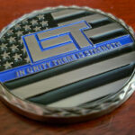
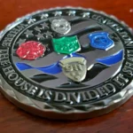
The coin uses a bare metal look with black and blue as the only applied colors, and the engraving carries the rest.
Bare metal is the confident choice here. A fully painted coin from an organization outside the service would look like merchandise. Metal with two accents looks like equipment, which is the register the audience actually lives in.
Two colors each have a job. With a limited palette one is the ground and one is the accent, and there is nothing spare to decorate with. Add four more and none of them is emphasis.
Engraving does the detail. A cut line in metal has its own contrast and holds its edge at small sizes, which is why the logo and the insignia here are engraved rather than built up in relief and filled. On a design with lettering inside a logo that is the more reliable route.
This is the same argument the tactical unit coins on this site make from the other direction. Police coins consistently run subdued where ceremonial coins run bright, and the reason is that a subdued coin matches the gear rather than the dress uniform. See how a tactical unit handles its palette.
A Diamond-Pattern Rim
The rim carries a repeating diamond pattern, and it works on this coin for a specific reason worth knowing.
The usual rule is one textured element per face: a busy field and a patterned rim will always compete. Here both faces are logo-led with open space around them, so the rim has room to be decorative without fighting anything.
Two practical notes. A repeating rim pattern has to be coarse enough to survive the strike, because a fine pattern closes up into a flat grey band and loses the point of having it. And a diamond or knurled pattern reads as industrial rather than ornamental, which is why it suits this register where a rope or scroll edge would not.
See plating options for how the base metal changes how a patterned rim reads.
What a Brand Coin Is Actually For
A coin from a company or publication is not a giveaway, and treating it as one wastes it.
The ones that work are given deliberately: to contributors, to people interviewed or featured, to departments the organization has worked with, to subscribers who have been there a long time, at conferences and events. The common thread is that the coin marks a relationship rather than advertising a product.
Two consequences for the order. The quantity is set by how many of those relationships there are, which is usually fewer than a marketing budget would suggest. And the design should not carry a tagline, a web address or a campaign, because those date and they turn the piece into a flyer. The name and the mark are enough.
For more on brand marks on coins, see our corporate logo coin page.
About Law Enforcement Today
Law Enforcement Today is a media outlet covering policing and law enforcement, and it commissioned this coin for a contemporary design built on classic challenge coin elements.
That is as much as the page needs. Ownership, funding arrangements and commercial plans change, and none of it has anything to do with the coin.
See more police challenge coins and corporate challenge coins.
Order a Police Appreciation Coin
Free professional artwork, unlimited revisions and a digital proof before anything is produced. Free shipping within the continental US, a 50-coin minimum, and most orders complete 45 to 50 days after artwork approval, with rush production available. Embleholics is veteran-owned, an SDVOSB, and registered in SAM.gov.
Two things worth telling us when you ask for a quote. Your logo as source artwork rather than a file pulled from a website, and who the coins are going to, because an appreciation coin given to officers is designed differently from one sold to supporters.
Finished Coin (Front)
Finished Coin (Back)
Frequently Asked Questions
What is a police appreciation coin?
A police appreciation coin is made by an organization outside law enforcement for an audience inside it, such as a media outlet, supplier, charity or support group. It carries that organization’s own mark rather than any agency’s insignia.
Can a company use a police badge on its coin?
No, and it is the main thing to avoid. Agency insignia belong to agencies, using one implies a relationship that does not exist, and the audience you are trying to reach is the audience most likely to notice.
What can a coin show instead of a badge?
Your own mark reproduced properly, and generic references such as a star or a plain shield outline with no agency name attached. Those read as law enforcement without reproducing anyone’s protected device.
Why are police coins usually subdued rather than colorful?
Because a subdued coin matches duty gear, where a brightly painted one reads as merchandise. Bare metal with two accent colors sits in the same register as the equipment the audience actually carries.
How many colors should a coin use?
Two or three against a metal field will beat a fully painted face in most cases. With a limited palette each color has a job, one as the ground and one as the accent, and additional colors stop any of them being emphasis.
Should a logo be engraved or raised and painted?
Engraved, where the logo contains lettering or fine detail. A cut line keeps its edge at small sizes while a raised edge rounds over, and paint in fine recesses tends to soften exactly what makes a logo readable.
Can a challenge coin have a patterned rim?
Yes, when the faces have open space around their artwork. A good rule is one textured element per face, and the pattern itself has to be coarse enough to survive the strike or it closes up into a flat band.
Should a brand coin carry a tagline or web address?
Better not. Taglines and addresses date quickly and turn the piece into a flyer rather than a keepsake. The organization’s name and mark carry it, and anything else belongs on a card alongside.
How many brand coins should be ordered?
As many as there are relationships to mark, which is usually fewer than a marketing budget suggests. The minimum is 50, and a brand coin given deliberately to contributors, partners and long-standing supporters works better than one handed out at volume.
More Law Enforcement Challenge Coins Projects