A corporate coin is built around a logo, and that is harder than it sounds. A brand mark was designed to be reproduced at high resolution on a screen and a letterhead. A coin is small, struck in metal, and unforgiving of exactly the things a modern logo relies on.
What a Logo Has to Survive
Here is the difference between a corporate coin and a unit coin. A unit emblem was designed inside a tradition of being reproduced in metal: bold shapes, heavy outlines, a limited palette. A corporate logo was not. It was designed for a screen, and that is a medium with no minimum line width, unlimited colors and perfect edges.
Four things give trouble, and all four are worth checking before artwork starts:
Thin strokes. A logo with hairline elements, a light-weight typeface or a fine rule under the wordmark will lose them. Struck metal has a minimum width below which a raised line disappears into the surface. The fix is to thicken those elements for the coin, which means the coin version of the logo is not pixel-identical to the screen version.
Gradients. Metal cannot do a gradient. A logo built on a colour fade has to be resolved into flat areas, and deciding where the steps fall is a design decision rather than a mechanical one.
Tight letter spacing. Letters set close together on screen will bridge into each other in metal, because each one is a raised form with a shoulder. Wordmarks usually need their spacing opened slightly.
Specific colours. A brand colour is specified exactly, and matching it in enamel is a real step rather than a formality. Send the colour reference rather than a picture of the logo.
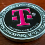
T-Mobile is an unusually good case, because the mark is a single-colour wordmark rather than an illustration. One colour, one typeface, no gradient and no fine detail is close to the ideal brief for a struck coin. Plenty of corporate marks are not that kind, and those are the ones that need work.
Reproduce It, Do Not Redesign It
The flip side of all that adaptation is a firm rule: nothing above changes what the logo is.
A company’s mark is fixed artwork owned by the company, usually with brand guidelines attached specifying the proportions, the clear space around it and the permitted colours. A coin is built around the logo rather than the logo being fitted to the coin. Thickening a stroke so it will strike is production. Restyling the mark because it would look better is not, and no corporate client will accept it.
That is the practical difference between corporate and unit work, and it is why a quote request for a corporate coin should come with brand guidelines attached rather than a logo pulled off a website.
Small Emblems on the Second Face
The reverse of this coin carries the emblems of the US armed forces, engraved, and that is where the production difficulty was.
Service emblems are among the most detailed artwork in common use. Each one contains a device, a border and usually lettering, all designed to be read at an inch or more across. Put several on a coin face and each is a fraction of that size.
Three things keep them legible. Set them to equal optical weight rather than equal diameter, because emblems of different proportions do not look the same size at the same height. Accept a floor on size, below which the lettering inside an emblem closes up and it becomes a disc with texture on it. And give them a plain field, since detailed artwork needs a quiet background.
If your company is planning a design that pairs its own mark with service emblems, the permissions side of that is a separate question and it matters. We cover it on our military appreciation coin page: service names, emblems and insignia are protected marks, commercial use generally needs a licence from the service concerned, and the request goes to the service rather than to a vendor.
Etched, Not Painted
Both faces here are etched and engraved rather than built up in heavy relief and filled with colour.
That suits the content. A cut line in metal has its own contrast and holds its edge at small sizes, where a raised edge rounds over. For a wordmark and a set of detailed emblems, both of which live or die on the crispness of their outlines, engraving is the more reliable choice. Paint sitting in fine recesses tends to soften exactly the detail that makes them readable.
See plating options for how the base metal changes how etched detail reads.
Why Companies Order Coins
A corporate coin is not a giveaway. It usually marks something: a partnership, a milestone, a programme, a team that finished a particular job. This one was made to mark a collaboration with the US armed forces.
Two things follow from that. A coin marking a collaboration should say who is giving it and what it marks, and those two things sit better on opposite faces than crowded onto one. And the quantity is set by the people involved rather than by a marketing budget, which is why corporate coin runs are usually smaller than people expect.
T-Mobile is a major wireless carrier in the United States. That is as much company description as the page needs: subscriber counts and hiring figures move every year and date a page that should not be dated.
See more corporate challenge coins and business coins.
Order a Corporate Coin
Free professional artwork, unlimited revisions and a digital proof before anything is produced. Free shipping within the continental US, a 50-coin minimum, and most orders complete 45 to 50 days after artwork approval, with rush production available. Embleholics is veteran-owned, an SDVOSB, and registered in SAM.gov.
Send your brand guidelines with the quote request, not just the logo. The proportions, the clear space and the colour references are what let us build the coin around the mark instead of adapting the mark to the coin.
Frequently Asked Questions
What is a corporate logo challenge coin?
A corporate logo challenge coin is built around a company’s brand mark rather than a unit emblem, usually to mark a partnership, a milestone or a team’s work. The design is constructed around the logo, which is fixed artwork owned by the company.
Can any logo be put on a challenge coin?
Most can, but many need adapting first. Hairline strokes, gradients and tight letter spacing all fail in struck metal, so those elements are thickened, resolved into flat areas or opened up for the coin version without changing what the mark is.
Why do thin lines disappear on a coin?
Struck metal has a minimum line width, below which a raised element has no shoulder to hold its shape and sinks into the surrounding surface. Logos designed for screens have no such limit, which is why fine rules and light typefaces have to be thickened.
Can a coin reproduce a gradient?
No. Metal and enamel cannot fade from one colour to another, so a logo built on a gradient has to be resolved into flat areas of colour. Deciding where those steps fall is a design decision and should be agreed before the proof.
Will the coin match our exact brand colour?
Matching a specified brand colour in enamel is a real step rather than a formality, and it needs the colour reference rather than an image of the logo. Send the brand guidelines with the quote request so the match is made from the specification.
Can a company redesign its logo for the coin?
A company can, but a vendor should not. Thickening a stroke so it will strike is production work. Restyling the mark because it would look better on a coin is not, and brand owners will not accept it.
How many emblems fit on one side of a coin?
Three to five, depending on how much lettering each contains. Service emblems are detailed and were drawn to be read at an inch or more across, so below a certain size the text inside them closes up and the fix is a larger coin rather than smaller artwork.
Can a company use military service emblems on its coin?
Service names, emblems and insignia are protected marks, and commercial use generally requires a licence from the service concerned. The request goes to that service’s own licensing programme rather than to a coin manufacturer, and it is worth settling before artwork starts.
Should corporate coin artwork be etched or painted?
Etching suits wordmarks and detailed emblems, because a cut line keeps its edge at small sizes while a raised edge rounds over and paint in fine recesses softens the detail. Painted relief suits bolder, simpler artwork with large areas of colour.
More Corporate Projects