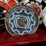
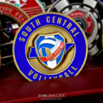
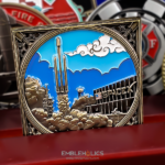
The company wanted the coin to be modern and contemporary in both its design and its form, so the construction itself is unusual: a transparent acrylic layer sits over the metal base. The front carries the regional logo in a layered metal and acrylic finish. The reverse carries the company’s core values in bold colors on a sleek acrylic surface, with the logo visible through the transparent layer.
Acrylic as a Material Layer
Most coins are metal and enamel. Adding a transparent layer over the top is a different construction, and it does things neither material can do alone.
It creates real depth. With a clear layer above the metal, there are two physical planes rather than one, and the eye can see the lower one through the upper. That is actual depth rather than the implied depth that relief and shading produce.
Which means elements can overlap across planes. A logo on the metal, visible through acrylic carrying its own content, is a layered composition. On a conventional coin everything is on one surface and overlap has to be faked.
It reads as contemporary. No traditional coin has a clear layer over it, so the material itself signals current rather than classical. For a technology company that is exactly the intent.
And it protects what is underneath. Anything below the acrylic cannot be scratched or worn, which matters for printed or finely detailed elements.
The costs are real too. A layered coin is thicker than a standard one, so it will not fit a capsule sized for a flat coin. The acrylic surface itself can scratch, where metal takes a polish. And the clear layer cannot carry struck relief, so any embossed or engraved detail has to sit on the metal below it or outside the acrylic area.
See manufacturing and finish options and, for the domed version of the same idea, a Navy Reserve Center coin.
Corporate Coins and Brand Rules
A coin for a large company is a different brief from a unit coin, and the differences are mostly about constraint.
The logo cannot be adapted. A corporate mark has specified proportions, clear space rules and approved color values. Unlike a unit crest, it cannot be simplified for metal, which means the design decisions available are its size, its position and what surrounds it.
Corporate logos are harder to reproduce than patch artwork. This is worth saying plainly. A brand mark is drawn for screens and print, so it can afford thin strokes, subtle gradients and tight letter spacing, all of which are problems at coin size. Military patch artwork, by contrast, was already designed to read at a distance.
Color references, not descriptions. Brand colors are specified exactly, and enamel is matched from a standard range, so send the references. A described color is a guess, and on a corporate piece an approximate brand color is a visible error.
And approval runs through brand governance. Which usually means more proof rounds than a unit coin and a longer lead time. Worth building into the schedule rather than discovering.
See more corporate challenge coins, a corporate logo challenge coin and a public-private partnership coin.
Putting Core Values on a Coin
The reverse carries the company’s core values in bold colors, which is one of the most common corporate requests and one of the easiest to get wrong.
Use the terms, not the definitions. A values framework usually has a word and a sentence explaining it. Only the words fit on a coin. The sentences belong on the intranet. We cover the same limits on our Employee Challenge Coin for WaFd Bank.
It is a list, so it needs vertical space. Four to six short words stacked down a face is manageable. The same number of phrases is not, and a list competes harder for attention than a single inscription because it needs the eye to travel.
Which is why it needs its own face. Sharing a side with artwork makes both weaker. Giving the list the whole reverse means it can be read rather than merely present.
And bold color is the right call here. On a list of words with no graphic element, color is what stops the face looking like a page of text. Strong distinct colors per term, or one strong color throughout, both work better than a subtle treatment.
A Coin for a Community Initiative
This coin commemorates a digital equity initiative rather than a product launch or an anniversary, and that is a good use of a corporate coin.
Comcast Pacific Northwest invests in community-based digital equity work, including Digital Navigators and broadband adoption efforts, through Project UP and its Digital Equity Network. The company describes itself as the largest home internet provider in the United States and says it has supported digital equity in its communities for more than a decade.
Three reasons an initiative makes a better coin subject than a company does.
The group is defined and mixed. This kind of work involves employees, community partners and volunteers who do not share a department or an employer, which is exactly the gap a coin fills.
It is an achievement rather than an identity. A coin marking something accomplished means more than one marking where somebody works.
And it is given, not issued. Which makes it a recognition piece. Those get kept; branded merchandise generally does not.
Order a Layered or Corporate Coin
Professional artwork is free with unlimited revisions, and nothing goes into production until you approve a digital proof. The challenge coin minimum is 50 pieces, standard production runs about 45 to 50 days after final artwork approval, rush production is available on many projects, and shipping within the continental United States is included. Embleholics is veteran-owned, SDVOSB and registered in SAM.gov.
Two things to plan for. Send your brand guidelines and color references up front, and build extra proof rounds into the schedule, because corporate approval runs through brand governance rather than one decision maker. And if you want a layered acrylic construction, say so at the quote stage, since it changes the thickness, the packaging and where struck detail can sit. Request a free quote to begin.
Frequently Asked Questions
What is an acrylic challenge coin?
It is a coin with a transparent acrylic layer over a metal base, so there are two physical planes and the lower one is visible through the upper. The construction creates real depth rather than the implied depth that relief produces.
Why use acrylic instead of enamel?
Because it allows layering. Elements can overlap across planes, with a logo on the metal visible through acrylic carrying its own content, where a conventional coin has everything on one surface and overlap has to be faked.
What are the drawbacks of a layered coin?
It is thicker, so it will not fit a capsule sized for a flat coin. The acrylic can scratch where metal takes a polish. And the clear layer cannot carry struck relief, so engraved detail has to sit on the metal below or outside the acrylic area.
Is a corporate logo harder to reproduce than a unit crest?
Usually yes. A brand mark is drawn for screens and print, so it can afford thin strokes, gradients and tight letter spacing, all of which are problems at coin size. Patch artwork was already designed to read at a distance.
Can a company logo be simplified for a coin?
No. A corporate mark has specified proportions, clear space rules and approved color values, so the available decisions are its size, position and surroundings rather than its form.
How do we get our brand colors right?
Send the color references rather than describing the shades. Enamel is matched from a standard range, so a named reference is exact where a description is a guess, and an approximate brand color is a visible error on a corporate piece.
Can company values go on a coin?
Yes, using the terms rather than their definitions, and on their own face. Four to six short words stacked down a side works; the same number of explanatory sentences does not, and a list competes harder for attention than a single inscription.
Why mark an initiative rather than the company?
Because an initiative is an achievement with a defined, mixed group behind it, often spanning employees, partners and volunteers who share no department. A coin marking something accomplished gets kept, where branded merchandise generally does not.
More Corporate Projects