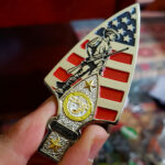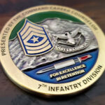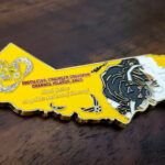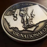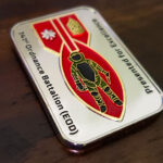
A rectangular challenge coin is a different proposition from a square one, and both are different from a round coin. The 741st Ordnance Battalion chose a rectangle deliberately, with their insignia engraved on both faces and color filled into the engraving, on a bright chrome base. Each of those three decisions follows from the one before it.
A Rectangle Is Not a Square
A square and a rectangle get treated as the same choice and they are not, because a rectangle has a long axis and a square does not.
A square, like a circle, is symmetrical in both directions. It has no inherent reading direction, so the design has to establish one. A rectangle arrives with one already built in. The eye travels along the long side, which means the layout is decided before you start: things read left to right, or top to bottom, in sequence rather than radially.
That makes a rectangle the right shape for content that has an order to it. A unit designation, then a motto. A name, then a date. A sequence of insignia. On a round coin those have to be arranged around a center and the viewer picks their own starting point. On a rectangle they queue up.
It also changes the register. A rectangle at roughly two to one is the proportion of a plaque, a nameplate, a sign or a bar. It reads as a plate rather than as currency, which is further from a coin than a square gets. For the square version of this argument, see the square challenge coin design.
Text Runs Straight on the Long Axis
This is the practical reason to choose a rectangle and it is the one most often overlooked.
On a round coin, any line of text long enough to matter has to be set on an arc. Curved type is harder to read, it limits how many characters you can fit before the letters start to lean, and it forces decisions about where the line begins and ends. A rectangle has a straight run the full length of the coin, so text sits flat at normal letter spacing and reads the way text is meant to read.
For a unit with a long name, a long designation or a motto of more than three or four words, that is the whole argument. A rectangular coin will carry text legibly that a round coin of the same area cannot.
A Border With Two Different Run Lengths
The one complication a rectangle brings is in the border, and it is worth knowing before the artwork stage.
A square border has four equal runs, so a repeating pattern divides evenly and the corners all behave the same way. A rectangle has two long runs and two short ones. A pattern that fits the long side neatly will not fit the short side neatly, and the mismatch shows at the corners.
Three ways through it. Use a pattern fine enough that an incomplete repeat is invisible. Use a corner element that absorbs the difference, so each run starts and stops cleanly against it. Or use a plain border and let the shape do the work, which is the simplest answer and often the best one. See custom shaped challenge coins for how these outlines are tooled.
Bright Chrome and Why the Engraving Is Filled
The base is a bright chrome-look finish, and on this coin the engraving is color filled rather than left bare. Those two facts are connected, and the connection is the most useful thing to take from this design.
A mirror finish does not just reflect light, it reflects the room. Hold a chrome coin and you see your hand, the window and the ceiling in it. Shallow engraved lines on that surface have to compete with all of that, so bare engraving on a mirror base can disappear entirely at some angles and reappear at others.
Filling the engraving solves it completely. Once the lines carry their own color, they have a fixed value that does not change with what the coin happens to be reflecting. The design becomes readable from every angle, which is what you want from a unit’s insignia.
So the rule is straightforward: a mirror base wants filled engraving, and bare engraving wants a matte, brushed or antiqued base that holds shadow instead of reflections. Mixing them the other way round is the most common reason a coin looks fine in a photograph and disappointing in the hand. More options are in challenge coin plating options.
About the 741st Ordnance Battalion
The 741st Ordnance Battalion is an Explosive Ordnance Disposal battalion of the Army National Guard, which is why the unit is referred to as both the 741st Ordnance Battalion and the 741st EOD.
For the EOD career field itself, including what the badge elements mean and why EOD identity crosses service lines, see the Air Force EOD coin. See also a bomb task force coin and more National Guard challenge coins.
Order a Rectangular Coin
Send your unit insignia and any text you want carried, and say how much of it there is, because the amount of lettering is usually what decides whether a rectangle is the right shape. If you want a mirror finish, tell us, since that affects whether the engraving should be filled.
Professional artwork is free with unlimited revisions, the minimum order is 50 coins, and nothing goes into production until you approve a digital proof. Standard production runs about 45 to 50 days after final artwork approval, rush production is available on many projects, and shipping within the continental United States is included. Embleholics is veteran-owned, SDVOSB and registered in SAM.gov.
Frequently Asked Questions
What is a rectangular challenge coin?
A rectangular challenge coin has a long axis rather than being symmetrical like a circle or a square, so the design reads in sequence along its length. At roughly two to one it reads as a plaque or nameplate rather than as currency, and it carries straight lines of text that a round coin would have to curve.
What is the difference between a square and a rectangular coin?
A square is symmetrical in both directions and has no built-in reading direction, so the design has to create one. A rectangle has a long axis, so the eye travels along it and content with an order to it, such as a designation then a motto, queues up naturally instead of being arranged around a center.
Is a rectangular coin better for long text?
Yes, and it is usually the deciding factor. On a round coin any substantial line of text has to be set on an arc, which is harder to read and limits the character count. A rectangle offers a straight run the full length of the coin, so text sits flat at normal spacing. A unit with a long name or a motto of more than three or four words will fit it legibly on a rectangle and not on a circle of the same area.
How do you handle a border on a rectangular coin?
A rectangle has two long runs and two short ones, so a repeating pattern that divides evenly along the long side will not divide evenly along the short side, and the mismatch shows at the corners. Use a pattern fine enough that an incomplete repeat is invisible, use a corner element that each run starts and stops against, or keep the border plain and let the shape carry the design.
Does a mirror or chrome finish work on a challenge coin?
Yes, but it needs the engraving to be color filled. A mirror surface reflects the room as well as the light, so bare engraved lines compete with reflections of whatever is nearby and can vanish at some angles. Filling the lines gives them a fixed value independent of the reflection, so the design reads from every angle.
When should engraving be left unfilled?
On a matte, brushed or antiqued base, where the surface holds shadow rather than reflections and the cut lines read as dark against it without any paint. Bare engraving on a mirror base and filled engraving on a matte base are both workable, but bare engraving on a mirror base is the combination that looks good in a photograph and disappointing in the hand.
What is the 741st EOD?
The 741st Ordnance Battalion is an Explosive Ordnance Disposal battalion of the Army National Guard, which is why it is referred to as both the 741st Ordnance Battalion and the 741st EOD.
Which shape should I choose for a unit coin?
Let the content decide. A circle suits a single central device with short text around the rim. A square suits a design that wants a decorative border. A rectangle suits a lot of lettering, or content that reads in a sequence. If you are unsure, the amount of text is the most reliable guide.
More National Guard Projects