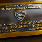
This piece is rectangular, cast in bronze tones, with a black field and brass-colored raised lettering, and the only graphic on it is the client’s emblem. It is not trying to look like a coin. It is trying to look like the bronze plaque that gets mounted at a landmark, and that is exactly the right instinct.
A Plaque in Miniature
When an engineering society recognizes a structure, what goes up at the site is a cast bronze plaque: dark recessed background, raised lettering in the natural metal, the society’s emblem, and a short inscription naming what was built and who built it.
That is a very specific visual language, and it is almost the opposite of the usual coin brief:
Text leads, not imagery. A plaque is mostly words. Most coins are mostly picture. Here the inscription honoring the builders is the subject and the emblem is the accent, which is why the layout is rectangular rather than round.
Bronze is not a decorative choice. It is the material commemorative plaques are actually made of, and using a bronze base rather than gold or silver is what makes the reference land.
The dark field is structural. On a cast plaque the background is recessed and darkened so the raised letters read. Black paint in the field of this piece is doing the same job: it puts the lettering forward without the lettering having to be larger.
One graphic, no more. A plaque carries the organization’s emblem and nothing else competing with the text. Adding a second device here would have turned it back into an ordinary coin.
For the mechanics of a rectangular format, see our rectangular coin page, which covers the corners, the orientation and why a rectangle suits text in even lines.
Raised Lettering on a Dark Field
This is the technique the whole piece rests on, and it is worth separating from the more common approach.
Most lettering on coins is recessed and filled with color. Here it is the other way round: the letters stand up in metal and the field behind them is painted dark. Three things follow.
The letters keep the metal’s own color. No paint on the text at all, so the brass tone is the base metal catching light. That is what reads as cast rather than printed.
The contrast is maximal. Bare metal against a dark field is the strongest pairing available without introducing a second color, which means the text is legible at arm’s length without being set large.
And the raised letters take the wear. That is the honest trade. Recessed lettering is protected by the surface around it. Raised lettering is the first thing contact reaches, so a piece like this is better kept or displayed than carried loose.
Practical note on the type itself: raised lettering needs more space around each character than recessed lettering does, because each letter is a form with a shoulder and letters set tight will bridge into one another. Open the spacing slightly and keep the weight even.
When a Coin Should Not Look Like a Coin
The broader point this piece makes is worth stating plainly, because it applies well beyond engineering societies.
A commemorative object borrows authority from the form it imitates. A coin that looks like a coin reads as a token. A piece that looks like a plaque reads as a record. A piece that looks like a medal reads as an award. None of those is better than the others, and picking the wrong one is the most common mistake on a commemorative order.
So the first question on a piece like this is not what shape or what finish. It is what kind of object the recipient should think they are holding. Once that is settled, the shape, the metal, the field treatment and the balance of text to image all follow from it.
See commemorative challenge coins and plating options.
About the Red Hill Facility and the Recognition
The Red Hill Underground Fuel Storage Facility at Pearl Harbor, Hawaii, was built during the Second World War. The original plan was for four horizontal tanks; what was actually constructed was twenty vertical tanks, excavated inside a ridge and set beneath roughly a hundred feet of volcanic rock, connected by tunnels to the harbor.
As a piece of wartime construction it was a remarkable undertaking: tanks the height of office buildings, mined out of rock, under wartime conditions and wartime secrecy. That is the achievement the American Society of Civil Engineers recognized and the achievement this coin’s inscription honors.
The facility has since been defueled and is going through closure under a Navy task force established for the purpose, so it is no longer in service. The coin is a record of how it was built rather than a statement about its operation.
The American Society of Civil Engineers is the professional body for civil engineers in the United States, and it recognizes historic structures as engineering landmarks. For the same discipline in another project, see this civil engineering coin.
Order a Commemorative Piece
Free professional artwork, unlimited revisions and a digital proof before anything is produced. Free shipping within the continental US, a 50-coin minimum, and most orders complete 45 to 50 days after artwork approval, with rush production available. Embleholics is veteran-owned, an SDVOSB, and registered in SAM.gov.
If the piece carries an inscription, send the exact wording with the quote request. On a text-led design the number of words decides the size of the piece rather than the other way round, and we will set it on the proof for you to check before anything is struck.
Frequently Asked Questions
What is a bronze challenge coin?
A bronze challenge coin uses a bronze base rather than gold or silver tones, which gives it the look of cast commemorative hardware. It suits text-led commemorative pieces, because bronze is the material plaques and markers are actually made from.
Can a challenge coin be made to look like a plaque?
Yes, and it is a deliberate design approach rather than a compromise. A rectangular format, a bronze base, a dark recessed or painted field, raised lettering in bare metal and a single emblem together produce something that reads as a plaque in miniature.
Should lettering be raised or recessed?
Recessed lettering filled with color is more common and better protected. Raised lettering in bare metal against a dark field reads as cast rather than printed and gives the strongest contrast available without a second color, at the cost of taking wear first.
Why does raised lettering need more space?
Because each raised letter is a form with a shoulder, and letters set close together will bridge into one another in struck metal. Opening the spacing slightly and keeping the stroke weight even is what keeps raised text legible.
Why is the background painted dark?
To put the lettering forward. On a cast plaque the background is recessed and darkened so the raised letters read against it, and a dark painted field on a coin does the same job, which means the text can stay modest in size and still be legible.
How much text fits on a commemorative piece?
The word count decides the size rather than the reverse. Struck lettering has a minimum height below which it stops being readable, so a long inscription needs a larger piece, and the exact wording should be settled before the proof.
What is the Red Hill facility?
Red Hill was an underground fuel storage facility at Pearl Harbor, Hawaii, built during the Second World War, with twenty vertical tanks excavated inside a ridge beneath roughly a hundred feet of rock. It has since been defueled and is going through closure.
Who ordered this coin?
The American Society of Civil Engineers, the professional body for civil engineers in the United States, which recognizes historic structures as engineering landmarks. The inscription on the piece honors the people who built the facility.
How do you decide what kind of object a commemorative piece should be?
Start with what the recipient should think they are holding: a token, a record or an award. A coin reads as a token, a plaque as a record, a medal as an award, and the shape, metal and balance of text to image all follow from that choice rather than preceding it.
More Navy Projects