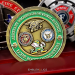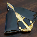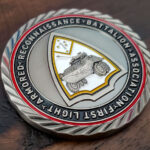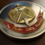
The foundation asked for something simple: a smooth edge, a clean rim, no machined patterns or decoration. The logo engraved and painted on the front, and the organization’s mission statement carved into the back at a height that could be read easily. For an organization whose coin is part of how it reaches people, that is the right brief.
Putting a Mission Statement on a Coin
This is a common request from nonprofits and a frequently botched one, because people underestimate what a paragraph does to a coin face.
Letter height is the constraint, not the space. A mission statement will physically fit on a coin at almost any length. Whether it can be read is a different question, and it is settled by the smallest letter height that survives the strike. The right order is to fix that height first and see how many words fit, rather than fitting the words and discovering the size.
Most mission statements need shortening. Organizations write them for websites and grant applications, where length costs nothing. On a coin, every word takes space from every other word. A coin version is usually one sentence rather than a paragraph, and cutting it is a better outcome than shrinking the type.
Line spacing matters more than on paper. Relief casts shadow in both directions, so tightly set lines of small type start to merge visually. Opening the leading is the most effective single fix when a block of text is not reading.
And it needs its own face. Text and a logo compete for attention and the logo wins every time. Giving the statement the whole reverse is what makes it something people read rather than something that is merely present.
For more on dense text in metal, see an engraved text challenge coin.
Why Plain Was the Correct Brief
No rope edge, no diamond cut, no sculpted border. On a coin whose job is to carry a message, that restraint is doing real work.
A decorated rim draws the eye outward, which is exactly wrong when the thing you want read is in the middle. A clean rim does the opposite: it frames the face without competing, so the text holds attention.
A smooth edge also suits an organization that will hand the coin to people outside its own world. Heavily machined edges and ornate borders read as military or institutional. A plain, well finished piece reads as considered, which is the register a foundation generally wants.
The lesson is that an edge treatment is a choice in both directions. Specifying none is as valid as specifying a diamond cut, provided it is a decision rather than an oversight.
Engraved and Painted Logo on the Front
The front carries the foundation’s logo, engraved and painted in its own colors, with nothing else on the face.
Two points worth copying. Using the organization’s actual colors rather than letting a designer choose is what makes a coin look like it belongs to that organization, and the way to get it exact is to send the color references rather than describing the shades, since enamel colors are matched from a standard range.
And a logo alone on a face is usually enough. The instinct is to add the organization’s name around the rim, but most logos already contain the name, and repeating it is the quickest way to make a clean face look cluttered.
Coins for Nonprofits and Foundations
A foundation coin works differently from a unit coin, and it is worth being clear about how.
It is given to people outside the organization. A unit coin circulates among members. A foundation coin goes to the people the organization is trying to reach, to supporters, to donors, to volunteers. That is why the message on it matters more than the insignia.
It is a physical object in a digital outreach effort. Most of what a nonprofit produces is a page or an email. A coin is something a person can put in a pocket and still have in six months, which is a different kind of contact.
And it works as a conversation piece. Somebody who has the coin can hand it to somebody who does not, and the mission statement on the back does the explaining. That is the practical reason to make the text readable rather than decorative.
See more organization challenge coins and veteran mental health challenge coins.
About the Foundation
The Warrior Tribe Foundation was started by two men who took on a responsibility that was not theirs to accept, because nobody else was going to. It began in response to losses and struggles within their own Marine battalions, and grew as the founders reached out further.
Its mission is to preserve lives by rebuilding community and holding to a long-term commitment to a shared purpose. Today it connects service members, veterans, first responders and their families to a network of people committed to selfless service.
That is the statement carved into the back of the coin, and it explains the whole brief. An organization whose work is connecting people needs something it can put in a hand.
Order a Coin for Your Organization
Send us your logo artwork, your color references and the text you want on the reverse. Professional artwork is free with unlimited revisions, and nothing goes into production until you approve a digital proof. The challenge coin minimum is 50 pieces, standard production runs about 45 to 50 days after final artwork approval, rush production is available on many projects, and shipping within the continental United States is included. Embleholics is veteran-owned, SDVOSB and registered in SAM.gov.
One suggestion. Bring the mission statement already shortened to a single sentence if you can, or tell us to cut it. Arriving with a full paragraph and asking for it all to fit is the most common way these coins end up with text nobody can read. Request a free quote to begin.
Frequently Asked Questions
What is a mission statement challenge coin?
It is a coin carrying an organization’s mission statement, usually on the reverse with the logo on the front. Nonprofits and foundations use the format because the coin goes to people outside the organization, who need the message rather than the insignia.
Can a mission statement fit on a challenge coin?
Yes, but usually a shortened version. A statement will physically fit at almost any length; whether it can be read depends on letter height. Fix the smallest workable height first, then see how many words fit, rather than the reverse.
How long should the text be?
One sentence is the realistic target. Mission statements are written for websites and grant applications where length is free, but on a coin every word takes space from every other. Cutting the text gives a better result than shrinking the type.
Should the mission statement have its own side?
Yes. Text and a logo compete for attention and the logo always wins. Giving the statement the whole reverse means it is the only thing on that face, which is what makes it something people actually read.
Why does small text on a coin need extra line spacing?
Because relief casts shadow in both directions, so tightly set lines of small type merge visually in a way they would not on paper. Opening up the leading is the single most effective fix when a block of text is not reading.
Is a plain rim a worse choice than a decorated one?
No, and for a text coin it is better. A decorated rim pulls the eye outward, which works against anything you want read in the middle. A clean rim frames the face without competing. Specifying no edge treatment is a valid choice, provided it is deliberate.
How do we get our logo colors exact?
Send the color references rather than describing the shades. Enamel colors are matched from a standard range, so a named reference is exact where a description is a guess. Using the organization’s real colors is what makes the coin look like it belongs to you.
Why do nonprofits order challenge coins?
Because a coin is a physical object in an otherwise digital outreach effort. Someone can keep it in a pocket for months, and hand it to somebody else, with the text on the back doing the explaining. That is a different kind of contact from a page or an email.
More Marine Corps Projects