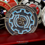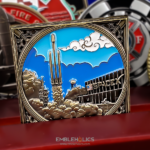
A minimalist challenge coin is defined by what comes off it, not by what goes on. The brief for this one was explicit: contemporary, no unnecessary patterns or carvings, and the minimum amount of color, to get a clean look. That is a harder instruction than it sounds, because removing things from a coin design has a right order and a wrong one, and it is easy to strip out the parts that were doing the work.
A Coin for a Moment, Not an Organization
This is a commemorative coin for a dense run of launches in a single month, which SpaceX followers nicknamed March Madness. That makes it a different object from a unit or company coin, in four ways.
- It should be dated, and that is the exception. Most coins are better without a date, because a date ages them out. A commemorative coin is about one specific time, so the date is the content rather than a liability.
- The quantity is fixed. The people who were there, plus a margin. There is no reorder, because the event does not happen again.
- It becomes historical immediately. The day after the event the coin stops being current and starts being a record, and part of its value is that it was never reissued.
- It should not try to be timeless. A commemorative coin is allowed to look like its moment. A contemporary, stripped-back design dates the piece in a way that is a feature here and would be a problem on a coin meant to last twenty years.
Minimalism Is Subtraction in a Specific Order
Everyone agrees a clean coin is better. The disagreements start at which element goes first. This is the order that works, and it goes from the elements that carry the least information to the ones that carry the most.
- Decorative pattern and borders. These are the first to go, because they add no information at all. A frame earns its place only when the center needs protecting from an empty perimeter, which is the opposite situation from this one. Compare this coin with the square SpaceX design, where an ornamental frame is load-bearing because the center holds a single large subject.
- Repeated text. The organization’s name belongs on the coin once. Most crowded coins carry it two or three times, plus a tagline, plus a motto, plus a location. Keep one line of each kind at most.
- Colors, down to one or two. Not to zero, for reasons below.
- Relief planes. Fewer levels with cleaner steps between them reads as more deliberate than many shallow levels, and it strikes more consistently.
- The subject itself, last and reluctantly. Simplifying the main device is the final move, not the first, and it is where most people start.
Two things never come off. The element that identifies whose coin it is, and on a commemorative, the date. Everything else is negotiable.
One Accent Color Beats None
The brief said minimum color, and minimum is not the same as none. On a coin like this a single accent does three things that bare metal alone does not.
It reads as a decision. An entirely unpainted coin can be read as a budget constraint, where one deliberate spot of color is obviously a choice somebody made.
It directs the eye. With one colored element on an otherwise monochrome face, there is no ambiguity about where to look first, and on a minimal design that is the only hierarchy you have left.
It wears well. Large painted areas chip at their edges over years in a pocket. A small accent has less perimeter exposed, so it survives longer than a broadly painted coin would.
For the metal and finish options underneath, see challenge coin plating options.
The Edge Is Where a Minimal Coin Shows Craft
Here is the part most people miss about stripped-back designs.
Nobody looks at the edge of a busy coin, because the faces are using all the attention. On a minimal coin the rim becomes visible, and that makes it the one place you can add real craft without adding any clutter to the design.
Edge treatments such as reeded or milled edges, rope edges and diamond-cut edges change how the coin reads in the hand and in a photograph, and none of them touch the faces. They also do something useful for a minimal piece specifically: they signal that the simplicity was intentional. A plain coin with a worked edge reads as restrained. A plain coin with a plain edge can read as unfinished to someone who is not paying attention.
Edge options vary by project and by tooling, so ask what suits your design when you request a quote.
What Minimalism Costs
Three honest trade-offs, because a page that only praises the approach is not much use.
The one subject has to be genuinely good. A busy coin has five things to look at and any one of them can carry a weak moment. A minimal coin has one, and if it is mediocre there is nothing to distract from that.
Flaws show. Large unbroken fields, symmetrical layouts and clean color edges all expose production variation that a complex design would hide. This is covered in more detail on the Defense Logistics Agency coin page.
Some people equate detail with value. Not everyone reads restraint as quality, and a minimal coin can look inexpensive to someone expecting a lot of metalwork for their money. The answer is to put the quality somewhere they will feel rather than see: a heavier gauge, a better finish, a worked edge, decent packaging.
About SpaceX
SpaceX, formally Space Exploration Technologies Corp., is an American spacecraft manufacturer and launch service provider founded in 2002 and headquartered in Hawthorne, California. It operates the Falcon 9 and Falcon Heavy launch vehicles and the Dragon spacecraft.
See more of these projects, including the SpaceX challenge coin and the Crew Dragon Demo-2 coin, and more corporate challenge coins.
Order a Commemorative Coin
Send your logo or artwork, the event name and the date. If you want a minimal design, say so at the start and tell us which single element matters most, because that decides what everything else has to give way to.
Professional artwork is free with unlimited revisions, the minimum order is 50 coins, and nothing goes into production until you approve a digital proof. Standard production runs about 45 to 50 days after final artwork approval, rush production is available on many projects, and shipping within the continental United States is included. Embleholics is veteran-owned, SDVOSB and registered in SAM.gov.
Frequently Asked Questions
What is a minimalist challenge coin?
A minimalist challenge coin uses a single clear subject, little or no decorative pattern, minimal text and one or two colors at most, so the design reads instantly. It is defined by what has been removed rather than by what has been added, and it suits commemorative and corporate coins where a contemporary look is wanted.
How do you decide what to remove from a coin design?
Work from the elements carrying the least information to the ones carrying the most. Decorative pattern and borders go first, then repeated text such as a name appearing more than once, then colors down to one or two, then the number of relief levels, and only last the main subject itself. The identifying element and, on a commemorative, the date should never be removed.
Should a minimalist coin have no color at all?
One accent is usually better than none. A single spot of color reads as a deliberate choice where a completely bare coin can be read as a budget constraint, it gives the eye somewhere to go on a design with little other hierarchy, and it has less painted perimeter to chip than broad color areas do.
Does a simple coin design look cheap?
It can, to people who equate visible detail with value. The fix is to put the quality where it is felt rather than seen, with a heavier gauge, a better finish, a worked edge or proper packaging, so the restraint reads as intentional rather than as a saving.
Is a minimalist coin cheaper to produce?
Sometimes, but less often than expected. Fewer colors and fewer relief levels reduce cost, while large flat fields and clean color edges need more careful surface preparation because they expose variation a busy design would hide. Ask for pricing on the finish as well as the artwork.
Should a commemorative coin have a date on it?
Yes. Dates are usually a liability on a unit or company coin because they age it out, but a commemorative coin exists to mark one specific moment, so the date is the content. The same applies to the event name.
How many coins should be made for an event?
The number of people present plus a margin for those who should have been. Event coins are not normally reordered, since the occasion does not repeat, and part of their value to the people who have one is that no more were made.
What edge treatments are available on a challenge coin?
Reeded or milled edges, rope edges and diamond-cut edges are all used, and they change how a coin feels in the hand and photographs without altering either face. They are particularly worth considering on a minimal design, where the rim is visible because the faces are quiet. Options vary by project and tooling, so ask when you request a quote.
More Corporate Projects