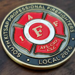
This coin was made for South Kitsap Fire and Rescue, the fire district covering Port Orchard and the surrounding communities. A fire district is a different kind of organization from a city fire department, and that difference shapes how the coin gets ordered.
A District Is Not a City Department
Most firefighter coins are ordered by municipal departments. A fire district is something else, and the distinction matters practically rather than just legally.
A district is its own public body. It is not a department inside a city government. It has its own boundaries, its own budget and its own elected commissioners, which means the approval chain runs through the district rather than through a city hall.
It is funded by its own levy. District money comes from the property owners inside its boundaries rather than from a city general fund. That makes spending more visible to the people paying for it, and it is worth knowing when a coin is being justified.
It serves communities, not a city. A district frequently covers unincorporated areas, several named communities and a mix of waterfront, suburban and rural ground. There is no single city identity to put on the coin.
And it is usually a combination service. Districts commonly run career and volunteer firefighters together, which is the case here, and a coin has to belong to both halves equally.
That last point deserves a plain rule: on a combination service, nothing on the coin should distinguish paid from volunteer. The district emblem leads and the distinction stays off the artwork entirely. For the volunteer side specifically, see a volunteer firefighter coin.
Firefighters Instead of Equipment
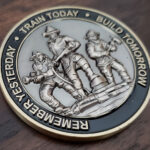
The reverse of this coin carries a sculpted image of firefighters, with the district’s motto inscriptions encircling them. That is a better choice than it might appear, and it is worth explaining why.
The default for a fire coin is equipment and symbols: an engine, a helmet, a Maltese cross, crossed axes, a hydrant. All of them are fine and all of them are on thousands of coins already. What they describe is the job.
People describe the service. A sculpted group of firefighters says what the district is rather than what it owns, and it is far harder to confuse with another agency’s coin.
Figures are also more demanding to sculpt than equipment, which is part of why they are less common. A fire engine is a box with recognizable features and survives simplification. A human figure has proportion, posture and gear that all have to read correctly at coin size, and the eye is unforgiving about people in a way it is not about vehicles.
The motto running around the figures is the right place for it. Text encircling a central image frames the subject rather than competing with it, which is the same reasoning behind a border. For more on content choices, see what to put on a fire department challenge coin.
Brass, Black and a Vintage Look
The district asked for something classic with a vintage, elegant feel that honored its history. The execution is a brass-colored base with embossed lettering over black paint, and red and white on the emblem.
Three things make that read as vintage rather than merely plain.
Brass rather than nickel. A warm metal tone reads as older. Bright nickel and polished silver read as current, whatever else is done to them.
Black behind raised lettering. Filling the recessed field behind embossed text with black is the oldest trick in coin finishing. It throws the raised letters forward and gives them a hard edge, and it is why struck lettering on antique coins is still legible.
Color held to the emblem only. Red and white appear where the emblem needs them and nowhere else. A vintage look depends on restraint, and a coin with color spread across both faces reads as modern no matter what metal it uses.
Our page on plating and finish options covers the combinations.
South Kitsap Fire and Rescue
South Kitsap Fire and Rescue covers roughly 117 square miles of Kitsap County, Washington, centered on Port Orchard and taking in around ten communities and neighborhoods. It runs twelve stations across waterfront, urban, suburban and rural ground, with seven staffed around the clock and five volunteer stations, and it fields over a hundred career personnel alongside more than thirty volunteers.
Embleholics is based in Port Orchard, inside the district. This is a coin for the service that covers our own address, and a fire district coin is work we would be glad to do for any of our neighbors.
Order a Coin for Your District
Professional artwork is free with unlimited revisions, and nothing goes into production until you approve a digital proof. The challenge coin minimum is 50 pieces, standard production runs about 45 to 50 days after final artwork approval, rush production is available on many projects, and shipping within the continental United States is included. Embleholics is veteran-owned, SDVOSB and registered in SAM.gov.
Two things worth saying at the start. If your district runs career and volunteer members together, tell us, because nothing on the coin should separate them. And if you want figures rather than equipment on the design, say so early, since sculpting people takes more attention than sculpting an engine. See more firefighter challenge coins.
Finished Coin (Front)
Finished Coin (Back)
Frequently Asked Questions
What is a fire district challenge coin?
It is a coin made for a fire protection district rather than a city fire department. A district is its own public body with its own boundaries, levy funding and elected commissioners, so the coin is approved and paid for by the district rather than by a city government.
How is a fire district different from a city fire department?
A district is an independent public body rather than a department inside a city. It has its own elected commissioners, is funded by a levy on property inside its boundaries, and often covers unincorporated areas and several separate communities rather than one city.
Can one coin represent career and volunteer members?
Yes, and it should. On a combination service nothing on the coin should distinguish paid from volunteer members. Lead with the district emblem and keep the distinction off the artwork entirely, since the coin belongs to both halves of the organization equally.
Should a fire coin show equipment or people?
Equipment describes the job and people describe the service. Engines, helmets and crossed axes are the default and appear on thousands of coins; a sculpted group of firefighters is harder to confuse with anyone else’s. Figures take more sculpting attention, which is part of why they are less common.
Is it harder to sculpt people than equipment?
Considerably. A vehicle is a recognizable shape that survives simplification, while a human figure has proportion, posture and gear that all have to read correctly at coin size. The eye is far less forgiving about people than about machines.
What makes a coin look vintage?
A warm metal tone such as brass rather than bright nickel, black paint filling the recessed field behind embossed lettering, and color restricted to one element rather than spread across both faces. Restraint is most of what reads as age.
Why put black paint behind raised lettering?
Because it throws the letters forward and gives them a hard edge. Filling the recess behind embossed text is the oldest technique in coin finishing and the reason struck lettering on old coins is still readable.
Where should a motto go on a coin?
Encircling the central image is usually the best place for anything longer than a few words. Text that frames a subject supports it, while text placed across the middle competes with it for the same space.
More Firefighters Projects