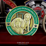
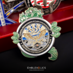
The coin is shaped like an arrow. The front is fully painted, with the institution’s logo embossed and etched lettering around it. The back has no paint at all, polished so the base metal shows through, carrying engraved lettering. It was made for FCI Pekin.
One Face Colored, One Face Bare
The strongest decision on this coin is the mismatch between its faces, and it is a technique worth copying.
Each face gets the treatment its content needs. A logo wants color, because an institution’s colors are part of how it is recognized. A block of text wants bare metal, because color boundaries compete with engraved line work and the text has to be read rather than looked at.
The contrast is the point. Turning the coin over moves you from a bright graphic face to a quiet reflective one. That shift is more interesting than two faces in the same register, and it signals that the two sides are doing different jobs.
It also keeps the cost sensible. Full coverage on one face rather than two roughly halves the enamel work, and the saving goes into the polish and the engraving depth on the other side.
The one thing to get right is the polish. A bare face relies entirely on the contrast between polished metal and recessed engraving, so the recesses have to be cut deeper than they would be under a paint fill. Shallow engraving on a polished surface washes out under reflected light. See finish and engraving options and a bare metal challenge coin for the fully unpainted approach.
The Arrow as an Outline
An arrow is an effective custom shape and a straightforward one to produce, which is an unusual combination.
It has direction. Unlike a circle, an arrow points, which gives the design an obvious axis to build along and a clear top and bottom. Text and devices arrange themselves naturally along the shaft.
The head is broad. An arrowhead is a wide triangle, which means the widest part of the shape is also a usable field. Compare a star, where the points are the widest part and cannot carry anything.
And the point is the only fragility concern. A single tip, rather than five or eight, which is far fewer places to bend. Rounding it very slightly handles the problem.
The constraint is the shaft. A narrow run of metal between the head and the nock is not a usable artwork area, so the design has to accept that most of the content sits in the head. On this coin that is where the logo and the lettering go. See custom shaped challenge coins.
Putting a Passage of Text on the Reverse
The back of this coin carries engraved lettering drawn from a poem, which is a common request for law enforcement and corrections coins and has two separate considerations.
The first is technical. A passage of text is governed by letter height rather than word count, so the right order is to fix the smallest workable letter height and then see how many words fit. Lines need generous spacing, because relief casts shadow in both directions and tightly set small type visually merges. And engraved beats embossed for anything dense, since a recessed line sits in a protected channel and keeps its edges.
The second is permissions, and it matters more. Check the authorship before you order. Some of the passages that circulate in corrections, police and military settings are old and in the public domain. Others have a named, living author and are still protected. The poem excerpted on this coin has a known author. For anything written in the last century, confirm your right to reproduce it, and get that in writing if the coin is being sold rather than given.
We produce from the text a customer supplies and we do not verify permissions on a customer’s behalf. If the rights are unclear, the usual solutions are to use the institution’s own motto instead, or to shorten to a phrase rather than a passage.
See also an engraved text challenge coin.
Coins in Federal Corrections
A federal correctional institution is a good coin client for reasons that are specific to the work.
The staff is a fixed, known group. Correctional officers work the same facility with the same colleagues over years, which is the condition under which a coin carries meaning.
The work is not publicly visible. Corrections rarely produces a ceremony or a citation, and almost never a photograph. A coin is one of the few available forms of recognition.
Specialized teams exist within it. Emergency response teams, canine units, transport details and training staff all have their own identity inside the institution, and each is a plausible coin at a smaller scale than the facility.
And it is an institution rather than a unit. Which means a facility coin can be issued continuously rather than tied to an event, so the design should carry nothing that dates.
See also a correctional officer challenge coin and a tactical challenge coin.
About the Institution
FCI Pekin is a federal correctional institution operated by the Federal Bureau of Prisons.
Order a Coin for Your Facility
Professional artwork is free with unlimited revisions, and nothing goes into production until you approve a digital proof. The challenge coin minimum is 50 pieces, standard production runs about 45 to 50 days after final artwork approval, rush production is available on many projects, and shipping within the continental United States is included. Embleholics is veteran-owned, SDVOSB and registered in SAM.gov.
Two things worth settling before artwork. If you want text on the coin, confirm who wrote it and whether you have the right to reproduce it, since a named living author’s work is likely still protected and that is a question to answer before a die is cut rather than after. And decide the paint coverage per face rather than for the coin as a whole, because a colored logo face and a bare engraved text face is often a better pairing than treating both sides the same. Request a free quote to begin.
Frequently Asked Questions
What is a federal prison challenge coin?
It is a coin made for a federal correctional institution or a team within one. Corrections work is rarely publicly visible and seldom produces a ceremony, which makes a coin one of the few available forms of recognition.
Can one face of a coin be colored and the other bare?
Yes, and it is often the better choice. A logo wants color because an institution’s colors are part of how it is recognized, while a block of text wants bare metal, since color boundaries compete with engraved line work.
Does a bare face need different engraving?
Yes, cut deeper. A bare face relies entirely on the contrast between polished metal and recessed line work, so shallow engraving washes out under reflected light where a paint fill would have carried it.
Can a coin be shaped like an arrow?
Yes, and it is one of the easier custom shapes. An arrow has direction, which gives the design a clear axis, the arrowhead is a broad usable field, and there is only one point to worry about rather than five or eight.
Where does the artwork go on an arrow shaped coin?
Almost entirely in the head. The shaft is a narrow run of metal that cannot carry readable content, so the design has to accept that the broad triangle is the working area.
Can we put a poem on a challenge coin?
Technically yes, but check the authorship first. Some passages circulating in corrections and law enforcement are in the public domain; others have a named living author and are still protected. Confirm your right to reproduce it before ordering.
What if the rights to a passage are unclear?
Use your institution’s own motto instead, or shorten to a phrase rather than a passage. Either avoids the question entirely, and a short phrase is easier to set at a readable size anyway.
How much text fits on a coin face?
It is governed by letter height rather than word count, so fix the smallest workable height first and then see how many words fit. Lines need generous spacing, because relief casts shadow in both directions and tightly set small type merges visually.
More Law Enforcement Challenge Coins Projects