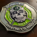
The crew wanted something out of the box that still read as a fire service piece, so the base shape is a Maltese Cross and the number 17 appears on both faces. On the front it sits on the forehead of an embossed skull carved with small tribal patterns. On the reverse it stands alone with lettering as accents on each arm.
Making a Number the Design
A station number looks like the least promising element you could build a coin around. It is the strongest one available to a fire crew, and it is underused.
It is the identity. Firefighters do not say they work for the department, they say they are at a station. The number is what crews call themselves, what other crews call them and what goes on the apparatus. It carries more meaning inside the service than a department crest does.
It is the one element nobody else can use. Every department in the country has a Maltese Cross and an axe. Only one crew is 17, and that specificity is what makes a coin worth keeping. For more on fire coin content, see What to Put on a Fire Department Challenge Coin.
And numerals reproduce perfectly. This is the practical argument. A number is bold, closed, high contrast and instantly legible at any size. There is no fine detail to lose, no internal elements to simplify and nothing that softens under the strike. It is close to the ideal coin subject.
Which means it can be large. The instinct is to tuck a station number into a corner as a label. The better move is to make it the biggest thing on the face, as this coin does on its reverse, and let everything else support it.
See more firefighter challenge coins.
A Number Repeated Across Both Faces
The 17 appears twice, once worked into the skull and once standing alone. Repeating an element across both faces is unusual and it works here for a reason.
Most two-sided coins divide the labor: identity on one face, something else on the other. When the identity is a single character, that division wastes it. Carrying the number through both faces means whichever way the coin lands, the crew’s identity is facing up.
It also lets the two faces take different registers with the same content. The front is illustrative, with the number integrated into artwork. The reverse is plain, with the number as a bare graphic. One face to look at, one face to read, built from the same element.
Tribal Carving on a Sculpted Device
The skull is embossed and carved with small tribal patterns, which is the part of this coin that required the most care.
Surface patterning on a sculpted element is a conflict waiting to happen. The sculpting works by light falling across curved forms and casting shadow; a fine pattern cut into those same surfaces creates a second set of shadows that can read as texture or noise rather than as decoration.
Three things keep it under control:
Cut the pattern shallower than the sculpting. The relief has to stay dominant. A pattern at the same depth competes with the form it is sitting on.
Keep the pattern off the high points. The brow and cheekbones are where light lands and where the form is read. Patterning works better in the flatter areas between them.
And keep the pattern elements large relative to the face. Fine tribal line work at coin size turns into a gray haze. Fewer, bolder strokes read as carving.
Lettering on the Arms of a Cross
The reverse puts lettering on each arm of the cross as accents around the central number, which is a good use of the shape.
A Maltese Cross gives you four arms radiating from a broad center. That is four short text zones, each with a flat run to set type on, arranged symmetrically. Compare a round coin, where text has to curve around a rim and distorts as it goes.
The constraint is that each arm is short, so this suits a few words per arm rather than a sentence. A station name, a crew name, a district, a founding year: four short items, one per arm, is the pattern that works. See custom shaped challenge coins.
About the Station and the District
The Boise Fire Department is the largest fire department in Idaho, providing fire suppression within Boise and contract services to Garden City and Hidden Springs. It serves the Whitney fire district through Station 17 in the Indian Lakes neighborhood.
Whitney’s first fire trucks were Ford trucks with water tanks welded onto the back, and before dispatch systems improved, cab drivers would radio information to a dispatcher who then telephoned the fire department.
That history is where the crew nickname comes from, and it is worth noting as a design lesson: a crew’s own name for itself, drawn from its own history, is better material than anything a designer could invent. See also a bulldog challenge coin and a fire district challenge coin.
Order a Coin for Your Station
Professional artwork is free with unlimited revisions, and nothing goes into production until you approve a digital proof. The challenge coin minimum is 50 pieces, standard production runs about 45 to 50 days after final artwork approval, rush production is available on many projects, and shipping within the continental United States is included. Embleholics is veteran-owned, SDVOSB and registered in SAM.gov.
Two suggestions. Put your station number front and center rather than treating it as a label, because it is the most legible element available and the one nobody else can use. And send us the crew nickname and where it came from; a name drawn from the station’s own history gives a coin something no stock design has. Request a free quote to begin.
Frequently Asked Questions
What is a station number challenge coin?
It is a coin built around a fire station’s number rather than around a department crest. The number is what crews call themselves and what goes on the apparatus, so it carries more meaning inside the service than a department-wide device.
Why does a number work so well on a coin?
Because numerals are bold, closed and high contrast, with no fine detail to lose and nothing that softens under the strike. A number is close to the ideal coin subject, which is why it can be made the largest element on the face.
Should the station number be large or small?
Large. The instinct is to tuck it into a corner as a label, but it is the most legible element you have and the one that identifies the crew, so it works better as the dominant element with everything else supporting it.
Can the same element appear on both faces?
Yes, and when the identity is a single character it is a good idea. Carrying it through both faces means the crew’s identity is facing up whichever way the coin lands, and each face can treat it differently.
Can a sculpted device also carry a surface pattern?
Yes, with care. Cut the pattern shallower than the sculpting so the relief stays dominant, keep it off the high points where the form is read, and use fewer, bolder strokes, since fine line work at coin size turns into a gray haze.
Why keep patterning off the high points?
Because the brow, cheekbones and other raised areas are where light lands and where the eye reads the three dimensional form. Patterning there creates a second set of shadows competing with the sculpting.
How much text fits on the arms of a Maltese Cross?
A few words per arm. The cross gives you four short text zones with flat runs to set type on, arranged symmetrically, which is better than curving text around a rim, but each arm is short so four brief items is the practical limit.
What should we send besides our logo?
Your crew nickname and where it came from. A name drawn from the station’s own history gives the coin something no stock design has, and it is usually the element that makes people keep the piece.
More Firefighters Projects