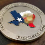
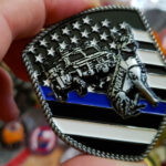
A custom challenge coin should feel connected to a particular group, achievement, or person. Yet even with the right intentions, certain design choices can make the finished coin look like it could belong to anyone. Avoiding these common challenge coin design mistakes will help you create something personal, recognizable, and worth carrying.
1. Starting With Decoration Instead of a Story
A coin can include an impressive eagle or star and still say very little about the people receiving it. Before choosing visual elements, define what the coin is meant to represent.
Is it commemorating an anniversary or strengthening a unit identity?
Once the purpose is clear, the design can grow from details that belong to that story. A location, motto, or date will often create a stronger connection than a collection of familiar symbols.
Traditional imagery is not the problem. A bald eagle may be exactly right for a military, government, or patriotic coin. It becomes generic when it is selected automatically rather than because it contributes something meaningful to the story you want to tell.
The Gold Star Families of Washington challenge coin shows how a familiar symbol can carry a specific meaning. The gold star represents families who have lost a loved one in military service and connects the coin to a century-old tradition of remembrance. Because the symbol belongs to the organization’s purpose, the design feels personal rather than generic.
Gold Star Families of Washington Challenge Coin


2. Trying to Include Every Idea
One of the most common visual mistakes is treating the coin like a miniature poster where multiple things are all placed together because every element feels important.
The result is usually a design without a clear focal point.
A stronger coin establishes a visual hierarchy. One image should attract attention first, while the remaining elements provide context. If the unit insignia is the most important feature, allow it to dominate the composition. If the coin commemorates a location or operation, build the design around the symbol that best communicates that story.
Remember that a coin is viewed at a much smaller scale than the artwork on a computer screen. Leaving space around important elements improves readability and gives the metalwork, enamel, and texture room to make an impact.
3. Using Symbols That Could Belong to Anyone
Certain images appear frequently on challenge coins because they communicate familiar qualities. Lions suggest courage. Eagles convey strength and national identity. Swords can represent readiness or service. These symbols need specific context to avoid being generic.
Ask why that particular symbol belongs on your coin and how it can be made specific to your group. Could a generic building silhouette be replaced with an actual headquarters?
The NAVSUP Fleet Logistics Center Puget Sound coin demonstrates how familiar naval imagery can still feel distinctive. Its rope-pattern rim, trident, restrained blue accents, and dark brushed-brass finish work together to represent both its naval identity and the character requested for the project. The symbols are recognizable, but their treatment is specific to the organization.
NAVSUP Fleet Logistics Center Puget Sound Challenge Coin
4. Treating the Logo as the Entire Design
Your logo may need to appear prominently, but placing it in the center of both sides does not always take full advantage of a custom coin.
Consider allowing one side to establish official identity while the other tells a deeper story. The reverse could carry a message understood by the recipients.
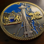
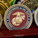
The U.S. Marine Corps Acquisition Security challenge coin shows how a logo can anchor the design without becoming the entire design. One side presents the official emblem in a traditional Marine Corps style. The other places the unit logo against an illustrated battlefield, giving the coin more context and a distinct visual character.
A clean logo presentation can be powerful when the opposite side provides narrative or visual contrast. The two sides should feel connected, but they do not have to perform the same function.
U.S. Marine Corps Acquisition Security Challenge Coin

5. Choosing Colors Without Considering the Metal
A challenge coin is not a printed graphic. Enamel colors are affected by the surrounding metal and the depth of the design. A palette that works on a website or uniform patch may need to be adjusted when translated into metal.
Too many competing colors can make the composition feel fragmented, while colors with similar values may cause separate details to blend together. Covering most of the surface with bright enamel can also prevent the metalwork from contributing to the design.
Instead of limiting the palette without reason, decide what each color should accomplish. Every color should have a purpose within the composition. It may help establish the setting or bring attention to the central image, but it should also work with the organization’s identity. Exposed metal can then create contrast and connect the composition. When an exact brand color matters, provide a reliable color reference rather than relying on a screenshot.
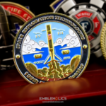
The SpaceX SN1100 challenge coin shows how several enamel colors can work together when the metal remains part of the design. Blue establishes the sky, while white clouds frame the central rocket. The polished gold-colored metal outlines the imagery and brings attention to the launch scene. Instead of competing with the enamel, the metal gives the coin the classic, vintage character requested for the project.
SpaceX SN1100 Challenge Coin

6. Ignoring Depth, Texture, and Finish
Even detailed artwork can feel flat when every section receives the same visual treatment. Changing the surface treatment can separate important elements without making the design busier.
The right treatment depends on the subject. Three-dimensional relief can bring depth to a portrait or monument, while an antique finish may strengthen a historical design. For a formal or ceremonial coin, polished metal can create a cleaner appearance. Textured backgrounds can also draw attention toward the central emblem.
These features should never be added simply because they are available. Each one should support the coin’s identity and direct the viewer’s attention. When every detail is emphasized, nothing truly stands out.
7. Defaulting to a Round Shape Without Considering the Concept
There is nothing wrong with a traditional round challenge coin. The shape is often the best choice. However, using it automatically can mean overlooking an opportunity to make the design more closely reflect its subject.
A custom shape can make a coin more distinctive when it reflects the group or its story. For example, the outline could follow a shield, badge, state, or meaningful piece of equipment. Cutouts and unusual edges can serve the same purpose, but only when they have a clear connection to the design.
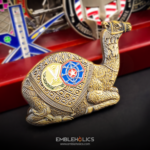
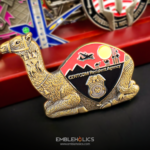
The CENTCOM Resident Agency camel challenge coin shows how shape can become part of the story. Its sitting-camel silhouette connects the coin to CENTCOM’s operations in the Middle East, while the engraved insignias preserve the agency’s identity. The result is unusual, but every choice has a clear purpose.
Before selecting a custom shape, consider how the coin will be carried and displayed. A unique outline should strengthen the idea without creating fragile extensions or making the coin uncomfortable to handle.
CENTCOM Resident Agency Camel Challenge Coin
8. Making Text Too Small or Too Long
Too much text can quickly overwhelm a coin. Lettering that looks readable in enlarged artwork may become difficult to distinguish once the design is produced at its actual size.
Focus on the message recipients need to notice first. Longer information can often be shortened or divided between the two sides of the coin. Text also needs enough open space around it, since detailed backgrounds can make even simple lettering difficult to read. Choose a clear font with enough weight to remain visible during production.
Review the artwork at approximately the coin’s finished dimensions before approving it. If you need to zoom in to read an important message, the text should probably be enlarged or simplified.
9. Overlooking the Planning Behind the Design
A strong coin begins with a clear purpose. Before the design process starts, explain who the coin is for and what it should represent. Share any required elements, along with references that can help the designer understand your idea.
Discuss the budget and deadline early so the design can be developed around realistic options. Before approving the artwork, check all details for accuracy and ask one or two people familiar with the organization to review it. Too many opinions can weaken the original concept.
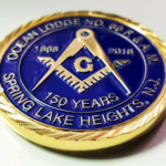
The Masonic challenge coin shows how clear direction can guide the design process. The customer chose a traditional round shape with a diamond-cut edge, then paired gold-colored plating with blue and white enamel. The required Masonic imagery was reproduced carefully so the finished coin remained accurate to the organization it represents.
Masonic Challenge Coin
Create a Coin That Could Only Belong to Your Group
The most memorable custom coins are not necessarily the busiest or most unusual. They are the ones in which every important choice feels connected to the people and story behind the design.
Embleholics works with customers to translate meaningful ideas into distinctive custom coins. Whether you have complete artwork or only the beginning of a concept, request a free quote and start creating a coin your recipients will immediately recognize as their own.
Recent Posts