This Army engineer challenge coin is cut to a crest rather than struck as a disc, with a shield at the centre and ribbons above and below it. It uses one color and one only, red, and the reason it uses red is not a design decision at all.
Branch Colors Are Prescribed, Not Chosen
Here is the thing that makes this coin worth looking at. When a unit says it wants one color and that color has to be a particular red, it is not expressing a preference. It is quoting a regulation.
Every Army branch has its own prescribed colors, and they appear on insignia, on cords, on piping and on flags. For the Corps of Engineers the branch color is scarlet, paired with white. It is not approximately red. It is a specific red that the branch has used for a very long time, and the people receiving the coin will know whether it is right.
That changes the job. On most coins the palette is something to agree. On a branch coin it is something to match, which means the color is specified from the insignia rather than picked from a chart, and the proof gets checked against the real thing rather than against whether it looks pleasant.
It also makes a single-color coin a confident choice rather than a thin one. One prescribed color on bare metal says the branch outright. Four colors chosen for effect would say less.
Why One Color Works Better Than Four
A coin with one color and one metal has nowhere to hide, and that is usually an argument against it. Here it is an argument for.
The single color becomes the emphasis. With everything else in relief on bare metal, the one red element is the brightest thing on the coin and the eye goes straight to it. Add a second and a third color and the red stops meaning anything in particular.
Engraving carries the rest. A cut line in metal has its own contrast and needs no color to be legible, which is why the insignia and the inscriptions on this coin work unpainted. Filling fine engraving with color tends to soften exactly the detail that makes it read.
And it ages better. Paint is a surface layer and it is the first thing to chip. A coin that relies on relief and one small painted area has far less to lose.
See antique and polished finishes for how the surface under the relief changes how much work the color has to do.
A Crest Is a Shield Plus Its Problems
A shield on its own is one of the best shapes in this trade: a hard outline, a broad flat interior, and straight or gently curved edges that lettering sits against naturally. That is why devices have been put on shields for centuries.
A crest adds the ribbons, and the ribbons are where the difficulty is.
Ribbons are thin and they project. A ribbon sweeping out past the body of the shield is the outermost metal on the piece, and it is narrow. That combination is the classic failure point: it bends first and it bends in the same place every time. The fix is to thicken the ribbon, shorten its sweep, or curl the ends back toward the shield so the metal stays continuous.
Ribbons carry text in a narrow band. Which means short text. Two or three words per ribbon, set along the curve, and there is a hard floor on letter height below which struck lettering closes up. The fix for too many words is fewer words, not smaller type.
The interior is the only generous area. On a crest, the shield is where anything substantial has to go. The ribbons are for naming, not for artwork.
For shape work generally, see custom shaped challenge coins.
Insignia on One Face, Words on the Other
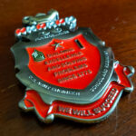
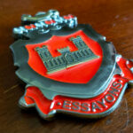
The front carries the branch insignia engraved, and the reverse carries inscriptions. That split is the right way round and it is worth saying why.
An insignia is fixed artwork. It is reproduced rather than designed, so it needs a full clean face and no competition. Setting lettering around it on the same side would mean shrinking the insignia to make room, and the insignia is the part with a correct answer.
Inscriptions want an empty field. Text reads best with nothing behind it, which is exactly what the second face provides. It also means the words can be sized to be read rather than squeezed.
The Engineer branch insignia is the castle, a device the branch has carried since the nineteenth century, and like any official insignia it should come to us as source artwork rather than as a photograph of a patch or a crest.
Engineer Units and Their Coins
Army engineers cover a very wide range of work, which is part of why the branch identity matters so much on a coin. A combat engineer company, a construction unit, a district of the Corps of Engineers and an engineer officer in a headquarters have little in common day to day, and the castle and the branch color are what they share.
That is an argument for building an engineer coin on the branch rather than on the job. A coin built on the branch is still right when somebody changes assignment. A coin built on one project is not.
See also an engineer company coin, a Corps of Engineers coin, and a civil engineering coin for the same discipline outside the Army.
Order an Engineer Coin
Free professional artwork, unlimited revisions and a digital proof before anything is produced. Free shipping within the continental US, a 50-coin minimum, and most orders complete 45 to 50 days after artwork approval, with rush production available. Embleholics is veteran-owned, an SDVOSB, and registered in SAM.gov.
Two things worth sending with a quote request. The insignia as source artwork, and the branch color reference if you have it, because on a coin like this the color is matched rather than chosen.
See more Army challenge coins.
Finished Coin (Front)
Finished Coin (Back)
Frequently Asked Questions
What is an Army engineer challenge coin?
An Army engineer challenge coin is made for engineer soldiers, units or officers and is usually built on the branch identity rather than on a particular job. That generally means the branch insignia, the castle, and the branch color, which is scarlet paired with white.
What is the Army Engineer branch color?
The Corps of Engineers branch color is scarlet, paired with white. Army branch colors are prescribed rather than chosen, which is why a coin using one needs the color matched to the insignia instead of selected from a chart.
Can a challenge coin use only one color?
Yes, and on a branch coin it is often the stronger choice. One prescribed color against bare metal becomes the emphasis on the whole piece, where several colors chosen for effect would leave none of them meaning anything in particular.
What shape is a crest coin?
A crest coin is cut to a heraldic outline: a shield at the centre with ribbons above, below or both. The shield gives a hard edge and a broad flat interior for artwork, and the ribbons carry short text.
Where does a crest-shaped coin break?
At the ribbons. A ribbon is the thinnest metal on the piece and it projects past the body of the shield, so it bends before anything else does. Thickening it, shortening its sweep or curling the ends back toward the shield keeps the metal continuous.
How much text fits on a ribbon?
Two or three words per ribbon. A ribbon is a narrow curved band and struck lettering has a minimum height below which it closes up, so the only way to fit more words is to use a larger piece rather than smaller type.
Should the insignia and the lettering go on the same side?
Usually not. An insignia is fixed artwork that should be reproduced exactly and given a clean face, and setting text around it means shrinking it to make room. Putting the inscriptions on the reverse lets both be sized properly.
Does engraving need to be filled with color?
No. A cut line in metal has its own contrast and reads without any color at all, which is why fine engraving is often left unfilled. Filling it tends to soften the detail that makes it legible in the first place.
What is the Army Engineer insignia?
The Engineer branch insignia is the castle, a device the branch has carried since the nineteenth century. Like any official insignia it should be reproduced from source artwork rather than redrawn from a photograph of a patch.
More Army Projects