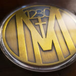
The brief was unsophisticated and minimalist, and the result is a single color piece: gold throughout, with a brushed effect across the metal that supplies texture and depth where color would normally do the work. The front carries the client’s logo and the words of Mark 12:30. This Christian challenge coin shows how far one metal and one finish can carry a design.
Coins in Churches and Ministries
Faith organizations have taken up the coin tradition steadily, and the reasons are closer to the original practice than most commercial uses are.
A coin is given, not sold. The whole tradition rests on presentation, which fits a context where the gesture matters more than the object and where selling merchandise can sit awkwardly.
It marks a passage. Baptism, confirmation, completing a program, a mission trip, a period of service. Congregations are full of moments that deserve something to mark them and usually get a certificate.
It carries without announcing. A coin in a pocket is private in a way a bracelet or a bumper sticker is not, which suits people who want a reminder rather than a statement.
And a verse is a natural inscription. Most organizations struggle to find words for the back of a coin. A faith organization has a text that already means something specific to the people receiving it. For another church coin, built on scripture references, see our Fishers of Men Coin.
See more custom organization challenge coins.
Putting Scripture on a Coin
A verse reference is one of the strongest things that can go on a coin, and there are a few practical points worth knowing.
The citation often beats the text. A book, chapter and verse is four or five characters and can be set large and clean. The full passage at readable size usually will not fit, and a verse squeezed into tiny type is worse than a reference set properly.
A reference invites the reader to look it up. Someone who reads the full text on the coin is done. Someone who reads a citation has to go and find it, which is more engagement rather than less.
If the text is used, the translation has to be chosen. Wording differs between translations, and the people receiving the coin will know their own. That is a decision for the organization rather than for the designer.
And a short passage is better than a long one. Mark 12:30 is about loving God with heart, soul, mind and strength, and even that is near the practical limit for a coin face. Anything longer wants to be a reference instead.
The typography point: scripture is usually best set in a serif face. It reads as text rather than as branding, which is the right register, and serifs suit the subject in a way a technical sans serif does not.
One Color, One Finish
A monochromatic coin is the hardest brief to execute and often the most elegant result, which is why a minimalist request should not be read as an easy one.
Everything depends on surface. With no color to separate elements, the only tools are relief depth and finish variation. The design has to be built around that from the first sketch rather than having color removed later.
Brushing is what rescues a single metal. A plain polished gold coin is a flat bright disc that bounces light and hides its own detail. Brushing scatters that light, so the texture becomes visible and the engraving reads from any angle.
Gold without color reads as formal rather than celebratory. Bright gold with enamel says award. Brushed gold on its own says something quieter and more serious, which matches what this coin is for.
And there is nowhere to hide. A monochromatic piece exposes every imperfection in the strike, because no color is covering anything. The finish quality is the product.
See antique vs polished finishes and whether a gold challenge coin is real gold.
When Minimalist Is the Right Brief
Clients ask for simple more often than they mean it, so it is worth saying what simple actually requires.
It means deciding what the single most important element is and giving it the space. It means leaving the rim plain, the field open and the color count at one. It means resisting the additions that arrive during revisions, each of which is individually reasonable: a date, a website, a second verse, a border.
The test is whether anything can be removed without losing the point. If a coin passes that, it is finished. Most coins fail it, and the reason is not bad design but accumulation across rounds of review.
The one thing a minimal coin cannot be is carelessly made. Simplicity and cheapness look alike in a photograph and nothing alike in the hand, and the difference is entirely in the strike and the finish.
Order a Church or Ministry Coin
Professional artwork is free with unlimited revisions, and nothing goes into production until you approve a digital proof. The challenge coin minimum is 50 pieces, standard production runs about 45 to 50 days after final artwork approval, rush production is available on many projects, and shipping within the continental United States is included. Embleholics is veteran-owned, SDVOSB and registered in SAM.gov.
Two suggestions. If a verse appears, consider the reference rather than the full text, since a citation can be set large and clean while a passage at readable size usually will not fit. And if the design is monochromatic, ask for a brushed rather than polished finish, because a single bright metal reflects light across its own detail and flattens it. Request a free quote to begin.
Frequently Asked Questions
What is a Christian challenge coin?
A coin made for a church, ministry or faith based organization, usually given to mark a passage such as baptism, confirmation, a mission trip or completing a program.
Why do churches use coins?
Because a coin is given rather than sold, which suits a context where the gesture matters more than the object, and because a coin carries privately rather than announcing itself the way a visible item would.
Should a coin carry a verse or just the reference?
Usually the reference. A book, chapter and verse can be set large and clean, while a full passage at readable size rarely fits, and a citation invites the reader to go and look it up.
What if the full text is used?
Choose the translation deliberately, because wording differs and recipients will know their own. Keep the passage short, since even a single verse is close to the practical limit for a coin face.
What typeface suits scripture on a coin?
A serif face. It reads as text rather than as branding, which is the right register, where a technical sans serif reads as corporate.
Why is a single color coin difficult?
Because relief depth and finish are the only tools available. The design has to be built for that from the start, and every imperfection in the strike is visible with no color covering it.
Why brush a gold coin rather than polish it?
A polished gold coin is a bright flat disc that reflects light across its own detail. Brushing scatters the light so the texture is visible and engraving reads from any angle.
How do you keep a minimalist design minimal?
Test whether anything can be removed without losing the point. Most coins fail that test not through bad design but through accumulation, as reasonable additions arrive across rounds of review.
More Corporate Projects