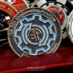
Double sided, with the organization’s logo on the front and an ocean map on the back. The finish is glossy, the palette is ocean blue and white with red as an accent, and the lettering uses a contemporary face. The design is understated on purpose, representing the mission and the technology without pushing either forward. This Global Fishing Watch coin was made for the organization that publishes data on human activity at sea.
Coins for Nonprofits and Research Organizations
A nonprofit is an unusual coin client, and the brief differs from a corporate or military one in ways worth setting out.
The coin cannot look expensive. An organization funded by donors and grants has to be careful about anything that reads as spending on itself. Restraint is a requirement rather than an aesthetic preference, which is exactly what understated means here.
The audience is partners, not employees. Research organizations work through collaborations with agencies, governments and other nonprofits. A coin from one goes mostly to people outside it, which means it has to explain the organization rather than celebrate it.
The mission is the subject. A company puts its logo on a coin and that is enough. A nonprofit is defined by what it is trying to achieve, so the design has to carry an idea rather than a brand.
And the staff are often dispersed. A distributed, partly remote organization has fewer shared objects than a team in one building, which makes a physical token do more work.
See more custom organization challenge coins.
Global Fishing Watch
Global Fishing Watch launched in September 2016, founded by Google in partnership with Oceana and SkyTruth. It publishes information about human activity at sea to support fair and sustainable use of the ocean.
The work is a good example of a mission with no obvious picture. The organization tracks vessel activity across the world’s oceans using satellite data and machine learning, and makes the results publicly available. There is no building, no vehicle and no uniform. The output is a map.
Which is why an ocean map on the reverse is the right answer rather than a default one. It is literally what the organization produces, it is instantly readable, and it shows scope without listing anything. For an organization whose product is data about a global commons, a map is not decoration.
The understatement also fits the subject. Monitoring and transparency work succeeds by being credible rather than loud, and a restrained coin matches that posture better than a bold one would.
Ocean Blue, White and a Red Accent
Three colors with one of them used sparingly is a disciplined palette, and the structure is worth copying.
Two colors carry the design. Blue and white do nearly all the work, which keeps the coin coherent and unmistakably about the sea.
The third is an accent, not an equal. Red appears in small quantity, which is what makes it function. A third color used at the same weight as the other two produces a design with no hierarchy.
Red against blue is the strongest contrast available. They sit opposite each other in warmth, so a small amount of red on a blue field draws the eye further than a larger amount of any analogous color would.
And gloss suits the subject. A glossy finish reads as wet, which is an association worth having on an ocean themed piece, and it makes blue read deeper than a matte fill does.
The caution on large glossy fills is that they show every imperfection. A flat expanse of blue has no pattern to hide an uneven fill or a small contamination, so the finishing quality has to be right rather than close.
See enamel and finish options.
Putting a World Map on a Coin
A global map is one of the most effective reverses available and it has two specific pitfalls.
The first is borders. Any map on a coin invites inspection, and national boundaries in contested regions have no neutral rendering. For an organization working with governments across the world, that is a real consideration rather than a theoretical one. Showing landmasses and coastlines without internal borders avoids it completely.
The second is detail. Coastlines are fractal, with endless small inlets and islands that a die cannot hold. A world map has to be simplified to major landmass shapes, and the simplification should be deliberate rather than whatever survives the strike.
For an ocean organization specifically there is a useful inversion available. Most maps treat land as the subject and water as background. A coin for an ocean organization can reverse that, making the water the raised or colored element and the land the empty space, which says something about the organization’s priorities without a word of text.
Order a Nonprofit or Mission Coin
Professional artwork is free with unlimited revisions, and nothing goes into production until you approve a digital proof. The challenge coin minimum is 50 pieces, standard production runs about 45 to 50 days after final artwork approval, rush production is available on many projects, and shipping within the continental United States is included. Embleholics is veteran-owned, SDVOSB and registered in SAM.gov.
Two suggestions. If a map appears on the coin, leave national borders off, which sidesteps a question with no neutral answer and strikes far more cleanly. And if the palette includes an accent color, hold it to a small share of the face, because a third color used at equal weight removes the hierarchy that made it an accent. Request a free quote to begin.
Frequently Asked Questions
Why do nonprofits order challenge coins?
Because their audience is partners rather than employees, and a coin travels to agencies, governments and collaborating organizations. For a dispersed staff it is also one of the few shared physical objects.
How should a nonprofit coin look?
Restrained. An organization funded by donors has to be careful about anything that reads as spending on itself, so understatement is a requirement rather than a style preference.
What goes on a coin for an organization with no physical product?
What it actually produces. For a data organization that means the map or the output itself, which is readable and honest where a generic emblem would say nothing.
What is Global Fishing Watch?
An organization launched in September 2016 by Google with Oceana and SkyTruth, publishing information on human activity at sea to support fair and sustainable use of the ocean.
How many colors should a coin use?
Two carrying the design and a third as an accent at much smaller weight. A third color used at equal weight to the others removes the hierarchy that made it work.
Why does red work against blue?
They are opposite in warmth, so a small amount of red on a blue field draws the eye further than a much larger area of a closely related color would.
Should a map on a coin show national borders?
Usually not. Boundaries in contested regions have no neutral rendering, and border lines are among the finest detail a die can hold, so leaving them off helps twice.
How detailed can a world map be on a coin?
Major landmass shapes only. Coastlines are endlessly detailed and a die cannot hold inlets and small islands, so the simplification should be a design decision rather than an accident of the strike.
More Corporate Projects