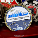
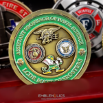
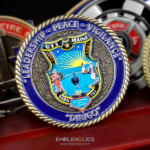
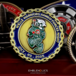
A coin for a very senior officer is a narrow brief. It has to be noticeably better than the standard command coin, because the recipient has a drawer full of those, and it has to stay formal, because the novelty options that work for a squadron would be wrong in this context. This one was made for a Navy commodore, and it solves the problem with a cutout: both faces match, with an opening through the centre that frames a triangle carrying the officer’s own symbols.
What a commodore actually is
Commodore is a title in the modern US Navy, not a rank. The rank of commodore was dropped in 1947, briefly revived in the early 1980s, and discontinued again in 1983. Today the title is held by a warfare-qualified captain, an O-6, in command of a squadron, an air wing or a special operations unit.
That means a commodore is not a flag officer, and it matters here because the distinction is one the audience lives with. The next grade up, O-7, is rear admiral lower half, and that is where flag rank begins. Getting this right on a coin’s inscription is the difference between a piece that reads as considered and one that reads as having been made by someone outside the Navy.
For the coin, the practical point is that a commodore holds a command title rather than a rank insignia. The coin should carry the command, the title and the officer’s own symbols, rather than reaching for a rank device that does not exist.
Distinctive without being a novelty
The usual ways to make a coin stand out are mostly unavailable at this level. A bottle opener, a mascot, a joke, a spinner, a figurative outline: all of these work beautifully for a mess or a squadron and sit badly on a piece a commodore will hand to a visiting foreign officer or a member of Congress.
What is left is structure and execution, which is where this design goes. A cutout is unusual enough to be noticed immediately but carries no tone of its own, so it reads as considered rather than playful. The techniques in this category are worth knowing:
- A cutout. Metal removed from the coin, so light passes through and the shape becomes part of the design. Formal, distinctive, and it costs die work rather than consumables.
- A non-round outline that is still geometric. An oval, a shield, an octagon. Clearly deliberate, never gimmicky.
- Two-tone plating. Gold relief on an antique silver field, or similar. Reads as quality and costs one extra operation.
- Weight and thickness. The least visible and most effective. A heavier, thicker coin registers in the hand before the recipient has looked at it.
- Edge treatment and packaging. A reeded or engraved edge and a proper presentation case. This is one of the rare cases where packaging earns its cost, because the coin will be presented rather than pocketed.
Matching faces and a framed centre
Making both sides the same is a deliberate and slightly unusual decision. Most coins treat the reverse as a second subject. Here the two faces mirror each other, which makes the coin symmetrical in the hand and means there is no wrong way to present it. For a piece that will be handed over formally, that is a genuine practical benefit: the giver does not have to orient it.
The cutout does the framing. Removing the centre and leaving a triangle inside it creates an inner field that is visually separated from the rest of the coin without needing a border, a color change or a relief step. Whatever sits in that space reads as the subject, because the eye goes to the opening first.
A cutout has structural requirements. Metal removed from the middle of a coin takes strength with it, so the remaining ring and any bridge across the opening need enough width to stay rigid. A thin ring around a large opening will flex. This is a case where the coin usually wants to be slightly thicker than standard, which suits the brief anyway.
Personal symbols on a senior officer’s coin
A coin at this level is often personal rather than organizational, and that is a decision to make consciously. An officer’s own symbols, whether drawn from their career, their warfare qualification, their commands or something of their own choosing, make the coin specific to them.
The trade-off is the familiar one. A coin carrying an individual’s symbols ends when their tour does and cannot be passed to a relief. For a commodore’s personal coin that is usually accepted and often the point. If the command wants a piece that survives the turnover, that is a separate design carrying the command rather than the person, and many officers run both.
Quantities are small and should be. A senior officer’s personal coin is for recognitions they make themselves and for exchange with counterparts, not for general distribution. Count conservatively against the length of the tour.
Ordering a coin for a senior officer
Tell us the title and command exactly, and whether the coin is the officer’s or the command’s. Those two answers settle the inscription and the quantity. If you want something distinctive, say so and let us bring you the formal options rather than the novelty ones, because the two lists barely overlap. You can see related work including the Rear Admiral coin and the Navy Captain coin, more Navy challenge coins, or send your details through the free quote form.
Frequently Asked Questions
Is commodore a rank in the US Navy?
No, it is a title. The rank of commodore was dropped in 1947, briefly revived in the early 1980s and discontinued again in 1983. Today the title is held by a warfare-qualified captain, pay grade O-6, commanding a squadron, air wing or special operations unit. A commodore is therefore not a flag officer; flag rank begins at O-7, rear admiral lower half.
How do you make a coin distinctive for a very senior officer?
Through structure and execution rather than novelty. Cutouts, geometric non-round outlines, two-tone plating, extra weight and thickness, edge treatment and proper presentation packaging all read as considered. Bottle openers, mascots, spinners and figurative shapes work well for a mess or a squadron and sit badly on a coin that will be handed to a foreign counterpart or a legislator.
What is a cutout coin?
A coin with metal removed from part of its body, so light passes through and the opening becomes part of the design. It is distinctive without carrying any particular tone, which makes it one of the few attention-getting techniques that stays formal. The cost is in die work rather than in per-coin consumables.
Does a cutout weaken the coin?
It can, so it has to be designed for. Removing metal from the middle takes strength with it, and the remaining ring and any bridge across the opening need enough width to stay rigid, or a thin ring around a large opening will flex. Cutout coins usually want to be slightly thicker than standard, which generally suits the brief anyway.
Why would both sides of a coin be the same?
Symmetry has a practical benefit on a coin that is presented formally: there is no wrong way round, so the giver does not have to orient it before handing it over. It also makes the coin feel resolved in the hand. Most coins treat the reverse as a second subject, so matching faces is unusual enough to be noticed.
Should a senior officer’s coin carry their personal symbols?
It can, and at this level many do. The trade-off is that a coin carrying an individual’s symbols ends with their tour and cannot be passed to a relief. That is usually accepted and often the intention. Where the command needs a piece that survives turnover, that is a separate design carrying the command rather than the person.
How many coins should a senior officer order?
Fewer than a command coin. A personal coin at this level is for recognitions the officer makes themselves and for exchange with counterparts, not for general distribution, so count conservatively against the length of the tour rather than against the size of the command.
More Navy Projects