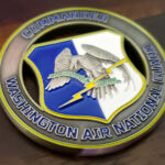
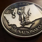
This coin is an award, given quarterly, which means it is one of a series rather than a one-off. A coin that will be handed to a different person every three months for years has to be designed differently from one made for a single occasion, and the restraint on this piece is the result.
An Award Coin Is a Template
The design has to work for every recipient, not for a particular one. That is the whole constraint and everything else follows from it.
Nothing on it can be specific to one person. No name, no date, no squadron within the wing. Whatever is on the coin has to be as true for the twelfth recipient as for the first.
It has to be reorderable. An award program runs for years, so the design is going to be struck again. That makes an undated design essential, and it makes it worth getting the artwork right once rather than tweaking it each time.
It should not be the most elaborate coin the wing owns. An award coin given four times a year sits alongside the commander’s coin, the unit coin and whatever else is in circulation. If the award piece is the loudest of them, the hierarchy is wrong.
And consistency beats novelty. The value of a quarterly award is that everyone who has one has the same one. Changing the design every year undercuts the thing the award is for.
That is why “classy, simple and spartan” was the right brief here rather than a modest one. For a different kind of recognition coin in the same service, see this recognition coin.
Painted on One Face, Bare on the Other
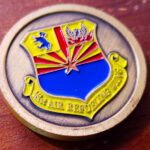
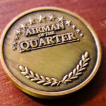
The design divides cleanly: the wing insignia painted in its own colors on one face, and the award lettering on the other surrounded by stars and leaves embossed without any color at all.
That split is a hierarchy and it is worth copying.
Color marks what is official. The wing insignia is a prescribed device with prescribed colors, and painting it is reproducing it. Everything that is ours to decide stays in bare metal.
Bare relief marks what is decoration. Stars and leaves are ornament. Embossed and unpainted they frame the lettering without competing with it. Painted, they would read as a second subject and the coin would have two centres.
And the lettering gets a quiet face. An award coin’s text is the point of it, and text reads best with nothing colored behind it.
The general rule, which holds across most of the coins in this gallery: paint the elements whose color carries information, and leave the rest as metal. Here that produces exactly one painted element on the whole piece.
See plating options.
One Bold Line Instead of a Patterned Rim
The edge carries a single solid line and nothing else, and that is a deliberate choice rather than an absence.
A plain rim with one strong line does two things a patterned rim cannot. It contains the design without adding another texture, which matters when one face already carries painted artwork and the other carries ornament. And it reads as formal, because a single rule is what a certificate or a plaque has, where a rope or scroll edge reads as decorative.
The working rule across this gallery is one textured element per face. Here the wing wanted both faces quiet, so the rim stays quiet too.
Air Refueling as a Subject
This is a refueling wing, and refueling is an unusually difficult thing to put on a coin, which is probably why this design does not try.
The act itself needs two aircraft in formation with a boom between them, which means two silhouettes close together at a specific relative angle, plus a thin connecting element. At coin size the two aircraft merge, the boom falls below the width struck metal can hold, and the result reads as one confused shape.
If a refueling unit does want the mission on a coin, the options are: one aircraft alone, which is clean and says tanker without saying refueling; the boom and receptacle alone, close up, which is specific and recognizable to anyone in the community; or the mission shown symbolically rather than literally. What does not work is a faithful two-aircraft scene at coin diameter.
Choosing the insignia instead, as this coin does, is the safer answer and the right one for an award piece.
About the Wing
The 161st Air Refueling Wing is an Arizona Air National Guard wing based at Goldwater Air National Guard Base at Phoenix Sky Harbor, with an air refueling mission. When federalized it is gained by Air Mobility Command.
See also another Goldwater coin, an Air National Guard commander’s coin, and an Air Mobility Command coin.
See more National Guard challenge coins.
Order an Award Coin
Free professional artwork, unlimited revisions and a digital proof before anything is produced. Free shipping within the continental US, a 50-coin minimum, and most orders complete 45 to 50 days after artwork approval, with rush production available. Embleholics is veteran-owned, an SDVOSB, and registered in SAM.gov.
If the coin is for a recurring award, say so at the quote stage. We will keep the design undated and reorderable, and we will hold the artwork so the next run matches the first exactly.
Finished Coin (Front)
Finished Coin (Back)
Frequently Asked Questions
What is an air refueling challenge coin?
An air refueling challenge coin is made for a tanker wing, squadron or crew. Most are built on the unit insignia rather than on the mission, because the refueling act itself is difficult to render at coin size.
How is an award coin different from a unit coin?
An award coin is one of a series given repeatedly, so nothing on it can be specific to one recipient, and it has to be undated and reorderable. A unit coin is issued once to a defined group and can be far more specific.
Should an award coin carry the recipient’s name?
No, unless it is being engraved individually afterwards. A name on the struck design means a separate run for every recipient, and the point of a recurring award is that everyone who has one has the same one.
Should an award design change each year?
Better not. The value of a recurring award is consistency, so changing the design undercuts it. Keeping the same piece year after year is the right instinct even though it feels less interesting.
Where should color go on an award coin?
On the official elements only. Paint the insignia, whose colors are prescribed, and leave decorative relief such as stars and leaves in bare metal so they frame the lettering rather than competing with it.
Why have a plain rim with a single line?
Because it contains the design without adding another texture, and a single rule reads as formal in the way a certificate border does. A patterned rim would be a third element competing with two already busy faces.
Can air refueling be shown on a coin?
Not easily as a literal scene. Two aircraft in formation merge at coin size and the boom falls below the width struck metal can hold. One aircraft alone, or the boom and receptacle close up, both work better.
What is the 161st Air Refueling Wing?
It is an Arizona Air National Guard wing with an air refueling mission, based at Goldwater Air National Guard Base at Phoenix Sky Harbor, and gained by Air Mobility Command when federalized.
How many award coins should be ordered at once?
Enough for several cycles, since reordering an existing design costs less than a first run and the tooling already exists. For a quarterly award, a run covering two or three years is usually the sensible balance.
More Air National Guard Projects