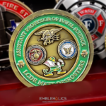
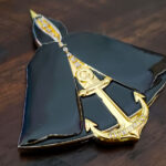
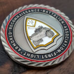
This coin was made for Marine Corps Base Camp Lejeune, the Marine installation at Jacksonville, North Carolina, established in 1942 and covering roughly 246 square miles. It is a shield-shaped coin finished in full color, with engraved insignia, patterning and lettering on both faces, and it is a good example of how far fine text can be pushed on a struck coin before it stops working.
How small can lettering actually go
This is the single most common design question we get, and the honest answer is that there is no fixed number. Minimum legible size depends on four things at once, and changing any of them moves the limit.
- Stroke weight, not point size. A bold sans-serif at a given height will survive where a light serif at the same height will not, because what fails is the thinnest part of each letter, not the letter overall. Choosing a heavier face buys you more than shrinking a lighter one costs.
- Depth of cut. Shallow fine lettering fills with plating and polishing compound and disappears. The same text cut deeper holds. This is why two coins with identical artwork can read completely differently.
- Finish. A bright polish rounds over the edges of small characters. An antique or satin finish preserves them, and antiquing actively helps by darkening the recesses so the letters have contrast to read against.
- What is around it. Small text on a plain field reads. The same text crowded against relief or sitting on a textured ground does not, because there is nothing for the eye to separate it from.
The practical approach is to test rather than guess. On this coin we confirmed the machinery could hold the small embossed patterning and the smallest carved letters before committing to the layout. That is the right order: establish what will survive, then design to it, rather than designing first and finding out at striking.
If text will not hold, there are three fixes and only one of them is shrinking it further. Increase the coin size, cut the wording, or move the text to a clearer part of the design. In practice cutting the wording improves most coins anyway.
A base is many places, not one
Camp Lejeune is not a single site. It includes a group of satellite facilities, among them Marine Corps Air Station New River, Camp Geiger, Stone Bay, Courthouse Bay, Camp Johnson and the Greater Sandy Run Training Area. Its first headquarters was in a cottage at Montford Point before moving to Hadnot Point in 1942.
That structure matters when ordering. A coin for the installation as a whole and a coin for one of its camps or schools are different pieces with different audiences. Before artwork starts, settle whether you are coining the base, a satellite facility, a school, or a tenant unit, because each has its own identity and the imagery follows from it.
Montford Point carries particular weight. It is where the first African American Marines trained, beginning in 1942, and the Montford Point Marines were collectively awarded the Congressional Gold Medal in 2012. If a design touches that history, it should be treated as a heritage subject and handled with the care that implies, with the wording checked by people who know it rather than approximated.
Why a shield suits an installation
A shield is the natural shape for a base coin. It reads as heraldic rather than commemorative, it has a broad top for an installation’s name, which tends to be long, and the tapering base gives a date or a motto somewhere to sit.
It also solves a layout problem that circles create. An installation coin usually has a lot of text, because the full name of a base is rarely short. A circle forces that text to curve around a rim, which reduces how much will fit and how large it can be. A shield lets the longest line run straight across the widest part.
Plan for the taper. The usable width narrows toward the bottom, so the longest text belongs at the top and whatever sits in the lower third should be short. A long unit title set across the base is the most common reason a shield coin looks cramped.
Full color on an installation coin
A base coin is one of the cases where full color earns its cost. Installation and tenant unit insignia are usually prescribed heraldry with specified colors, and reproducing them accurately is the point. This is different from a design where color is decorative and could be reduced.
The constraint is that color and fine text compete. Enamel fills recesses, and small lettering sitting next to or within a colored area loses the clean edge it needs. Keep the smallest text on bare metal, away from enamel, and the two can coexist on one face.
Ordering a base or installation coin
Tell us whether the coin is for the base, a satellite camp, a school or a tenant unit, and send the full official name. Those two things drive the layout more than anything else, because installation names are long and the shape has to accommodate them. If you want small lettering, say what it has to say and we will tell you honestly whether it will hold at the size you want before anything is struck. You can see more Marine Corps challenge coins we have produced, including the Marine battalion coin, or send your artwork through the free quote form.
Frequently Asked Questions
How small can lettering be on a challenge coin?
There is no single number, because the limit depends on stroke weight, depth of cut, finish and what surrounds the text. A bold sans-serif survives where a light serif at the same height fails, deeper cuts hold where shallow ones fill with plating, and an antique finish preserves small characters that a bright polish would round over. The reliable approach is to test what the machinery will hold and then design to it.
What do I do if my text will not fit legibly?
Increase the coin size, cut the wording, or move the text somewhere less crowded. Shrinking it further is the one option that does not work. In practice cutting the wording improves most designs anyway, since crowded text is usually a symptom of trying to say too much on one face.
Why is a shield shape good for a base coin?
Because installation names are long and a circle forces text to curve around a rim, which limits both how much fits and how large it can be. A shield gives a broad top where the longest line can run straight across, reads as heraldic rather than commemorative, and its tapering base frames a date or motto. Keep the lower third short, since the usable width narrows.
Should a base coin or a unit coin be ordered?
They are different pieces. A large installation like Camp Lejeune includes satellite facilities, schools and many tenant units, each with its own identity and audience. Settle which one the coin represents before artwork begins, because the imagery follows directly from that decision.
Can a coin have both full color and very small text?
Yes, with planning. Enamel fills recesses, so small lettering placed next to or within a colored area loses the clean edge it needs to read. Keeping the smallest text on bare metal, away from the enamel, lets both work on the same face. Full color is worth the cost on an installation coin because the insignia colors are prescribed rather than decorative.
What is Camp Lejeune?
Marine Corps Base Camp Lejeune is a Marine Corps installation at Jacksonville, North Carolina, established in 1942 and covering roughly 246 square miles. It includes several satellite facilities, among them Marine Corps Air Station New River, Camp Geiger, Stone Bay, Courthouse Bay, Camp Johnson and the Greater Sandy Run Training Area.
What is Montford Point?
Montford Point is where the first African American Marines trained, beginning in 1942, and it is also where Camp Lejeune’s first headquarters was located before moving to Hadnot Point. The Montford Point Marines were collectively awarded the Congressional Gold Medal in 2012. Any coin design touching that history should be treated as a heritage subject and its wording checked by people who know it.
More Marine Corps Projects