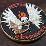
The front carries a winged skull holding a Viking battle axe in its jaw. The back carries the motto, peace through power, we are the arms of the fleet, alongside the ordnance community’s long standing acronym. Both faces use black backgrounds, the Viking pattern on the axe is etched and painted so it reads from a distance, and the edge is left clean with no pattern or paint. This Viking Ordnance challenge coin is bold by design.
Aviation Ordnance Culture
Aviation ordnancemen have one of the strongest trade identities in the Navy, and a coin from that community is working with unusually rich material.
The work is physical and hazardous. Ordnance handles the weapons: loading, arming and maintaining them on a flight deck, where the margin for error is zero. Trades with real physical risk tend to develop strong internal cultures, and this one has.
The motto is already written. We are the arms of the fleet is the community’s own phrase, as is the well known acronym that ordnancemen use among themselves. A coin that uses existing language lands differently from one carrying something invented for the occasion.
The humor is part of the identity. Ordnance culture is famously blunt, and a coin that sanded that off would read as inauthentic to the people receiving it. The acronym on the reverse belongs there.
And the imagery runs dark deliberately. Skulls, axes and aggressive iconography are the community’s established visual language rather than a design choice made in isolation.
See also Navy challenge coins and military challenge coins.
Combining a Skull With a Norse Theme
A winged skull holding an axe is three ideas in one image, and the combination holds together for a specific reason.
Wings signal aviation. The skull signals the hazardous edge of the work. The Viking axe supplies the unit name. Each element is doing a separate job, which is what keeps a busy image from being merely busy, and it is the test worth applying to any composite design: if an element can be removed without losing information, it was decoration.
Composition is the difficulty. Three strong elements competing on one face needs a clear reading order, and this design solves it by physically connecting them. The skull holds the axe in its jaw, so the two are one object rather than two objects placed near each other, and the wings frame both rather than sitting beside them.
The alternative, which fails more often than people expect, is arranging the elements in a row or a triangle on the field. Connected elements read as a single image; adjacent ones read as a collection.
Etching a Pattern to Read at Distance
The Viking pattern on the axe is etched and painted specifically so it carries beyond arm’s length, and that is a design requirement worth stating plainly.
Etching alone reads close up. Recessed line work depends on shadow, which is subtle, so an unpainted etched pattern disappears at a few feet.
Paint in the recesses fixes that. Filling the etched lines with color turns a subtle shadow pattern into a high contrast one, which is what makes it visible from across a room.
Interlace patterns need spacing. Norse ornament is built from interwoven bands, and interlace at coin scale is the kind of dense repeating detail that merges when struck. The pattern has to be simplified to fewer, wider bands than a drawing would use.
And the pattern should be confined. Running interlace across the whole face would compete with the skull. Keeping it on the axe gives the ornament a defined area and a reason to be there.
See engraving and paint options.
Black Backgrounds on Both Faces
A black field on both sides is the most practical choice available and it is doing more than setting a mood.
Black is the most forgiving fill on a coin. Variations in depth, minor contamination and small unevenness all disappear against it, where a pale field would show every one. A coin with black backgrounds is the least likely to arrive with visible imperfections.
It also gives maximum contrast to everything on top. Metal elements against black separate more strongly than against any other ground, which means detail reads without needing a second color to define it.
And it matches the register. Black reads as serious rather than celebratory, which is correct for a community whose identity runs toward the austere and the blunt.
Leaving the edge clean, with no pattern and no paint, completes it. A bare metal rim around two black faces is a defined bright line that frames both sides, and a patterned edge would add decoration to a design built on not having any.
Order an Ordnance or Squadron Coin
Professional artwork is free with unlimited revisions, and nothing goes into production until you approve a digital proof. The challenge coin minimum is 50 pieces, standard production runs about 45 to 50 days after final artwork approval, rush production is available on many projects, and shipping within the continental United States is included. Embleholics is veteran-owned, SDVOSB and registered in SAM.gov.
Two suggestions. If a composite image combines several elements, connect them physically rather than arranging them on the field, because connected elements read as one image and adjacent ones read as a collection. And if a fine pattern needs to be visible at a distance, plan for paint in the etched recesses from the start, since unpainted line work disappears a few feet away. Request a free quote to begin.
Frequently Asked Questions
What do aviation ordnancemen do?
They handle the weapons: loading, arming and maintaining ordnance on aircraft, much of it on a flight deck where the margin for error is zero.
Why does ordnance culture suit a bold coin?
Because the community’s visual language already runs dark, and it has its own motto and acronym. A coin using existing language lands differently from one carrying something invented for it.
How do you combine several symbols on one face?
Give each one a separate job, then connect them physically. If an element can be removed without losing information it was decoration, and adjacent elements read as a collection rather than an image.
Why does an etched pattern need paint?
Etching reads through shadow, which is subtle and disappears at a few feet. Filling the recesses with color turns a low contrast pattern into a high contrast one visible across a room.
Can Norse interlace be reproduced on a coin?
Simplified, yes. Interlace is dense repeating detail that merges when struck, so it needs fewer and wider bands than a drawing would use, and it should be confined to one area.
Why use a black background on a coin?
It is the most forgiving fill, hiding variations in depth and small imperfections that a pale field would reveal, and it gives maximum contrast to metal elements sitting on it.
Should a black coin have a patterned edge?
Usually not. A bare metal rim around black faces is already a defined bright line framing both sides, and patterning it adds decoration to a design built on restraint.
Does a motto belong on the reverse?
Often, particularly when the community already has one. An existing phrase carries weight that a line written for the coin cannot, and it frees the front for a single strong image.
More Navy Projects