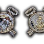
This coin carries a goat in Chief’s Khakis on the front and Supply Corps keys over blue waves on the back. It took several rounds to get there, and the first drafts were rejected for reasons that apply to most coin designs.
What the First Drafts Got Wrong
Most gallery pages show a finished coin and say nothing about how it got that way. This one is worth doing differently, because the early versions of this design were not right and the reasons are the three most common problems in coin design.
The reverse had too much empty space. This is the single most frequent fault in a first draft, and it happens for a structural reason: a client arrives with a clear idea for the front and nothing in mind for the back. The result is a coin that looks finished from one side and unfinished from the other.
The fixes are straightforward once the problem is named. Add a background texture. Carry a border across from the front. Or give the reverse a subject of its own rather than treating it as leftover space. This coin ended up doing all three.
The keys were too bulky. The Supply Corps device looked correctly proportioned as flat artwork and became heavy once it stood off the surface. That is worth understanding as a principle, because it catches almost everyone: relief adds visual weight. An element that is balanced on screen casts a shadow in metal, and the shadow makes it read larger and heavier than it did flat. Artwork usually has to be drawn slightly lighter than you want it to finish.
And the two faces did not relate to each other. A coin is one object, and if the front and the back share nothing they read as two unrelated designs. Here the fix was carrying the background lines and the roped border across both faces, which ties them together without making them the same.
None of that is a sign of a problem. Revisions are normal, they are included, and a design that goes through three rounds is a design that got looked at properly. The ones that go straight through are usually the ones nobody questioned. For timing, see How long does the design stage take before production starts?
Why a Goat
The goat is the long-established symbol of the Navy’s Chief Petty Officers, and putting one in Chief’s Khakis is immediately legible to anyone who has served while meaning nothing at all to anyone who has not.
That is exactly what a community symbol is supposed to do. It is a marker of belonging, and it works precisely because it is not self-explanatory. For the traditions behind it, see Navy chief traditions and the coins that mark them.
The design point worth making is that a figure in uniform is considerably harder to sculpt than a crest. Clothing has to read as fabric at a size where it amounts to a few lines of relief, and the difference between khakis and any other uniform is carried in the collar, the cut and the devices. Getting that right at coin size is the achievement on this face.
The Keys and the Waves
The reverse carries the Supply Corps keys with 3D features and precise cutouts, over waves painted blue, with the background lines and the roped border carried over from the front.
Three techniques are working together here. Sculpted relief gives the keys their depth. Cutouts open the parts of the keys that should read as gaps rather than as flat surface. And flat color on the waves gives the lower half of the face something to do without competing with the relief above it.
That combination is what solved the empty-space problem. The reverse has a sculptural subject, a colored element and a patterned field, which is enough to look at. One note on the cutouts: an open shape inside a raised element has to keep enough metal around it to hold, and that constraint is part of why the keys were reworked. See 2D and 3D coins compared for more on sculpted relief.
The Roped Inner Border
The rope on this coin runs around the inner round area rather than around the outer rim, which is unusual and easy to miss.
It achieves two things. It frames the central subject while leaving a plain outer margin, so the coin has a border without the rim competing with the design. And it gives both faces the same internal structure, which is part of how the front and back were brought into agreement with each other.
Most people assume a roped edge means the outside of the coin. Moving it inward is a small decision that changes the whole composition.
Order a Navy Chief Coin
Professional artwork is free with unlimited revisions, and nothing goes into production until you approve a digital proof. The challenge coin minimum is 50 pieces, standard production runs about 45 to 50 days after final artwork approval, rush production is available on many projects, and shipping within the continental United States is included. Embleholics is veteran-owned, SDVOSB and registered in SAM.gov.
Two things that make a design go well. Come to us with an idea for both faces rather than only the front, because the back is where most designs run thin. And expect at least one revision round, since the designs that go through two or three are the ones people keep. See more Navy challenge coins or a Chief’s Mess coin.
Frequently Asked Questions
What is a Navy Chief challenge coin?
It is a coin made for Navy Chief Petty Officers, the senior enlisted leaders of the Navy. Designs commonly use the goat, which is the long-established symbol of the Chiefs, along with rating devices and a unit or command reference.
Why is there a goat on Navy Chief coins?
The goat is the traditional symbol of the Navy’s Chief Petty Officers and has been for well over a century. It reads immediately to anyone who has served and means nothing to anyone who has not, which is precisely what makes it a marker of belonging.
How many revisions does a coin design usually take?
Two or three is typical and entirely normal. Revisions are included, and a design that goes through several rounds is usually one that got properly scrutinized. The common pattern is a strong first attempt at the front and a reverse that needs reworking.
What should go on the back of a challenge coin?
Something, which sounds obvious and is the most common failure in a first draft. Three approaches work: add a background texture, carry a border or pattern across from the front, or give the reverse a subject of its own. Most good coins use more than one.
Why do designs look heavier as relief than as artwork?
Because relief casts a shadow and flat artwork does not. An element that looks correctly proportioned on screen stands off the surface in metal and reads as larger and heavier than it did. The practical consequence is that artwork is usually drawn slightly lighter than you want the finished piece to look.
Can both faces of a coin share a border or background?
Yes, and it is one of the simplest ways to make a coin feel like a single object rather than two designs. Carrying the same border treatment or background texture across both faces ties them together while still letting each side have its own subject.
What do the keys represent on a Navy coin?
Crossed keys are the device of the Navy Supply Corps, the community responsible for logistics, supply and support. On a Chief’s coin they identify the rating as well as the rank, which is how a coin says both what someone achieved and what they did.
Can a figure in uniform be sculpted at coin size?
Yes, though it is harder than a crest. Clothing has to read as fabric in a few lines of relief, and the details that identify a particular uniform sit in the collar, the cut and the small devices. It takes more sculpting attention than a geometric design, and it is usually worth it.
More Navy Projects