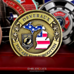
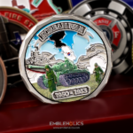
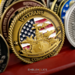
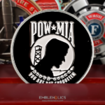
This coin was made for a law practice serving service members and veterans. It is deliberately plain, with a brushed brass base and no background pattern, so that several small engraved marks stay legible rather than competing with decoration.
Why a Law Firm Orders Coins
Lawyers are an unexpected coin buyer and a logical one. A firm with a military or veterans practice works in a world where the coin already means something: its clients have them, its referral sources hand them out, and the object needs no explaining to the people receiving it. A branded pen does not land that way.
Four things make the brief different from a corporate one.
The relationship is the subject, not the firm. A coin given to a service member is not an advertisement, and one that reads like an advertisement fails. This is the single judgment that decides whether a professional services coin works, and the way to get it right is to make the coin about the shared background rather than about the firm’s name.
Professional identities are typographic. A law firm’s mark is usually a wordmark set in a specific typeface with no emblem at all, and a wordmark is the hardest kind of logo to put on metal. More on logos in metal in Can a Company Put Its Logo on a Challenge Coin.
There are usually several small marks rather than one large one. A practice group device, an association membership, a bar or accreditation mark. All of them small, all needing to stay readable.
And understatement is the correct register. A glossy, colorful coin from a law firm reads as merchandise. The restraint on this piece is not a limitation, it is the point.
For another professional firm’s piece, see this corporate security coin.
Keeping Small Logos Legible
This coin looks simple and was not. The difficulty was keeping several small marks readable at coin size, and that is worth setting out because it applies to any professional or corporate buyer with a detailed wordmark.
A logo designed for a letterhead assumes resolution metal cannot deliver. Print holds a hairline. A struck die does not.
Thin strokes thicken and counters close up. The enclosed spaces inside letters such as e, a and o are the first casualty. When they fill in, a wordmark becomes a row of blobs that still has the right rhythm and is no longer readable.
Several small marks compete for the same light. Grouped tightly, they read as texture. They need space between them more than they need size.
And color at small scale needs a metal wall between every pair of colors, and that wall has a minimum width that does not shrink with the artwork.
The solutions are practical. Enlarge the mark rather than the coin where the layout allows it. Simplify a wordmark to its distinctive element instead of reproducing the whole lockup. Separate the marks across both faces rather than crowding one. Drop color on the secondary marks and let them work as engraved detail. And take a physical proof, because a screen will render type that metal cannot hold. Our page on engraving, enamel and finish options covers the processes involved.
Brushed Brass With No Pattern
The base is brushed brass with no background pattern or motif, and both choices are doing work.
Brushing scatters light rather than reflecting it, which keeps small engraved detail readable when the coin is held at an angle. A polished field throws highlights straight across fine lines and makes them disappear exactly when someone is trying to read them.
Leaving the field unpatterned gives the marks room. A texture or a background device would compete with them for attention, and on a coin whose entire difficulty is legibility that is a cost with no benefit.
The general rule is transferable. The busier the artwork, the plainer the field has to be. Buyers usually want both a detailed logo and an interesting background, and those two wishes work directly against each other.
A Practice That Serves Veterans
The firm behind this coin was founded in the 1960s and runs a military law team representing clients on federal matters nationally, alongside its wider practice.
That connects back to the coin in one way that matters. A practice built around service members works with people for whom a coin is already a familiar and meaningful object. The same piece from a general commercial firm would be a curiosity. From this one it is a recognizable gesture, which is why the restraint reads as respect rather than as a lack of budget.
For more on veteran-owned businesses using coins, see veteran-owned business challenge coins.
Order a Coin for Your Firm
Professional artwork is free with unlimited revisions, and nothing goes into production until you approve a digital proof. The challenge coin minimum is 50 pieces, standard production runs about 45 to 50 days after final artwork approval, rush production is available on many projects, and shipping within the continental United States is included. Embleholics is veteran-owned, SDVOSB and registered in SAM.gov, and you can read more about what SDVOSB means.
Two things to send. Vector artwork, and the smallest size your logo is approved to appear at, because that conversation is far easier before the die than after. And tell us whether the coins are going to clients or to staff, since it changes how much of the firm belongs on the piece. See more corporate challenge coins.
Finished Coin (Front)

Finished Coin (Back)

Frequently Asked Questions
What is a law firm challenge coin?
It is a custom coin made for a legal practice, usually given to clients, staff or referral partners. Firms with military and veterans practices order them most often, because the coin already carries meaning for that audience and needs no explanation.
Why would a professional services firm give out challenge coins?
Because for the right audience a coin is a recognized gesture rather than a branded giveaway. A firm working with service members and veterans is dealing with people who already have coins, already understand the convention, and will keep one in a way they would not keep a pen.
How small can a logo be on a challenge coin?
Smaller than people expect for a simple mark and larger than they expect for a detailed one. The limiting factors are stroke thickness and the enclosed spaces inside letters, which close up before the overall shape fails. Ask us for the minimum size on your specific artwork rather than working to a general figure.
Will a wordmark logo work on a coin?
It can, with care. Wordmarks are the hardest logo type to strike because thin strokes thicken and the counters inside letters fill in, so an e or an a can become a solid shape. The usual fixes are to enlarge the wordmark relative to everything else or to simplify it to its distinctive element.
Can several small logos fit on one face?
They can, but they need space between them more than they need size. Grouped tightly, small marks read as texture rather than as individual logos. Splitting them across both faces, or dropping color on the secondary ones so they work as engraving, usually produces a more readable coin.
Should a client coin carry the firm’s branding?
Less than you would think. A coin given to a client is a gesture, and one that reads as an advertisement stops being a gesture. Most effective professional services coins lead with the shared connection and treat the firm’s mark as a signature rather than the subject.
What does a brushed brass finish do for fine detail?
It scatters light instead of reflecting it, which keeps engraved detail readable when the coin is viewed at an angle. A polished surface throws highlights across fine lines and can wash them out entirely under ordinary indoor lighting.
Do I need a physical proof for small lettering?
If the coin carries small text or several small marks, yes. A digital proof confirms the layout, but a screen will happily render type at a resolution the die cannot reproduce. A physical sample is the only reliable way to confirm that small lettering is readable in metal.
More Veterans Projects