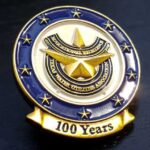
The association had already ordered challenge coins to mark 100 years of service. This pin recreates the front of that coin, with every detail the same except the edges, which are flat rather than roped, and a ribbon added at the bottom. They are custom enamel pins, finished antique.
Turning a Coin Design Into a Pin
This is one of the most efficient things an organization can do, and most do not realize it is available.
The artwork already exists. The largest part of the effort on any custom piece is settling the design, and that work does not repeat. Putting an approved coin face onto a pin is not the same job as commissioning a pin from scratch.
Only one face is needed. A coin has two; a pin has one. So the design is already more than sufficient, and the decision is which face to use rather than what to draw. It is almost always the one carrying the primary emblem.
And the two pieces then work as a set. Members who have both have a matched pair, which reads as a programme rather than two unrelated purchases. For an organization with a visual identity, that consistency is worth more than variety.
What does not carry over is the minimum quantity. Lapel pins are quoted separately from challenge coins with their own minimums, so ask about both in the same conversation rather than assuming the coin figure applies. See custom lapel pins.
What Has to Change for a Pin
A pin is not a smaller coin, and three things genuinely differ.
The edge treatment goes. This pin uses flat edges where the coin had roped ones, and that is the right call. A roped or reeded edge is a currency convention that reads correctly on a coin and reads as fussy on a pin, where there is no second face and no rim to frame. Flat edges let the artwork run to the boundary.
The outline can gain elements. A ribbon was added at the bottom, which a round coin could not have carried without becoming a shaped coin. A pin’s outline is freer, because it does not have to sit flat in a stack or fit a capsule.
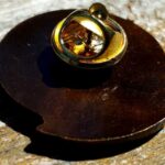
And the back is hardware, not a design surface. Which means the attachment has to be specified: the post and clutch type affects how securely the pin sits and how easily it is lost. It is worth deciding rather than defaulting.
The scale question is the other one. A pin is typically smaller than a coin, so detail that was comfortable at coin size may need thickening. On a design recreated from an existing coin, that is the step to watch at proof stage.
Adding a Ribbon
The ribbon at the bottom took several drafts before the client settled on one, which is normal and worth understanding.
A ribbon is the most-revised element on most pin designs, because it does two jobs that pull against each other. It carries text, which wants length, and it has to fit the outline, which wants compactness. Every extra word makes the ribbon wider or the lettering smaller.
Three things that help. Keep the ribbon text to two or three words, since it is a label rather than a sentence. Give it a flat central run for the type to sit on, because letters following a curved ribbon distort at the ends. And decide whether the ribbon is part of the outline, as here, or sits inside the shape, because that changes both the silhouette and the usable area.
An Antique Finish
The antique finish was applied at the end, and it is a good choice on a centennial piece.
An antique finish darkens the recesses while leaving the raised surfaces lighter, so relief reads as depth without needing paint to separate the elements. On a piece carrying a detailed emblem that is exactly what you want: the detail reads through shadow rather than through color.
It also does something specific for an anniversary. A finish that reads as aged suits an organization marking a hundred years in a way a bright polish would not. The piece looks like it has history rather than looking newly made.
See antique vs polished finishes.
A Matched Set for an Association
The Texas Water Utilities Association ordered coins for its centennial and then came back for pins. That sequence is common and it is worth planning for deliberately.
Different items suit different occasions. A coin is handed over; a pin is worn. For an association with a calendar of conventions, installations and awards, the two serve genuinely different purposes rather than duplicating each other.
A pin is the lower price point. Which matters if items are being sold to members or offered at different membership tiers.
And asking for everything at once is cheaper. Settling the artwork once and applying it across coins, pins and keychains costs far less than three separate projects. See the association’s challenge coin and its matching keychain.
Order a Matching Pin
Professional artwork is free with unlimited revisions, and nothing goes into production until you approve a digital proof. Standard production runs about 45 to 50 days after final artwork approval, rush production is available on many projects, and shipping within the continental United States is included. Minimum quantities for lapel pins differ from challenge coins, so ask when you request a quote. Embleholics is veteran-owned, SDVOSB and registered in SAM.gov.
Two suggestions. If you already have a coin from us, say so, because the artwork is on file and a matching pin is a much shorter project than a new design. And ask about every item you might want in one conversation, since the artwork only has to be settled once and the minimums differ by product. Request a free quote to begin.
Lapel Pin (Front)
Lapel Pin (Back)
Frequently Asked Questions
What is a custom association lapel pin?
It is an enamel pin carrying an organization’s emblem, often made to match an existing challenge coin. Associations use them for conventions, officer installations and awards, where a worn item suits better than a coin handed over.
Can our challenge coin design be used for a pin?
Yes, and it is far cheaper than a new design. A coin has two faces and a pin needs one, so the artwork is already more than sufficient. The decision is which face to use, usually the one carrying the primary emblem.
What has to change when a coin becomes a pin?
The edge treatment usually goes, since roped and reeded edges are a currency convention that reads as fussy on a pin. The outline can also gain elements such as a ribbon, which a round coin could not carry.
Why use flat edges on a pin?
Because a pin has no second face and no rim to frame, so a decorative edge has nothing to do. Flat edges let the artwork run to the boundary, which is the better use of a small surface.
Is the minimum order the same as for coins?
No. Lapel pins are quoted separately with their own minimums, so ask about coins and pins in the same conversation rather than assuming the coin figure carries over.
How much text fits on a ribbon?
Two or three words. A ribbon is a label rather than a sentence, and every extra word makes it wider or the lettering smaller. Give the type a flat central run to sit on, since letters distort at the curved ends.
What does an antique finish do?
It darkens the recesses while leaving raised surfaces lighter, so relief reads as depth without paint. It also reads as aged, which suits an anniversary piece better than a bright polish does.
Does the back of a pin need specifying?
Yes. The back is hardware rather than a design surface, and the post and clutch type affects how securely the pin sits and how easily it gets lost. It is worth deciding rather than defaulting.
More Corporate Projects