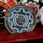
A trucking company challenge coin is a recognition piece built for people who work out of a vehicle rather than an office. This one was made for Real Trucking, a freight carrier founded in 2007 and headquartered in Broadview, Illinois, to mark a partnership with its insurance provider. It is a round, silver-colored coin with the company logo engraved in relief on both faces and only a small amount of color, which is a harder specification to execute well than it sounds.
A driver coin has to survive a working environment
This is the part that separates a trucking coin from an office coin. A coin given to a desk-based employee usually ends up on a shelf. A coin given to a driver goes into a jeans pocket, a cup holder, a door pocket, or a wallet, and it stays there for years alongside keys and change. It gets hot in a cab in summer, it gets handled with diesel on the hands, and it gets washed by accident.
What that rules out, and what it favors:
- Soft enamel chips in a pocket. Soft enamel leaves the color slightly recessed below the metal ridges, which looks good but gives the edges of each color field something to catch on. For a coin that will live loose among keys, hard enamel polished flush with the metal wears far better.
- Bright polish shows every mark. A mirror-polished coin looks best on day one and worst on day two hundred. An antique or satin finish absorbs handling instead of recording it, which is why most coins intended for daily carry use one.
- Engraved relief outlasts anything printed. A design cut into the metal cannot rub off. Printed or offset-printed artwork on a coin face will, eventually, and a driver’s pocket gets there faster than most.
- Edges matter more than usual. A plain or reeded edge is fine; a thin decorative edge treatment is the first thing to deform if a coin is dropped on concrete, which in this line of work it will be.
A clean design is not the easy option
Removing elements does not remove the work, it concentrates it. With a logo on a plain field and almost no color, there is nothing to distract the eye from proportion. Three things have to be right, and all three are judgment calls rather than settings:
Proportion against the rim. A logo set too close to the edge looks cramped; set too small it looks lost in the field. The usable area on a round coin is smaller than the coin itself, because the rim and the taper into it take up more room than people expect.
Relief and inscription height. On a monochrome coin, depth is the only thing creating separation. The logo needs to stand at a different height from the lettering, and both need to stand clear of the field, or the whole face reads as one gray disc in indoor light.
Where the color goes. When a design uses a small amount of color, that color becomes the focal point whether you intend it or not. Putting it on the single element you most want seen works. Scattering it across three small details defeats the restraint the design was aiming for.
What trucking companies actually use coins for
The most common use is milestone recognition, and it suits the format well. Safe mileage milestones, years of service, and accident-free records are all specific, verifiable, and worth marking with something physical. A coin works better than a certificate here for a simple reason: a driver can carry it, and a framed certificate does not fit in a truck.
The other common uses:
- Partnership and anniversary coins, like this one, marking a relationship between two companies. These are usually short runs, since the audience is both companies’ staff rather than a whole workforce.
- Recruiting and orientation coins, handed to drivers at onboarding. These need to be reorderable, so keep dates and named individuals off the die.
- Driver appreciation coins for annual recognition events, which tend to be the largest runs.
If the coin marks a tier, design the tier in from the start. A company that expects to recognize one million, two million, and three million safe miles is better served by one die with the figure as the only changing element than by three unrelated designs. It is cheaper, and it makes the set legible as a progression.
Ordering a trucking or corporate coin
Bring the logo as vector artwork if you have it, and tell us where the coin will end up. The second part determines the finish and the enamel type, and it is the question most corporate orders skip. If these are going to drivers, say so, and we will steer you toward hard enamel and an antique finish rather than the brightest option on the sheet. We have produced coins across this field, including the Motorola Solutions coin, and you can see the range on our corporate challenge coins page or send artwork through the free quote form.
Frequently Asked Questions
What is a trucking company challenge coin?
A trucking company challenge coin is a recognition piece made for drivers and staff at a freight carrier, usually marking safe mileage milestones, years of service, accident-free records, or a company partnership. The format suits the industry because a driver can carry a coin in a cab or a pocket, where a framed certificate has nowhere to go.
Which enamel is best for a coin drivers will carry?
Hard enamel. It is polished flush with the surrounding metal, so there are no raised ridges around each color field for keys and change to catch on. Soft enamel leaves the color slightly recessed, which gives more visible depth but chips over time in a pocket. For a coin meant for daily carry, hard enamel is the more durable choice.
What finish holds up best for daily carry?
An antique or satin finish. A mirror polish looks best when the coin is new and shows every scratch and fingerprint afterwards, whereas an antique finish absorbs handling rather than recording it. Engraved relief also outlasts any printed artwork, which will eventually rub off on a coin that lives in a pocket.
Is a simple coin design cheaper and easier?
Cheaper, usually, because there is less enamel work. Easier, no. With no color to separate elements, everything rests on proportion against the rim and on relief heights, and those are judgment calls rather than settings. A plain coin with the logo set at the wrong scale or at a uniform relief height reads as a flat gray disc in indoor light.
Can we use coins for safe mileage milestones?
Yes, and it is the most common use in the industry. If you plan to recognize more than one milestone, design one die with the figure as the only element that changes rather than commissioning separate designs. It costs less across the set and it makes the milestones read as a progression, which is the point of a tiered award.
Should we put the year on a company coin?
Not if the coin is for ongoing use such as onboarding or annual recognition, because a date means new artwork every time you reorder. Put dates on commemorative runs only, such as an anniversary or a partnership coin, where being tied to a specific moment is the purpose.
What artwork do you need from us?
Vector artwork of the logo is ideal, since it scales to the resolution a die needs without loss. If you only have a raster image or a photograph of existing signage, our designers will redraw it. Tell us at the same time where the coins are going, because an order destined for drivers gets specified differently from one destined for an office.
More Corporate Projects