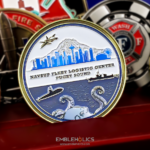
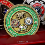
Shaped as a bottle opener, with the mouth sized to actually fit and open a bottle. The front sets Seattle in the background with an aircraft carrier, a small boy and a submarine representing the local supply community’s ships, a shipyard feature for the Puget Sound region, and Mount Rainier rising from the top in raised 3D. The back carries a supply oak leaf standing off the surface in 3D with five stars on it for the pillars of the Supply Corps. Gold coloring throughout with a fine silver finish on the sides. This Navy bottle opener challenge coin was made for the Puget Sound Navy Supply Corps Ball.
A Coin That Has to Work
A bottle opener coin is one of the few challenge coins with a mechanical requirement, and that changes the engineering.
The mouth has to be the right size. A crown cap is a fixed dimension, so the opening and the lip that catches under the cap are not design choices. Get them wrong and the piece is a coin shaped like a bottle opener rather than a bottle opener.
It needs mass and thickness. Levering a cap puts real force through the metal. A thin coin flexes or bends, which is why the page describes this piece as full and heavy, built to hold up under repeated use. That weight is a specification rather than a luxury.
Relief has to stay clear of the working end. Sculpted detail near the mouth gets ground down against bottle caps and makes the piece uncomfortable to grip under load. Detail belongs away from the business end.
And it will be used. Unlike most coins, this one gets handled hard, which argues for plating over paint on any surface that takes contact.
See also custom bottle openers and whether a challenge coin can be a bottle opener.
Putting a Region on a Coin
This design is built from place rather than from insignia, which is unusual and effective.
Seattle in the background, a shipyard, an aircraft carrier, a submarine and Mount Rainier are all Puget Sound. Together they say where this community is without a line of text, and anyone stationed in the region reads every element instantly.
The ships are doing double duty. A carrier, a submarine and a small boy are the vessel types the local supply community actually supports, so the imagery is simultaneously geographic and occupational. That is the most efficient kind of coin content: one element answering two questions.
Mount Rainier raised in 3D is the right choice for the focal point. A mountain is a form rather than a flat shape, so it gains more from relief than any of the other elements would, and it is the single most recognizable thing in the region’s skyline. On a face carrying several components, giving the strongest one the most depth is what creates hierarchy.
See also Navy challenge coins.
The Supply Oak Leaf
The reverse puts a supply oak leaf in 3D with five stars for the pillars of the Supply Corps, and the choice follows a principle worth copying.
The front of this coin is busy, carrying a city, three vessel types, a shipyard and a mountain. A reverse with similar complexity would produce a piece with no resting point. Instead the back carries one raised element and five small marks, which gives the eye somewhere to settle and makes the front read as the front.
The oak leaf is also the Supply Corps’ own device rather than a generic symbol, so the quiet face is still carrying specific identity. That is the ideal arrangement: a detailed narrative side and a simple emblematic side, both meaningful.
Five stars for five pillars is the kind of detail that only works for an audience that knows the reference. For a coin going exclusively to supply officers at their own ball, that is exactly the right audience.
See also a Navy supply corps challenge coin.
Gold With a Silver Edge
Gold faces with a fine silver finish on the sides is a dual plating arrangement that is more subtle than the usual front and back split.
Plating the edge differently from the faces produces a bright line around the whole piece, visible from every angle, which frames the design without any pattern being cut into the rim. For a coin with an irregular outline, that line also traces the shape, so the silhouette reads more clearly than it would in a single metal.
It works particularly well on a thick piece. A bottle opener coin has more edge than a standard coin because it is heavier, and a thin coin’s rim would barely show the second metal. Here there is enough material for the contrast to register.
Because both treatments are plating rather than paint, neither can chip. On a piece designed for repeated hard use, that is the governing consideration.
See antique vs polished finishes.
Order a Bottle Opener or Event Coin
Professional artwork is free with unlimited revisions, and nothing goes into production until you approve a digital proof. The challenge coin minimum is 50 pieces, standard production runs about 45 to 50 days after final artwork approval, rush production is available on many projects, and shipping within the continental United States is included. Embleholics is veteran-owned, SDVOSB and registered in SAM.gov.
Two suggestions. If the piece has to open bottles, keep sculpted detail away from the working end and accept the extra thickness, because a thin opener flexes and a decorated mouth is uncomfortable under load. And use plating rather than paint on any surface that takes contact, since a coin designed to be used will lose paint from the high points first. Request a free quote to begin.
Frequently Asked Questions
Can a challenge coin work as a real bottle opener?
Yes, if it is engineered for it. The mouth has to match the fixed dimension of a crown cap, and the piece needs enough thickness and mass to take the leverage without flexing.
Why is a bottle opener coin heavier than a normal coin?
Because levering a cap puts real force through the metal. The extra thickness is a specification rather than a premium feature, and a thin piece will bend.
Where should detail go on a bottle opener coin?
Away from the working end. Relief near the mouth gets ground against caps and makes the piece uncomfortable to grip, so sculpting belongs on the body.
Paint or plating on a piece that gets used?
Plating. Paint fails first at raised edges, which are exactly the surfaces that take contact on something handled hard, while plating is the metal itself and cannot chip.
How do you represent a region on a coin?
Pick elements that are locally unmistakable and let them overlap with the organization’s work. A carrier, a submarine and a shipyard say both where the unit is and what it supports.
Which element should get the deepest relief?
The strongest one. On a face with several components, giving the most recognizable element the most depth creates the hierarchy that keeps the design readable.
Should both faces of a coin be detailed?
Usually not. A detailed narrative front paired with a simple emblematic back gives the eye somewhere to settle, where two busy faces leave a piece with no resting point.
What does plating the edge differently achieve?
A bright line around the whole piece visible from any angle, which frames the design without cutting a pattern into the rim and traces the silhouette on an irregular shape.
More Navy Projects