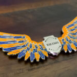
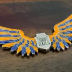
Most unit coins start from the official insignia. This one started by setting it aside. The 7th Signal Command (Theater), which integrates, secures and defends Army networks in the continental United States, asked for a coin that did not use its distinctive unit insignia, and the result is a wing-shaped piece with eagle wings framing a central shield, finished in orange and blue.
When a unit does not want its own crest on the coin
It happens more often than you would think, and there are usually good reasons. A distinctive unit insignia is prescribed artwork designed to be read on a uniform at close range, and that is not the same job as working on a coin. Some crests are too detailed to survive at coin scale. Some are visually similar to a dozen other units’ in the same branch. And some units simply want something of their own that is not the thing on everyone’s shoulder.
What has to replace it, because something must:
- The elements rather than the whole. Most crests are built from a few symbols. Taking one or two, enlarging them and giving them room usually produces a stronger coin than reproducing the full device small. The 7th’s own insignia pairs an eagle with seven lightning flashes, where the eagle stands for vigilance and the flashes refer both to the signal mission and to the command’s number, and an eagle used on its own carries a great deal of that.
- The shape. If the crest is not carrying identity, the silhouette can. A wing outline is distinctive enough that the coin is recognizable before any detail is read.
- The colors. Branch and command colors do identifying work on their own, and they survive at any size.
- The name. Obvious, but it becomes load-bearing once the crest is gone, so it needs real prominence rather than a rim position.
One thing to confirm internally first. Going away from the official insignia should be a command decision rather than a designer’s preference, because the coin still represents the unit. Get it agreed before artwork rather than discovering at proof stage that somebody expected the crest.
Wings as a coin shape
A wing outline is one of the more effective non-round shapes and one of the more demanding to cut. It reads instantly, it has a natural horizontal axis that suits a long command name, and the central body gives a shield or crest somewhere protected to sit.
The difficulty is in the feathers. Individually rendered feather tips are thin projections, and a row of them along a wing edge is a row of things to bend and catch. The fix is to treat the outer edge as a continuous scalloped profile with the tips slightly thickened, and let the feather detail live in the relief inside the outline rather than in the silhouette itself. Done that way a wing coin survives a pocket; done literally it does not.
Wings also eat usable area. The flat space on a wing-shaped coin is mostly in the central body, so the shield or crest and any text have to fit there. Spread wings look generous and give you less room than a circle of the same width.
Two colors doing a lot of work
A two-color scheme on a shaped coin is usually the right call, and this one shows why. When the outline is already distinctive, adding a broad palette makes the coin busy and competes with the shape. Two colors give the design contrast and identity while leaving the silhouette as the first thing anyone registers.
Signal units have an advantage here. The branch has a strong color identity, and a coin that leans on it is immediately placeable within the Army even by someone who does not know the specific command. Where a unit is using branch colors, confirm the exact shades against the official specification rather than approximating them, since these are prescribed rather than chosen.
About the command
The 7th Signal Command (Theater) is responsible for integrating, securing and defending Army networks in the continental United States, and for extending Army network capability to forces supporting US-based expeditionary operations. Its mission covers network capabilities and services for Army, joint, interagency and multinational forces in the Western Hemisphere. It is one of several theater signal commands and a subordinate element of NETCOM.
Network and cyber units have a design problem in common with electronic warfare squadrons: the work is invisible. There is no vehicle, no weapon and no obvious artifact. That is a large part of why signal and network commands lean so heavily on heraldic devices, lightning, eagles and shields, and why a unit in this field going away from its crest has to find something else with real presence to replace it.
Ordering a command coin
Tell us whether the official insignia is in or out, and make sure that is settled internally first. If it is out, bring the elements you do want to keep, the command colors and the full name, because those three carry the identity in its place. If you want a wing or other feathered shape, we will show you the adjusted profile with the fragile points already resolved before any die is cut. You can see more Army challenge coins we have produced, including the 644th Combat Communication Squadron coin, or send your artwork through the free quote form.
Finished Coin (Front)
Finished Coin (Back)
Frequently Asked Questions
Can a unit coin leave off the official unit insignia?
Yes, and units do it for good reasons: some crests are too detailed to survive at coin scale, some look much like other units’ in the same branch, and some units want something that is not the device already on every shoulder. What matters is that something else then carries the identity, and that the decision is made at command level rather than by the designer.
What replaces a crest if it is not used?
Four things, usually in combination. Individual elements from the crest, enlarged and given room, which often read better than the full device shrunk down. The coin’s silhouette, if the shape is distinctive enough to identify it. The command or branch colors, which identify at any size. And the unit’s name, which becomes load-bearing once the crest is gone and needs real prominence rather than a rim position.
Is a wing shape difficult to produce?
The outline is fine; the feathers are the problem. Individually rendered feather tips are thin projections that bend and catch, so the outer edge should be cut as a continuous scalloped profile with the tips slightly thickened, with the feather detail carried in the relief inside the outline rather than in the silhouette. Treated literally, a wing coin damages quickly.
How much space does a wing-shaped coin give you?
Less than it appears. The usable flat area is concentrated in the central body, so the shield, crest and any text all have to fit there. Spread wings look generous but deliver less working room than a circle of the same overall width, which is worth planning for before the layout is drawn.
How many colors should a shaped coin use?
Few. When the outline is already doing the identifying, a broad palette makes the coin busy and competes with the shape. Two colors give contrast and identity while leaving the silhouette as the first thing anyone registers, which is usually the right balance on a non-round coin.
Should we use our branch colors on the coin?
If the unit wants to be placeable within the Army at a glance, yes. Branch colors identify a unit’s field even to people who do not know the specific command. Confirm the exact shades against the official specification rather than approximating, since branch colors are prescribed rather than chosen.
What is the 7th Signal Command?
The 7th Signal Command (Theater) integrates, secures and defends Army networks in the continental United States, and extends Army network capability to forces supporting US-based expeditionary operations. Its mission covers network capabilities and services for Army, joint, interagency and multinational forces in the Western Hemisphere, and it is a subordinate element of NETCOM.
More Army Projects