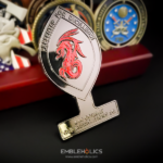
The coin is an ellipse with pointed ends, the shape of a football, with a small rectangular banner across the bottom. Most of the surface is glossy metallic black with red pearls, and other colors appear only on the flags and the mascot. It was made for the 644th Combat Communication Squadron.
Why a Pointed Ellipse Works
The football shape, a vesica or pointed oval, is one of the most useful custom outlines available and it is underused.
It has a long axis. A circle has no direction, so every element has to be positioned from scratch. A pointed ellipse has an obvious horizontal run through the middle, which gives any design a spine to build on. A map, a vehicle, a wordmark or a horizontal scene all sit naturally along it.
The two points are free anchors. They frame whatever sits between them, drawing the eye inward from both sides toward the center. That is the opposite of a star, whose points pull outward.
It is structurally sound. Unlike a star’s tips or a wheel’s handles, the points on an ellipse are broad and gradual rather than narrow projections, so there is no real fragility concern. The curvature thickens into the body rather than ending in a spike.
And it is distinctive without being a novelty. It stands out among round coins while still reading as a serious object, which is the same argument for an octagon or a shield.
The constraint is vertical space. An ellipse is wide and shallow, so a tall subject will not fit. Anything with real height has to be reworked into a horizontal arrangement, which is why this shape suits maps, scenes and crests better than it suits figures or monuments. See custom shaped challenge coins.
The Banner Across the Bottom
A small rectangular banner is added at the base of the outline, which is a detail worth copying.
The problem it solves is where to put the unit’s name. On a round coin, text wraps around the rim and curves as it goes, which limits how many words you can use before legibility suffers. On a pointed ellipse the curve at the bottom is shallow and the available run is short, so rim text works even less well.
A banner gives you a flat, straight line to set type on. Letters on a straight baseline do not distort, which means they can be smaller and still readable than the same text curved, so more words fit. It also separates the name from the artwork, so the two are not competing.
The piece attaches to the outline, so it becomes part of the silhouette rather than sitting on the face. That is the structural advantage: it adds a text zone without taking any of the artwork area away.
Glossy Black With Red Pearls
Most of the coin is a glossy metallic black with red pearls, and the pearl element is the part worth explaining.
A pearl or metallic pigment is mixed into the paint rather than applied as a plating, so the color itself contains fine reflective particles. The effect is that the surface shifts as the coin moves, catching light differently from a flat enamel of the same color. On a dark base in particular it reads as depth rather than as a solid fill.
Three practical notes:
It needs a glossy finish to work. The pigment depends on reflection, so a matte topcoat largely cancels the effect.
It reads best in large areas. A pearl effect in a small cell is barely visible. On a face that is mostly one color, as here, it has the room to show.
And it photographs poorly. A pearl finish is a thing you see when the coin moves, which a still image cannot show. If the coin will be sold from a photograph, that is worth knowing before specifying it.
Keeping the rest of the palette restricted, with color only on the flags and the mascot, is what lets the black carry the coin. See enamel and finish options.
A Map and Crossed Weapons
The reverse carries a map of the INDOPACOM area with crossed Gurkha knives, the flags of the United States and Guam, and the words “INDOPACOM Ready.”
A theater map is a good use of a horizontal shape, since an area of operations is wide rather than tall, and the ellipse gives it the run it needs. Etched map lines are the right technique, because a map is a drawing and recessed line work reads as one.
Crossed weapons behind a central element are one of the oldest devices in heraldry and they still work, for a practical reason: two diagonals crossing create a symmetrical X that fills the corners of a face, which is exactly the area most compositions leave empty. On an ellipse they also echo the two points of the outline.
The front, by contrast, carries a tribal-style dragon crest, the squadron’s symbol of excellence, with embossed lettering and machined detail. A graphic device on one face and a scene on the other is a reliable way to divide a two sided piece.
About the Squadron
The 644th Combat Communication Squadron is part of the 36th Contingency Response Group. It supports Air Force leadership in responding to fast-moving contingency deployments across the Pacific, with a mission of rapidly deploying combat airmen and communications support in INDOPACOM, one of six geographic unified combatant commands, headquartered in Honolulu, Hawaii.
Its stated vision is to lead an expeditionary communications force providing agile, resilient, survivable and interoperable capabilities across the theater.
See more Air Force squadron coins and what goes on them and Air Force challenge coins.
Order a Shaped Squadron Coin
Professional artwork is free with unlimited revisions, and nothing goes into production until you approve a digital proof. The challenge coin minimum is 50 pieces, standard production runs about 45 to 50 days after final artwork approval, rush production is available on many projects, and shipping within the continental United States is included. Embleholics is veteran-owned, SDVOSB and registered in SAM.gov.
Two suggestions. If your design is horizontal, a map, a scene, a long wordmark, ask about a pointed ellipse rather than defaulting to a circle; the long axis is the whole advantage and it costs nothing extra over any other custom shape. And if you want the unit name legible, ask for a banner on the outline instead of rim text, since letters on a straight baseline can be smaller and still read. Request a free quote to begin.
Frequently Asked Questions
What is a football shaped challenge coin?
It is a coin cut as an ellipse with pointed ends, also called a pointed oval or vesica. The long horizontal axis gives a design a spine to build on, which a circle does not, and the two points frame whatever sits between them.
Why use an ellipse instead of a circle?
Because a circle has no direction, so every element has to be positioned from scratch. An ellipse has an obvious horizontal run, which suits maps, vehicles, long wordmarks and horizontal scenes naturally.
Are the points on an ellipse fragile?
No. Unlike a star’s tips or a wheel’s handles, the points on an ellipse are broad and gradual, with the curvature thickening into the body rather than ending in a spike. There is no real fragility concern.
What does an ellipse not suit?
Tall subjects. The shape is wide and shallow, so anything with real height, such as a figure or a monument, has to be reworked into a horizontal arrangement or it will not fit.
What is a banner on a challenge coin?
It is a small rectangular panel attached to the outline, usually at the bottom, giving you a flat straight line to set the unit’s name on. It becomes part of the silhouette, so it adds a text zone without using any of the artwork area.
Why is straight text better than curved text on a coin?
Because letters on a straight baseline do not distort, so they can be set smaller and still read clearly. The same words curved around a rim have to be larger, which means fewer of them fit.
What is a pearl finish on a coin?
It is a paint with fine reflective particles mixed into it, so the color itself shifts as the coin moves. On a dark base it reads as depth rather than as a solid fill, which flat enamel cannot do.
Does a pearl finish photograph well?
No, and that is its main drawback. The effect depends on the coin moving under light, which a still image cannot show, so it is worth reconsidering if the coin will be sold from a photograph. It also needs a glossy rather than matte topcoat to work at all.
More Air Force Projects