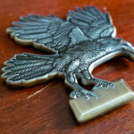
Rather than a round coin, this one is cut to the shape of a raven standing on a plaque. The feathers carry machined detail painted black, with the eye picked out in red as the single accent. The reverse carries an officer’s name, the regiment’s insignia and its motto, engraved. It was made for the 179th Infantry Regiment, the Tomahawks.
A Bird as a Coin Outline
Birds are among the most requested shapes and among the hardest to execute. A raven is one of the better candidates, and the reasons are worth setting out.
A standing bird has a compact silhouette. Body, head, tail and legs in a vertical mass. Compare a bird in flight, where the spread wings are wide, thin at the tips and the first thing to bend.
A raven’s profile is distinctive. A heavy bill, a flat crown and a wedge tail. Those are the three features people read, and all three survive at coin size because they are proportions rather than details.
The legs are the problem. Thin, and they carry the whole bird. This is exactly what the plaque solves: standing the raven on a base gives the legs something continuous to join, so they are not unsupported projections.
And the plaque earns its place twice. It supports the structure and it provides a flat area for lettering, which a bird-shaped outline otherwise has nowhere to put.
The general lesson applies to any figurative outline: find the arrangement where the fragile parts are supported rather than exposed. A standing figure on a base, a vehicle on a ground line, an animal against a backdrop. See custom shaped challenge coins and a die cut challenge coin.
Machined Feathers
Feather detail is the thing that makes or breaks a bird on a coin.
Texture does not survive; pattern does. Attempting individual feathers produces a haze at coin size. What works is rendering feathers as a repeating pattern of larger overlapping shapes, fewer and bolder than the real bird has.
The pattern should follow the form. Feathers on a wing run in a different direction from feathers on a breast, and that directional change is what tells the eye it is looking at a three dimensional bird rather than a flat cutout with marks on it.
Keep the head smoother than the body. A raven’s head reads from its outline, and patterning it competes with the profile that identifies the bird. The contrast between a smooth head and a textured body also gives the piece somewhere to rest.
And paint fills the pattern rather than covering it. Black paint in machined recesses leaves the raised metal between them catching light, which is what makes the feathers read as feathers. A flat black face would lose the whole effect.
One Red Accent
The eye is red and nothing else on the piece is colored, which is the most efficient use of color available.
On an otherwise monochrome coin, a single point of color is where the eye goes first and stays longest. Putting it on the bird’s eye means the viewer looks at the bird’s face, which is exactly where a figurative design wants attention.
Two more colors would have halved that effect. A fully painted raven would have lost it entirely, and would also have lost the metal showing between the machined feathers.
The principle generalizes: on a sculpted single-subject coin, pick the one point that should draw the eye and color only that. An eye, a flame, a light, a single star.
A Name on the Reverse
The reverse carries an officer’s name alongside the regiment’s insignia and motto, which makes this a presentation piece rather than a unit issue.
That changes two things. The details have to be exactly right, because a named coin cannot be corrected after the strike, so the spelling and the form of the name should be checked against an official record by somebody other than the person ordering. And the quantity question shifts: a named coin is for one person, but the minimum is 50, which means the surplus goes to the people present when it is given.
A motto is the better companion to a name than a date. It is short, it does not age, and it says what the unit is rather than when something happened. See a rank insignia challenge coin for another individual presentation piece.
About the Regiment
The 179th Infantry Regiment is part of the Army National Guard. It was constituted in the Oklahoma Volunteer Militia as the 1st Infantry Regiment on 2 May 1890 and serves as part of the 45th Infantry Division. The 1st Battalion is the regiment’s only active battalion, a combined arms battalion within the 45th Infantry Brigade Combat Team of the Oklahoma Army National Guard.
See also a 22nd Infantry Regiment coin and more National Guard challenge coins.
Order a Figurative Shaped Coin
Professional artwork is free with unlimited revisions, and nothing goes into production until you approve a digital proof. The challenge coin minimum is 50 pieces, standard production runs about 45 to 50 days after final artwork approval, rush production is available on many projects, and shipping within the continental United States is included. Embleholics is veteran-owned, SDVOSB and registered in SAM.gov.
Two suggestions. If you want an animal or figure as the coin’s shape, ask about an arrangement that supports the thin parts, such as standing it on a base, because unsupported legs or wingtips are where a figurative outline fails. And if the coin carries a name, have somebody other than the person ordering verify the spelling and the form of it against an official record, since a named coin cannot be corrected once struck. Request a free quote to begin.
Frequently Asked Questions
What is a raven challenge coin?
It is a coin built around a raven, either as a device or, as here, as the coin’s own outline. The raven works well in metal because its heavy bill, flat crown and wedge tail are proportions rather than fine details.
Can a coin be shaped like a bird?
Yes, and a standing bird works far better than one in flight. A standing silhouette is a compact vertical mass, where spread wings are wide, thin at the tips and the first part to bend in a pocket.
How are thin legs handled on a bird shaped coin?
By standing the bird on a base. A plaque gives the legs something continuous to join so they are not unsupported projections, and it supplies a flat area for lettering that a bird outline otherwise has nowhere to put.
How should feathers be rendered?
As a repeating pattern of larger overlapping shapes, fewer and bolder than the real bird has. Attempting individual feathers produces a haze at coin size. The pattern should also change direction to follow the form.
Should the head be textured too?
No, keep it smoother than the body. A bird’s head reads from its outline, and patterning competes with the profile that identifies it. The contrast between smooth head and textured body also gives the eye somewhere to rest.
Why paint into machined feather detail rather than over it?
Because paint filling the recesses leaves the raised metal between them catching light, which is what makes the feathers read. A flat painted face would lose the pattern entirely.
Why use only one point of color?
Because on an otherwise monochrome coin a single accent is where the eye goes first and stays longest. Placing it on the bird’s eye draws attention to the face, which is where a figurative design wants it.
What should be checked on a named coin?
The spelling and the exact form of the name, verified against an official record by somebody other than the person ordering. A named coin cannot be corrected after the strike.
More Army Projects