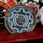
Round, chrome, with a contemporary polished look. The front carries the firm’s logo, engraved and machined at an angle so it sits slightly recessed into the surface rather than flat on it. The edge is smooth with no pattern and the rims are thin. Glossy solid paint completes it. This Raftelis challenge coin was made for Raftelis Financial Consultants, a management consulting firm serving local governments and utilities.
Recessing a Logo Rather Than Raising It
Setting a mark below the surface instead of above it is the decision that gives this coin its character, and it is the less obvious of the two options.
Raised is the default. Most coins lift the logo off the field, which makes it the high point and the first thing light hits.
Recessed inverts that. The logo becomes a depression, which means the surrounding metal is the high surface and the mark reads through shadow collecting inside it. It is quieter and more deliberate, and it suggests the mark is part of the object rather than applied to it.
Angling the walls is what makes it work. A recess with vertical sides reads as a flat hole. Machining the walls at an angle creates a graded shadow around the edge of the mark, which is where the depth comes from.
And it protects the logo. A recessed mark sits below the contact surface, so handling wears the surrounding field rather than the logo itself. On a polished chrome coin that is a practical gain as well as an aesthetic one.
See 2D vs 3D challenge coins and machining and finish options.
Consulting Firms as Coin Clients
Professional services firms are a growing coin client and the brief differs from a product company’s in a few ways.
There is nothing to depict. A consultancy sells judgment. There is no product, no vehicle and no building, which is why these coins are almost always built around the logo and the finish rather than around an image.
Understatement is the register. A firm advising governments and utilities on finance and strategy cannot hand out something that reads as promotional. A restrained metal object does, and a colorful one does not.
The audience is clients, not staff. A consultancy’s coin goes to the people it serves, which means it functions as a relationship object rather than as internal recognition.
And the logo has to survive the format. Professional firms usually have wordmark logos set in a specific typeface, and a wordmark is the hardest kind of mark to put on metal, because thin strokes thicken and enclosed letter spaces fill in.
See more corporate challenge coins and a corporate security coin.
Raftelis and the Utilities Sector
Raftelis is a management consulting firm working with local governments and utilities worldwide, across finance, assessment, communications, technology, executive recruitment and strategic planning. The firm reports helping more than 600 organizations in the past year.
That client base explains why a coin suits the firm better than most consultancies. Local government and utility work puts Raftelis alongside public agencies, and public agencies are deep in the coin tradition already. A coin handed to a utility director or a city manager lands in a world where the object is familiar, whereas the same gesture in a purely private sector setting would need explaining.
The water and utility sector in particular runs on professional associations, conferences and certifications, which are exactly the settings where coins change hands. A firm embedded in that world is operating inside an existing custom rather than importing one.
See also a water utilities association coin.
Chrome With Thin Rims and a Smooth Edge
Three choices here all push in the same direction.
Chrome is the most contemporary plating. Where gold reads as an award and antique bronze reads as heritage, a bright chrome reads as current and technical. For a firm positioning on analysis and technology, that is correct.
Thin rims enlarge the faces. Narrowing the raised border moves the usable area outward, which makes the coin feel larger and gives a single central logo more room around it.
A smooth edge keeps it quiet. No rope and no milling. On a coin whose entire content is a logo, an ornamental rim would become the most decorated thing on the piece.
The one practical caution is that chrome shows handling. A mirror finish displays fingerprints and fine scratches more readily than a brushed or antique surface. For a coin presented to clients and likely kept on a desk that is acceptable, and for a pocket piece a satin finish would wear better.
See antique vs polished finishes.
Order a Corporate or Professional Services Coin
Professional artwork is free with unlimited revisions, and nothing goes into production until you approve a digital proof. The challenge coin minimum is 50 pieces, standard production runs about 45 to 50 days after final artwork approval, rush production is available on many projects, and shipping within the continental United States is included. Embleholics is veteran-owned, SDVOSB and registered in SAM.gov.
Two suggestions for a firm whose coin is built around a logo. Ask about recessing the mark rather than raising it, since a recessed logo with angled walls reads as part of the object and is protected from wear. And check whether your wordmark’s thinnest strokes need thickening, because type drawn for screen and print assumes a resolution a struck die cannot deliver. Request a free quote to begin.
Frequently Asked Questions
Can a logo be recessed into a coin rather than raised?
Yes, and it reads differently. A recessed mark makes the surrounding metal the high surface, so the logo shows through shadow collecting inside it, which is quieter than a raised version.
Why angle the walls of a recess?
Because a recess with vertical sides reads as a flat hole. Angled walls create a graded shadow around the edge of the mark, which is where the sense of depth comes from.
Does a recessed logo last longer?
Yes. It sits below the contact surface, so handling wears the surrounding field rather than the mark itself, which matters most on a polished finish.
What goes on a consulting firm’s coin?
Usually the logo and the finish, because a consultancy sells judgment rather than a product. There is no object, vehicle or facility to depict.
Why do professional firms keep their coins understated?
Because anything that reads as promotional undercuts the positioning. A restrained metal object works as a relationship gesture where a colorful one reads as merchandise. For a law firm with the same instinct, see our Veterans Business Challenge Coin.
What makes a wordmark difficult on a coin?
Thin strokes thicken in the strike and the enclosed spaces inside letters fill in, which turns a wordmark into a row of shapes that keeps the right rhythm and stops being readable.
Why choose chrome over gold?
Chrome reads as current and technical where gold reads as an award. For a firm positioning on analysis and technology, that is the more accurate signal.
What is the drawback of a chrome finish?
It shows fingerprints and fine scratches more than brushed or antique surfaces. That is acceptable for a desk piece and less so for a coin carried in a pocket.
More Corporate Projects