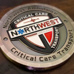
No classic patterns, no decorative etching, clean margins and clean lines. The front carries the full color company logo chiseled into the face. The reverse carries the international symbol of the ambulance. It was made for Northwest Ambulance, which transports thousands of patients a year across Puget Sound.
Why an Ambulance Service Is Not a Fire Department
EMS coins get treated as a subset of fire service coins, and for a private or independent ambulance provider that is the wrong model.
There is no Maltese Cross tradition. A fire department arrives with a symbol everyone in the sector shares. An ambulance service has the Star of Life, which is a medical marking rather than a heraldic device, and that difference shapes the whole design.
The organization is a company, not a municipal department. Which means it has a brand with specified colors and a logo designed for vehicles and uniforms, and the coin should reflect that rather than borrowing fire service conventions.
The staff is clinical and mixed. EMTs, registered nurses, paramedics, dispatchers and management, which is a wider range of roles than a single station holds. A coin is one of the few objects that covers all of them.
And the work is transport across a region rather than response from a station. Crews cover long distances between hospitals, clinics, fire departments and nursing homes rather than working out of one building, so the identity is the company rather than a location.
See more first responder challenge coins and EMS coin design ideas.
A Contemporary Register
The brief was explicitly contemporary: no classic patterns, no decorative etching, clean margins and lines. That is a set of decisions rather than an absence of them.
No rope or reeded edge. Those are currency conventions and they read as traditional. A clean rim is what makes a coin look current.
Flat color fields rather than textured ones. A machined background pattern reads as military or institutional. Solid areas read as modern graphic design.
Geometric spacing. Clean margins means consistent distances: the same gap from the rim on every side, elements aligned to a grid rather than arranged by eye. It is the thing that most distinguishes a contemporary coin from a classical one.
And a sans serif typeface. Type is what dates a design fastest in either direction. A clean sans serif is contemporary; a serif with generous letter spacing is period.
For the opposite register on a comparable organization, see a vintage challenge coin.
A Full Color Logo Chiseled Into the Face
The logo is recessed into the coin rather than raised, and then filled with its full color palette. That combination is worth understanding because it is the right way to put a corporate logo on a coin.
A recessed logo keeps its exact shape. The cut defines the boundary, and the color fills it. A raised logo’s edges soften slightly under the strike, which on a brand mark with specified proportions is a real loss.
The color sits in a protected channel. Which matters on a coin carried by working crews. Paint in a recess is shielded by the metal around it, where paint on a raised surface is the first thing to rub.
And full color means the brand is correct. A company logo reduced to one or two colors is no longer the logo. For an organization whose identity is its brand rather than a heraldic tradition, reproducing the palette accurately is the point.
The practical note is to send the color references rather than describing the shades, since enamel is matched from a standard range and a brand color is specified exactly. See enamel and finish options.
The Star of Life on the Reverse
The international ambulance symbol on the reverse is one of the better devices available for a coin, and for reasons that are structural.
It is radially symmetrical. Six bars radiating from a center, which fills a circular face completely with no awkward gaps and no orientation to get wrong. Most devices have to be fitted to a round coin; this one arrives fitted.
It is built from bold closed shapes. No fine internal detail, nothing that softens when reduced. It reads at any size.
And it is universally recognized. Which means the reverse needs no lettering to explain itself, and the coin identifies the sector to anyone who picks it up.
One note. The Star of Life is a controlled emblem in some jurisdictions, used to mark certified EMS personnel and equipment. Using it on a commemorative coin is ordinary practice, but if you are in any doubt about your organization’s authorization, confirm it before ordering. We produce from what the customer supplies and do not grant permission on anyone’s behalf.
About the Service
Northwest Ambulance has over 250 EMTs, registered nurses, paramedics, dispatchers and management staff, and transports thousands of patients a year from across Puget Sound, with a service area running from Pierce County to Whatcom County. Crews transport to hospitals, clinics, fire departments and nursing homes.
The company’s stated philosophy is that technology should improve clinical care, customer service, employee working conditions and efficiency, and that balance leads to stability and dependable long-term relationships.
A 250-person organization is worth noting on quantity. That is well above a 50 piece minimum, so a single order covers the roster with spares for new hires, and the cost per piece falls as the quantity rises.
Order a Coin for Your Service
Professional artwork is free with unlimited revisions, and nothing goes into production until you approve a digital proof. The challenge coin minimum is 50 pieces, standard production runs about 45 to 50 days after final artwork approval, rush production is available on many projects, and shipping within the continental United States is included. Embleholics is veteran-owned, SDVOSB and registered in SAM.gov.
Two suggestions. Send your brand color references rather than describing the shades, since enamel is matched from a standard range and your logo colors are specified exactly. And ask for the logo recessed rather than raised, because a cut edge holds the mark’s proportions precisely and the paint inside it lasts far longer on a coin that working crews will carry. Request a free quote to begin.
Frequently Asked Questions
What is an expeditionary wing challenge coin?
It is a coin for an Air Force wing operating from a deployed location rather than a home station. Because the population rotates constantly, a wing-level coin has a wide audience and a single design can keep being issued for years.
Should a deployed unit’s coin carry a date?
No. A coin tied to one rotation is obsolete within months, where one carrying the wing and the location stays correct for as long as the unit is there and can be reordered from the same die.
Why put the host nation’s flag on the coin?
Because a deployed unit operates from another country, and that relationship is something a home-station coin has no equivalent of. Two flags side by side is the most direct way to say it.
How should two national flags be arranged?
Side by side at equal size, which is the neutral reading. Overlapping, crossing or sizing them differently says something else, and that matters when one country is hosting the other.
How are the stars on the US flag handled?
Not at full count. Fifty five-pointed stars is beyond what striking holds at coin size, so the options are reducing the count, rendering the canton as a textured field, or enlarging the canton relative to the stripes so the stars have room.
Why do two flags sometimes need different treatment?
Because they reduce differently. A flag built from bands of color reproduces beautifully, while one carrying a central emblem or fine device loses that detail first, so matching their apparent quality takes deliberate adjustment.
How should aircraft be shown on a coin?
As silhouettes in plan view or clean side profile. A silhouette reads from its outline, which is what survives at coin size, where a detailed rendering loses its panel lines and markings and turns to texture.
Does a heavily painted coin need a protective coat?
Yes. Glossy painted areas wear before the metal does on a coin carried in a pocket, so an epoxy layer over the colored areas is worth specifying on any piece with substantial color.
Frequently Asked Questions
What is an ambulance challenge coin?
It is a coin made for an ambulance service or EMS provider, usually carrying the company’s logo and the Star of Life. It differs from a fire department coin because the identity is a brand rather than a heraldic tradition.
How is an EMS coin different from a fire coin?
A fire department has the Maltese Cross, a symbol everyone in the sector shares. An ambulance service has the Star of Life, which is a medical marking rather than a heraldic device, and a company brand with specified colors.
Should a company logo be raised or recessed?
Recessed. The cut defines the boundary exactly, where a raised logo’s edges soften slightly under the strike, which matters on a brand mark with specified proportions. The paint also lasts longer in a protected channel.
Can a logo be reproduced in full color?
Yes, and it should be. A company logo reduced to one or two colors is no longer the logo. Send the color references rather than describing the shades, since enamel is matched from a standard range.
What makes a coin design look contemporary?
A clean rim rather than a rope or reeded edge, flat color fields rather than machined textures, consistent geometric margins, and a sans serif typeface. Type is what dates a design fastest in either direction.
Does the Star of Life work well on a coin?
Very well. It is radially symmetrical, so it fills a circular face with no gaps and no orientation to get wrong, it is built from bold closed shapes with no fine detail to lose, and it is universally recognized without lettering.
Is there any restriction on using the Star of Life?
It is a controlled emblem in some jurisdictions, used to mark certified EMS personnel and equipment. Using it on a commemorative coin is ordinary practice, but confirm your organization’s authorization if you are in any doubt.
How many coins should a large service order?
A 250-person organization is well above the 50 piece minimum, so one order covers the roster with spares for new hires. The cost per piece falls as quantity rises, which makes ordering generously the economical choice.
More EMS Projects