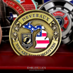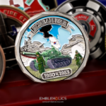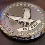
An etched eagle on one face and the United States flag on the other, styled after traditional American coinage rather than after a modern unit coin. This armed forces silver eagle coin was made for the Silver Eagles of the United States Armed Forces.
Designing in the Style of Real Coinage
Making a challenge coin look like currency is a deliberate register, and it is different from simply putting an eagle on a disc.
The structure is fixed and symmetrical. A central device, an inscription following the rim, a defined border, and nothing off-center. Real coinage has used that layout for centuries and departing from it is what makes a piece read as modern.
Relief is low and even. Struck currency has shallow, uniform relief rather than dramatic sculpting. Deep 3D elements immediately break the illusion, however impressive they look in isolation.
There is no color. Nothing undoes a coinage style faster than enamel. The design has to work entirely through line and shadow, which raises the standard on the die.
And the typography is specific. Serif capitals, evenly spaced, following the curve of the rim. A contemporary sans serif face is correct for most coins and wrong for this one.
The payoff is that currency styling carries authority automatically. A coin that looks minted reads as official in a way a designed emblem does not, and that association is doing work no amount of detail could.
See 2D vs 3D challenge coins and antique vs polished finishes.
The Eagle in American Military Design
The eagle is the most used symbol in American insignia and the easiest one to use badly, which is worth addressing directly.
It appears on the Great Seal, on service emblems, on rank insignia and on currency, which means it is familiar to the point of invisibility. An eagle placed on a coin without a reason is decoration, and it reads that way.
What makes an eagle work is specificity of pose and treatment. The bird facing left or right, wings raised or displayed, perched or in flight, head turned or forward. Each of those is a different image with different associations, and the versions on official seals are precisely defined rather than generic. A design that picks a deliberate pose looks intentional, while one that uses a stock eagle looks like a placeholder.
Etching suits the subject particularly well. Feathers are line work, hundreds of small defined strokes, and recessed line work reproduces that more faithfully than sculpted relief does at coin scale. A sculpted eagle at this size tends to lose its feathers into a smooth mass.
The Flag on the Reverse
Pairing an eagle with the flag is the most conventional combination in American coin design, and conventional is not the same as weak.
The pairing works because the two elements do different jobs. The eagle is a figure and the flag is a field, so they do not compete for the same kind of attention. Putting two figures on the two faces, or two fields, produces a coin that feels repetitive.
The design problem is that a flag is dense with fine parallel detail. Thirteen stripes and fifty stars at coin scale is more line work than a die can hold cleanly, and the usual outcome is stripes that merge and stars that fill in. The practical solutions are to show the flag partially rather than complete, to render it furled or waving so the stripes vary in width, or to simplify the star field rather than attempting the full count.
Without color, the flag has to be built entirely from relief and line direction, which is harder but produces a more dignified result than a painted flag on a coin that is otherwise bare metal.
Coins Across All Branches
A coin representing the armed forces as a whole rather than one service has a specific set of constraints.
Service specific imagery is out. An anchor, a globe and anchor, wings or a tank each claims one branch. A joint coin needs symbols that belong to the nation rather than to a service, which is exactly why the eagle and the flag appear so often on them.
If branches are named, all of them are named. Listing services means listing every one, in the correct order of precedence, with current names. Omitting one is the error people notice and remember.
The audience is the widest possible. A joint coin goes to veterans of every service and every era, so nothing on it should require current knowledge to understand.
And the register should be timeless. A coin for the armed forces as an institution outlives any particular unit or operation, which is the strongest argument for a traditional coinage style rather than a contemporary one.
See also military challenge coins.
Order a Commemorative or Patriotic Coin
Professional artwork is free with unlimited revisions, and nothing goes into production until you approve a digital proof. The challenge coin minimum is 50 pieces, standard production runs about 45 to 50 days after final artwork approval, rush production is available on many projects, and shipping within the continental United States is included. Embleholics is veteran-owned, SDVOSB and registered in SAM.gov.
Two suggestions. If the design includes an eagle, choose the pose deliberately and supply a reference, because a stock eagle reads as a placeholder while a specific one reads as intentional. And if the flag appears without color, show it partially or waving rather than flat and complete, since fifty stars and thirteen stripes at coin scale is more fine detail than a die will hold. Request a free quote to begin.
Frequently Asked Questions
How do you make a challenge coin look like real coinage?
Use a fixed symmetrical structure with a central device and a rim inscription, keep the relief low and even, leave out color entirely, and set the type in serif capitals following the curve.
Why does currency styling work on a challenge coin?
Because the association carries authority automatically. A coin that looks minted reads as official in a way a designed emblem does not, without needing any additional detail.
What breaks a coinage style?
Color and deep 3D relief. Enamel undoes it instantly, and dramatic sculpting departs from the shallow, even relief that struck currency actually has.
How do you use an eagle without it looking generic?
Choose the pose deliberately. Facing left or right, wings raised or displayed, perched or in flight are all different images with different associations, and a stock eagle reads as a placeholder.
Why does etching suit an eagle?
Feathers are line work, and recessed line work reproduces hundreds of small defined strokes better than sculpted relief does at coin scale, where a sculpted eagle tends to lose its feathers into a smooth mass.
How should a flag be rendered on a coin?
Partially, furled or waving rather than flat and complete. Thirteen stripes and fifty stars at coin scale is more parallel detail than a die can hold, so stripes merge and stars fill in.
Why pair an eagle with a flag?
Because the two do different jobs. The eagle is a figure and the flag is a field, so they do not compete. Two figures or two fields across the faces makes a coin feel repetitive.
What should a coin representing all branches avoid?
Service specific imagery, since an anchor or wings claims one branch. If services are named at all, every one has to appear, in the correct order and with current names.
More Veterans Projects