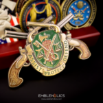
An Emerald Society challenge coin belongs to a police or fire fraternal organization for officers of Irish descent, and it has to carry two identities at the same time: the job and the heritage. This one was made for the Metro Richmond Police Emerald Society, founded at an organizational meeting on 30 September 2011 by officers from across the Greater Richmond area of Virginia. The coin is cut to a police badge outline, with a shamrock and block lettering on the front and the society’s own logo in Irish-style lettering on the back.
Two identities, one coin, and why most designs pick the wrong split
The failure mode is treating the heritage as decoration added to a police coin. A badge with a small shamrock tucked into a corner reads as a department coin with a sticker on it. An Emerald Society coin works when both identities get real weight, and the cleanest way to do that is to let one own the shape and the other own the content.
That is what this design does. The badge outline carries the professional identity, so the coin is unmistakably a police piece before anyone looks at the artwork. Inside that outline, the heritage takes the center of the front and the whole of the back. Neither is competing for the same space, and neither has been shrunk to accommodate the other.
Two other splits that work:
- One face each. The department or society crest on the front, the heritage emblem on the back at full size. Simplest to execute and hardest to get wrong.
- Heritage in the rim. A Celtic knotwork or interlace border running around a conventional badge or crest. The border carries the heritage continuously without taking any space from the center.
Lettering is where the heritage either lands or looks like costume
Two different typefaces on one coin is a deliberate choice here, not an accident. The front uses the heavy block lettering standard in police insignia. The back uses an Irish-style face matching the society’s existing logo. Using one typeface for both faces would have meant losing one identity, and that is the trade most coins make without noticing.
Celtic and uncial lettering needs more room than block lettering. The letterforms are wider, the strokes vary in thickness, and the decorative terminals that make the style recognizable are the first thing to disappear at small sizes. In practice that means a heritage typeface belongs on the face with fewer words, and a long organization name set in it will need the coin to be a size larger than you first planned.
Match the society’s existing logo rather than choosing afresh. Most Emerald Societies have had a logo for years, on patches, shirts, and banners, and members recognize its lettering specifically. A coin using a different Celtic face is subtly wrong to the people who will carry it, even if they cannot say why.
Green on metal: the one color decision that matters
Green is the point, so it should be the only strong color on the coin. A shamrock in enamel against bare metal reads from across a room. The same shamrock on a coin that also has blue, gold, and red elements becomes just another detail.
Choose the metal with the green in mind. Green enamel against antique silver or nickel gives a cool, high-contrast result. Against gold or antique brass it reads warmer and more traditional, which is often what a heritage organization wants. It is worth seeing both before committing, because the same green behaves differently against each, and this is the kind of thing that is obvious on a proof and invisible in a description.
Badge shapes still need permission
A society is not the department, and that distinction matters here. If the coin reproduces a department’s issued badge design, the department’s authorization is needed even though the order is coming from a fraternal organization rather than from the agency. Where a society spans several departments, as this one does across the Richmond metro area, using any single agency’s badge raises the question of why that one and not the others.
The usual solution is a generic badge outline rather than a specific agency’s. A shield, star, or civic-crown profile that is not any one department’s issued design carries the professional identity without reproducing controlled artwork, which is both simpler and more appropriate for a multi-agency membership. We cover the approval question in more detail in our guide on permission to use a police badge on a coin, and the mechanics of cutting a badge profile on our Roswell Police badge coin project.
Ordering a society coin
Bring the society logo, a decision on the shape, and your membership number. The last one sets the quantity, and fraternal organizations are one of the few cases where the audience is genuinely countable. We will show you the outline and both faces, set at actual size, before anything is cut, which is when the lettering decisions get made. You can see more police challenge coins we have produced, including the Smyrna Police Department coin, or send your artwork through the free quote form.
Frequently Asked Questions
What is an Emerald Society challenge coin?
An Emerald Society challenge coin is made for a police or fire fraternal organization whose members identify with Irish heritage. These societies exist in cities across the United States, and their coins have to carry two identities at once: the professional one, usually through a badge shape or crest, and the heritage one, usually through a shamrock, Celtic lettering, or knotwork.
How do you fit both the badge and the Irish heritage on one coin?
Let one own the shape and the other own the content. A badge-shaped outline establishes the professional identity before any artwork is read, which frees the faces for the heritage emblem and lettering at full size. The alternative splits that work are one face each, or Celtic knotwork in the rim around a conventional crest. What does not work is a small shamrock added to a corner of a department coin.
Can we use Celtic or Irish lettering on a coin?
Yes, but it needs more room than block lettering. The letterforms are wider, stroke weights vary, and the decorative terminals that make the style recognizable are the first detail lost at small sizes. Put heritage lettering on the face with fewer words, and expect that a long organization name set in it may require a slightly larger coin.
Should the coin use our existing logo’s lettering?
Yes. Members recognize the specific letterforms from patches, shirts, and banners, and a coin set in a different Celtic typeface reads as subtly wrong to the people carrying it. Matching the existing logo is almost always the right call, even if another face would be technically cleaner.
What metal works best with green enamel?
Both silver and gold tones work, but differently. Green against antique silver or nickel is cool and high-contrast. Against gold or antique brass it reads warmer and more traditional, which many heritage organizations prefer. Ask to see both on a proof, because the same green behaves differently against each and the difference does not come across in a written description.
Does a fraternal society need department permission for a badge design?
If the coin reproduces a department’s issued badge, yes, even when the order comes from a society rather than the agency itself. For a society spanning several departments, using one agency’s badge also raises the question of why that one. The usual answer is a generic shield, star, or civic-crown outline that belongs to no single department, which carries the professional identity without reproducing controlled artwork.
How many coins should a society order?
Fraternal organizations are one of the easier cases, because the membership roll gives you a real number. Work from current membership, add a margin for new members over the next year or two and for presentation to visiting societies, and keep dates off the die so the same design can be reordered as the society grows.
More Police Projects