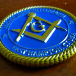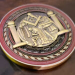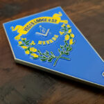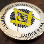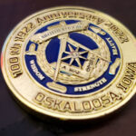
Freemasonry has a deeper stock of symbols than almost any organization we design for, and each behaves differently once it is cut into metal. This coin was made for Mahaska Lodge No. 664, finished in bright gold with heavily engraved emblems and inscriptions on both faces. What follows is a working guide to the symbols themselves and how each one translates to a struck coin.
The symbols, and how each one strikes
The square and compasses. The central emblem of the craft and the one that identifies a coin as Masonic to anyone. It is pure line work, two overlapping geometric tools, which makes it close to ideal for engraving: clean straight edges, consistent stroke weight, no fine internal detail to lose. It works at almost any size and needs no color. If a coin carries one symbol, this is it.
The letter G. Usually set within the square and compasses. The thing to watch is the typeface, since the G is often drawn in an ornate serif with thin strokes that are the first thing to fill with plating. A slightly heavier letterform holds much better and looks no different at coin size.
The all-seeing eye. A harder one. The eye needs enough area to read as an eye rather than an oval, and the radiating rays around it are thin lines that crowd together at their base. Give it room, keep the rays few and relatively thick, and resist adding the full sunburst.
The pillars. Boaz and Jachin are architectural and strike well, with one caveat: the capitals carry detail that disappears if the pillars are rendered small. Either give them real height on the coin or simplify the capitals deliberately.
The trowel, the gavel, the plumb and the level. Working tools are simple shapes with clear silhouettes and are among the most reliable elements on a Masonic coin. They also give a design something to arrange around the central emblem.
The beehive, the hourglass, the acacia. More pictorial, more detail, more risk. These want relief rather than engraving, because they depend on form rather than outline, and they need to be the largest thing on their face to work.
Engraving is the right technique here
Masonic symbolism is drawn, not colored, and the production method should follow that. Almost everything in the craft’s visual vocabulary is line work: tools, geometry, architectural forms. Those are things you cut into metal. Enamel is for filling areas of flat color, and a square and compasses filled with enamel loses the precision that makes it what it is.
Heavy engraving on a bright field is a deliberate pairing. Deep cuts hold shadow, and a polished gold surface around them throws the engraved lines into relief. The alternative, shallow engraving on a matte field, produces a much softer coin. Neither is wrong, but a lodge wanting its emblems to look crisp and formal should ask for depth.
The cost argument runs the same way. Engraving lives in the die and is reproduced across the whole run at no extra cost per coin, where enamel is charged by color area on every single piece. For a lodge funding coins from dues, an engraved coin is both more appropriate and cheaper.
Lodge, the word, and why it matters on a coin
Among Masons, a lodge is the body of members, not the building. Freemasons meet as a lodge rather than in one, and the premises are more properly a hall or temple. It is a distinction the craft takes seriously and an easy one for an outsider drafting coin wording to get wrong.
Lodge names follow recognizable patterns, usually drawn from a founder, a town or county, a historical figure, a notable Mason, or a symbolic word, with the number following the name. Mahaska is a county name in Iowa, which places the lodge immediately for anyone local.
The number is not optional. A lodge is identified by name and number together, and the number should be as legible as the name. It is also what distinguishes one lodge’s coin from the thousands of others carrying the same square and compasses.
What goes on which face
The reliable split is craft symbols on one face, lodge identity on the other. The square and compasses, with or without the letter G, owns the front and says what the coin is. The lodge name, number and jurisdiction own the back and say whose it is.
Resist filling both faces with symbols. The temptation on a Masonic coin is to include everything, because every symbol carries meaning. A coin with the square and compasses, the all-seeing eye, both pillars, the working tools and a beehive has no focal point, and the symbols stop reinforcing each other and start competing. Two or three, well cut and well spaced, say more.
Ordering a lodge coin
Tell us the lodge name and number exactly as chartered, and which symbols matter most to your lodge. That second question is the useful one, because most lodges have two or three that mean something particular to them, and a coin built around those is better than one trying to represent the whole craft. We have produced a number of these, including the Anchor Lodge No. 112 coin and the Masonic lodge coin, and you can see the full range of Masonic lodge coins or send your details through the free quote form.
Frequently Asked Questions
Which Masonic symbols work best on a challenge coin?
The square and compasses is close to ideal, being clean geometry with no fine internal detail to lose, and it identifies the coin as Masonic on its own. The working tools, the trowel, gavel, plumb and level, are similarly reliable simple silhouettes. The all-seeing eye, the pillars and pictorial symbols such as the beehive need more space and more care.
Should a Masonic coin use enamel or engraving?
Engraving. The craft’s visual vocabulary is line work, geometry and architectural form, which is what cutting into metal does well. Enamel fills areas of flat color and a square and compasses filled with enamel loses the precision that defines it. Engraving is also cheaper, since it lives in the die rather than being charged per coin by color area.
How many symbols should a lodge coin carry?
Two or three, well cut and well spaced. Every Masonic symbol carries meaning, which makes the temptation to include all of them strong, but a coin with the square and compasses, the all-seeing eye, both pillars, the working tools and a beehive has no focal point and the symbols compete rather than reinforce. Choose the ones that mean most to your lodge.
Why is the letter G sometimes hard to strike?
Because it is often drawn in an ornate serif with very thin strokes, and those thin strokes are the first thing to fill with plating and polishing compound. A slightly heavier letterform holds far better and is indistinguishable at coin size, so it is worth specifying rather than accepting the most decorative version available.
Does a lodge coin need the lodge number?
Yes, and as legibly as the name. A lodge is identified by name and number together, and the number is what distinguishes your coin from the thousands of others carrying the same square and compasses. Take both exactly as they appear on the charter.
Is a lodge the building or the members?
The members. Freemasons meet as a lodge rather than in one, and the premises are more properly called a hall or a temple. The distinction matters to the craft and is an easy one to get wrong when drafting coin wording, so it is worth having a member check the text before it goes to a die.
How should the two faces of a lodge coin be divided?
Craft symbols on one, lodge identity on the other. The square and compasses, with or without the letter G, carries the front and says what the coin is; the lodge name, number and jurisdiction carry the back and say whose it is. That split keeps both faces clear and stops the symbols competing with the text.
More Masons & Masonic Lodges Projects