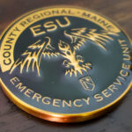
Two colors only, gold and black. The front carries the unit’s logo and nothing else. The back carries the motto as an inscription. There are no etched patterns and no additional elements anywhere on the piece, which is what keeps it bold and direct. This emergency service unit coin was made for a regional emergency service unit in Maine, which responds to crisis calls including hostage incidents and barricaded suspects.
Coins for Tactical and Crisis Units
A specialized response unit inside a larger agency is one of the strongest cases for a coin there is.
Membership is selected. Officers apply, are assessed and train continuously to stay on the team. That is the defining condition for a meaningful coin: something not everyone has.
The team is small. A unit of this kind is usually a few dozen people within a much larger department, which fits a single order and makes the coin genuinely scarce.
The work is high consequence and low volume. Hostage incidents and barricaded suspects are rare and serious, so the unit spends most of its time training for events that may not come. Recognition in that situation has to be internal, because there is no steady stream of visible outcomes.
And the bond is unusually tight. People who train together for low frequency, high risk work form a close group, and a coin marks that membership better than any patch, which anyone in the unit wears anyway.
See also police challenge coins.
Two Colors and Nothing Else
Gold and black is among the most effective pairings available, and the restraint here is deliberate rather than economical.
Maximum contrast. Gold against black is as much separation as a coin can produce without resorting to a third color. Anything on a black field in gold reads from across a room.
Black is the most forgiving fill. Variations in depth and small imperfections disappear against it, so a two color coin with a black ground is among the most reliable to produce cleanly.
Gold carries weight without ceremony here. Paired with black rather than with bright color, gold reads as serious rather than as an award, which suits a tactical unit.
And two colors force the design to be decided. A limited palette removes the option of using color to separate elements, so the composition has to work structurally. That is a discipline rather than a constraint.
Leaving out etched patterns completes it. On a coin with two colors and two elements, a background texture or a decorative rim would be the busiest thing present, which is the opposite of the intent.
See enamel and finish options.
A Logo on One Face and a Motto on the Other
This is the oldest layout in coin design and it still works, provided one condition is met.
The split is clean: the front says who, the back says what they believe. Neither face has to carry both, which means the logo gets a full face at a size where its detail survives, and the motto gets a full face where it can be set large enough to read.
The condition is that the motto has to be worth the space. A full face given over to text is a significant commitment, and a generic line, something that could belong to any unit, wastes it. A motto that is specific to the unit, long established and known to its members justifies the face. One written for the coin usually does not.
The typography then matters more than on any other kind of coin, because the lettering is the entire design on that side. Spacing, line breaks and the relationship of the text block to the rim are the composition, and they deserve the same attention a graphic would get.
What an Emergency Service Unit Does
The term covers a specialized response capability within a law enforcement agency, handling the calls that exceed what a patrol unit can manage. That includes hostage situations, barricaded suspects, high risk warrant service and technical rescue, depending on how the agency structures it.
What distinguishes these units is breadth. An emergency service unit is frequently both tactical and rescue oriented, trained for entry work and for rope rescue, vehicle extrication or water rescue. Officers hold multiple qualifications and carry a far wider skill set than a single purpose team would.
For a coin, that breadth is the thing that resists a single image. A unit that does entries and rescues and technical work has no one representative piece of equipment, which is part of why a logo and a motto is the right structure here: the unit’s own mark already carries whatever synthesis the organization settled on.
Order a Tactical or Specialized Unit Coin
Professional artwork is free with unlimited revisions, and nothing goes into production until you approve a digital proof. The challenge coin minimum is 50 pieces, standard production runs about 45 to 50 days after final artwork approval, rush production is available on many projects, and shipping within the continental United States is included. Embleholics is veteran-owned, SDVOSB and registered in SAM.gov.
Two suggestions. If a full face is going to a motto, use one the unit already has rather than one written for the coin, because a generic line wastes the most valuable space on the piece. And consider holding the palette to two colors, since a limited palette forces the composition to work structurally instead of leaning on color to separate elements. Request a free quote to begin.
Frequently Asked Questions
What is an emergency service unit?
A specialized response capability inside a law enforcement agency, handling calls beyond what patrol can manage, including hostage situations, barricaded suspects and often technical rescue work.
Why do specialized units suit challenge coins?
Because membership is selected rather than automatic, the team is small, and the work is high consequence and low volume, so recognition has to come from inside the unit.
Why is gold and black an effective pairing?
It is close to the maximum contrast available without a third color, and black is the most forgiving fill, hiding variations in depth that a pale ground would show.
Is a two color coin a budget choice?
Not necessarily. A limited palette removes the option of using color to separate elements, which forces the composition to work structurally. That is a discipline rather than a saving.
Should a coin have a logo on one face and a motto on the other?
It is a reliable structure, provided the motto earns the space. A full face of text is a large commitment, and a generic line wastes it.
What makes a motto worth a whole face?
That it already belongs to the unit and is known to its members. A phrase written specifically for the coin rarely carries enough weight to justify the real estate.
How important is typography on a motto face?
It is the design. Spacing, line breaks and the relationship of the text block to the rim are the composition, and they deserve as much attention as a graphic would get.
Why not use a piece of equipment as the central image?
Because a unit doing entries, rescues and technical work has no single representative tool. The unit’s own logo already contains whatever synthesis the organization settled on.
More Law Enforcement Challenge Coins Projects