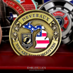
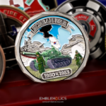
Two colors and two logos, one per face. Simple, and eye-catching because of it rather than in spite of it. The coin was made for the Hometown Heroes Alliance, which raises funds and awareness for first responders, with a partner organization’s logo on the reverse.
Why Black and White Is a Strong Choice
Dropping to two colors sounds like a compromise. On a coin it is frequently the better design, and for reasons that are specific to the medium.
Maximum contrast, by definition. Black against white is the furthest apart two fills can be. Every edge is crisp, every shape is distinct, and nothing in the design depends on the viewer distinguishing two similar tones at small size.
It survives reproduction anywhere. A two color coin photographs cleanly, prints cleanly and reads at a glance in poor light. A subtle multicolor design that looks beautiful under a lamp can turn muddy in a photograph or across a table.
The color count is small, so the budget goes elsewhere. Each distinct color is a separate enamel fill and a cost. Two colors leaves room in the quote for a better finish, a custom shape or an edge treatment, which are things people notice more than an extra shade.
And it reads as considered. A restricted palette looks like a decision. A coin with eight colors looks like a design that could not decide, which is usually what it is.
The catch is that it is less forgiving. White is the hardest color on a coin, because any contamination, thin spot or unevenness in the fill shows against it where a dark or mid tone would hide it. A black and white coin has nowhere for a production flaw to hide, which is exactly why it looks good when done properly. See enamel and finish options.
Designing for Two Colors
Most logos were not drawn for a two color reproduction, so the conversion is where the work happens.
Shapes replace shades. A logo that uses three greens to separate three elements has to separate them some other way: by outline, by a gap, or by alternating black and white. That is a redraw rather than a recolor.
Gradients have to go. Any part of a logo built on a fade has to become a hard edge, and the designer has to decide where that edge falls. It is worth having an opinion on this rather than leaving it to chance.
Decide which color is the background. A black field with white elements and a white field with black elements are two completely different coins, and on a two sided piece you can use one of each. That is a free way to distinguish the faces.
And watch thin white lines. A fine white line on black is a narrow channel of enamel, which is the hardest thing to fill cleanly. Thin black lines on white are much safer, because the recess is cut into a wider field.
Two Organizations, One per Face
This coin carries the Hometown Heroes logo on the front and Copout Adventures on the reverse, which is the standard solution when two organizations are involved in one effort.
Putting both marks on a single face ranks them, because one ends up larger, higher or to the left, and everybody involved notices. Giving each its own side removes the question. It also means each logo gets the whole face it was designed to occupy rather than half of one.
For a charity coin in particular this matters, because the second mark is usually a sponsor or a partner whose support made the coin possible. Putting them on their own face is both the cleaner layout and the better acknowledgment.
One practical note: when two organizations’ marks appear, both have to approve the use before artwork begins. We produce from the artwork a customer supplies and do not grant permission on either party’s behalf.
Coins for Charities and Fundraising
The Hometown Heroes Alliance supports first responders financially, physically and emotionally, including those who have been disabled by on-the-job incidents and left in difficulty as a result. The organization runs benefit concerts and directs the proceeds to people in need.
That shape of organization uses coins differently from a unit, in three ways worth knowing.
They are often sold rather than given. A coin can be a fundraising item in its own right, which means stock moves and gets reordered rather than sitting in a drawer.
They go to supporters, not members. A unit coin circulates among people who already share an identity. A charity coin goes to donors, volunteers and attendees, which is why the design has to communicate to someone encountering the organization rather than someone already in it.
And events are the distribution channel. Concerts, drives and benefit nights all put the coin in front of people in a moment when they are already engaged.
See more organization challenge coins and first responder challenge coins.
Order a Two Color Coin
Professional artwork is free with unlimited revisions, and nothing goes into production until you approve a digital proof. The challenge coin minimum is 50 pieces, standard production runs about 45 to 50 days after final artwork approval, rush production is available on many projects, and shipping within the continental United States is included. Embleholics is veteran-owned, SDVOSB and registered in SAM.gov.
Two suggestions. If your logo uses more than two colors, send it anyway and let us work up a two color version; it is a redraw rather than a recolor, and it is better done deliberately than by stripping colors out. And if you intend to sell the coin for fundraising, say so at the quote stage, since larger quantities lower the cost per piece and that margin is the point. Request a free quote to begin.
Frequently Asked Questions
What is a black and white challenge coin?
It is a coin using only two enamel colors, black and white, usually with one as the background and the other for the design elements. It gives the maximum contrast available and reads clearly at a glance in any light.
Is a two color coin cheaper than a full color one?
Yes, because each distinct color is a separate enamel fill and a cost. The useful part is what you do with the saving: a better finish, a custom shape or an edge treatment are all things people notice more than an extra shade.
Does a two color coin look cheap?
No, usually the opposite. A restricted palette reads as a decision, where eight colors tends to read as a design that could not choose. The contrast also makes every edge crisp, which a subtle multicolor scheme does not.
Is white difficult to produce on a coin?
It is the least forgiving color. Contamination, thin spots and unevenness all show against white where a dark fill would hide them. A black and white coin has nowhere for a flaw to hide, which is part of why it looks good when done well.
Can our multicolor logo be converted to two colors?
Yes, but it is a redraw rather than a recolor. Elements separated by different shades have to be separated some other way, by outline, by a gap, or by alternating black and white, and any gradient has to become a hard edge.
Should thin lines be black or white?
Black on white, where possible. A fine white line on a black field is a narrow channel of enamel and the hardest thing to fill cleanly, while a thin black line is a recess cut into a wider field and much safer.
How do you handle two organizations on one coin?
One logo per face. Putting both on a single face ranks them by size and position, which everyone involved notices, and each mark ends up with half the space it was designed for.
Can a charity sell challenge coins to raise funds?
Many do, and it is one of the main reasons nonprofits order them. Mention it at the quote stage, since larger quantities lower the cost per piece and the margin between cost and sale price is the whole point.
More Veterans Projects