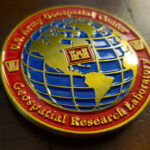
The design is deliberately simple and contemporary, with modern elements and none of the complex traditional patterning that usually appears on military coins. The graphic is a globe map with the laboratory’s logo at the center. It was made for the Geospatial Research Laboratory, part of the Engineer Research and Development Center.
Coins for Research and Technical Organizations
A laboratory is a different coin client from a unit, and the differences are worth setting out because they recur across every research and engineering organization we work with.
The staff is largely civilian. A research lab inside a military organization is mostly scientists and engineers rather than uniformed personnel. They sit inside the coin tradition without having come up through it, which means a coin often has to work as a professional object rather than relying on military convention to carry it.
There is no lineage to draw on. A battalion has a century of history, campaign credits and a crest built from them. A laboratory founded in a recent reorganization has none of that, and a design that tries to borrow the visual language of lineage ends up looking borrowed.
So the subject is the work itself. This is the key move. A lab’s identity is what it studies, which means the coin can be built from the subject matter: a globe for geospatial work, a molecular structure, a waveform, a circuit, a terrain profile. That is more specific than any crest and it communicates to people outside the organization too.
And a contemporary register is correct. An organization doing current technical work is better served by a clean modern design than by rope borders and heraldic scrollwork. The traditional treatment reads as ceremonial, which is not what a laboratory is.
See also a state agency challenge coin for a contemporary approach in a government setting.
A Globe as the Central Device
The globe is a well judged choice and a harder subject than it appears.
A sphere has no silhouette to speak of. Cut a globe out and you have a circle, which on a round coin is invisible. So a globe has to read from its internal content, the landmasses and the grid, which is the opposite of how most coin devices work.
Which means the graticule does the work. Lines of latitude and longitude curving across a circular field are what make it read as a sphere rather than as a disc. Those lines are also the element most likely to be cut too fine, so they need to be bolder and fewer than a real globe shows.
Landmasses have to be simplified hard. Continental outlines at coin size lose every bay, peninsula and island. What survives is the broad mass, and a globe showing three or four recognizable continental shapes reads better than one attempting an accurate world map.
And the orientation is a decision. A globe centered on one region says something about the organization’s focus. A globe seen from an angle that shows mostly ocean says very little. It is worth being deliberate rather than accepting the default view.
Putting the logo at the center is what resolves the composition. A globe alone is a field with no focus; a device in the middle of it gives the eye somewhere to land and makes the globe a background rather than the subject.
Why a Simple Design Is Harder
The brief here was simplicity with minimal ornament, and that is more demanding than a decorated coin.
A traditional coin has a rope border, a patterned field and a heraldic device, each of which fills space and carries visual interest. Strip those away and the entire result depends on things nobody notices when they are right: the spacing between the globe and the rim, the size relationship between the logo and the globe behind it, the weight of the lettering, and whether the whole arrangement is actually centered.
A circle is particularly unforgiving here. Any element even slightly off center on a round coin with a plain field looks like a mistake rather than a choice, because the circle gives the eye a perfect reference.
None of that is difficult to get right and all of it has to be got right, which is the honest reason a simple coin takes as much attention at the artwork stage as an elaborate one.
About the Laboratory
The Geospatial Research Laboratory is a component of the Engineer Research and Development Center, the US Army Corps of Engineers laboratory organization. It was created in 2014 in a reorganization of the Topographic Engineering Center, which had been based in Alexandria, Virginia.
Its mission is to provide science, technology and expertise in engineering and environmental sciences in support of the Armed Forces and the Nation, and it conducts geospatial research, development and evaluation of technologies that characterize the physical terrain and social environments the Army encounters.
That mission statement is also a good illustration of the earlier point: “characterizing physical and social environments” is not something a crest can depict, but a globe gets close.
See more Army challenge coins.
Order a Coin for Your Laboratory
Professional artwork is free with unlimited revisions, and nothing goes into production until you approve a digital proof. The challenge coin minimum is 50 pieces, standard production runs about 45 to 50 days after final artwork approval, rush production is available on many projects, and shipping within the continental United States is included. Embleholics is veteran-owned, SDVOSB and registered in SAM.gov.
Two suggestions. Tell us what your organization studies rather than only what it is called, because the subject matter is almost always a better coin device than an organizational emblem and it is the thing a research body has that a unit does not. And say explicitly if you want a contemporary rather than traditional treatment, since that decision changes the approach from the first sketch rather than being a styling choice applied later. Request a free quote to begin.
Frequently Asked Questions
What is a research laboratory challenge coin?
It is a coin made for a research or technical organization rather than an operational unit. Because a lab has no lineage or campaign history to draw on, the design is usually built around the subject matter the lab studies.
Why do research organizations need a different design approach?
Because the staff is largely civilian and there is no lineage to reference. A design borrowing the visual language of unit history looks borrowed, where a design built from the lab’s actual subject matter is specific and communicates outside the organization.
Should a laboratory coin look traditional or modern?
Modern, generally. Rope borders and heraldic scrollwork read as ceremonial, which is not what a laboratory is. A clean contemporary design better reflects an organization doing current technical work.
Can a globe go on a challenge coin?
Yes, though it is harder than it looks. A sphere has no silhouette, so on a round coin it has to read entirely from its internal content, which is the opposite of how most coin devices work.
What makes a globe read as a sphere?
The lines of latitude and longitude curving across the circular field. Those lines need to be bolder and fewer than a real globe shows, since they are the element most likely to be cut too fine to survive.
How detailed should the continents be?
Much less than a map. Every bay, peninsula and island disappears at coin size, so three or four recognizable continental masses read better than an attempt at an accurate world map.
Does the globe’s orientation matter?
Yes, and it is worth deciding deliberately. A globe centered on a particular region says something about the organization’s focus, while one angled to show mostly ocean says very little.
Is a simple coin easier to design?
No, harder. A traditional coin’s border and patterned field carry visual interest, and removing them leaves the result depending entirely on spacing, size relationships, lettering weight and centering, all of which are invisible when right and obvious when wrong.
More Army Projects