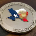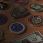
Yes. We match requested colours closely, including Pantone and PMS references, so a unit crest, department badge or corporate logo comes out in its correct colours rather than an approximation.
Send your colour references with the artwork. Useful formats, in order of precision:
- Pantone or PMS numbers: the most precise, and what brand guidelines usually specify
- A brand guidelines document: often contains the PMS values already
- A previous coin or physical sample: matched by eye against the piece
- A high-quality image file: workable, though screen colour is not a reliable reference
One honest caveat. Slight variation can occur between physical enamel and the same colour displayed digitally or printed on a proof. Enamel is a physical material with its own opacity and depth, and it sits against metal rather than white paper. Very light tints, metallics and fluorescents behave differently in enamel than in print, and a colour on polished gold reads differently from the same colour antiqued.
The match is close, and on standard colours it is close enough that most buyers cannot tell it from the reference. It remains a match rather than a reprint.
Your digital proof shows the specified colours before anything is manufactured, and revisions are unlimited and free.
See colour work in our gallery, or request a free quote with your colour references.
Recent Posts